Case Media
Case Notes
This page keeps the media, full prompt, and original source together so you can inspect the result first and decide whether the prompt is worth copying, saving, or comparing.
Case Insights
To make this page easier to search, cite, and reuse later, the case is also broken down into practical guidance about usage, visual cues, and prompt structure.
Best Fit Scenarios
- Use this as a poster & illustration benchmark when you need a fast style baseline before rewriting your own prompt.
- It is especially helpful if your target overlaps with Poster, Illustration, Typography and you want to judge the image result before tuning wording.
- Keep it as a control sample when you compare nearby prompt variants one variable at a time.
Visual Signals To Notice
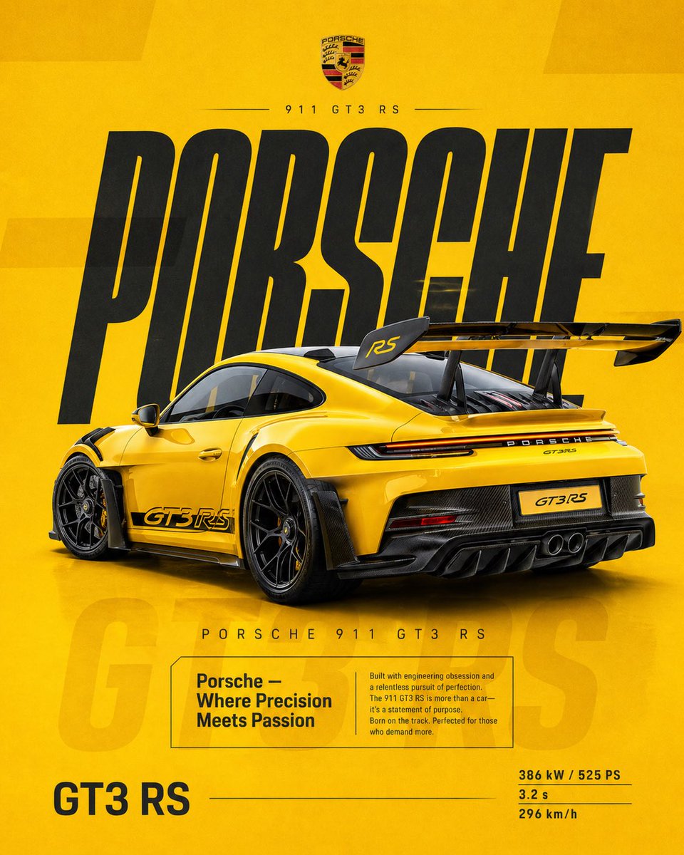
- The clearest style signals here are Poster, Illustration, Typography, so those should usually stay in your first rewrite.
- Pay close attention to layout rhythm, headline hierarchy, illustration texture, and how information is staged in the frame.
- This case keeps one primary output, so the first image should be treated as the main visual reference.
How The Prompt Is Structured
- The prompt reads as a long, highly specified prompt, which is useful when you want to judge how much specificity this direction needs.
- Its keyword cluster is centered on Poster, Illustration, Typography, so you can usually keep that cluster while swapping subject, camera, layout, or copy details.
- A practical rewrite path is: keep the outcome, keep the strongest style cues, then replace only the subject and environment blocks.
Good Follow-up Questions
- What changes first if you keep Poster, Illustration, Typography but switch the subject matter?
- Which part of the result comes from section-level structure (Poster & Illustration) versus tag-level style cues?
- Which related cases in the same section give you a cleaner or more extreme variation of the same direction?
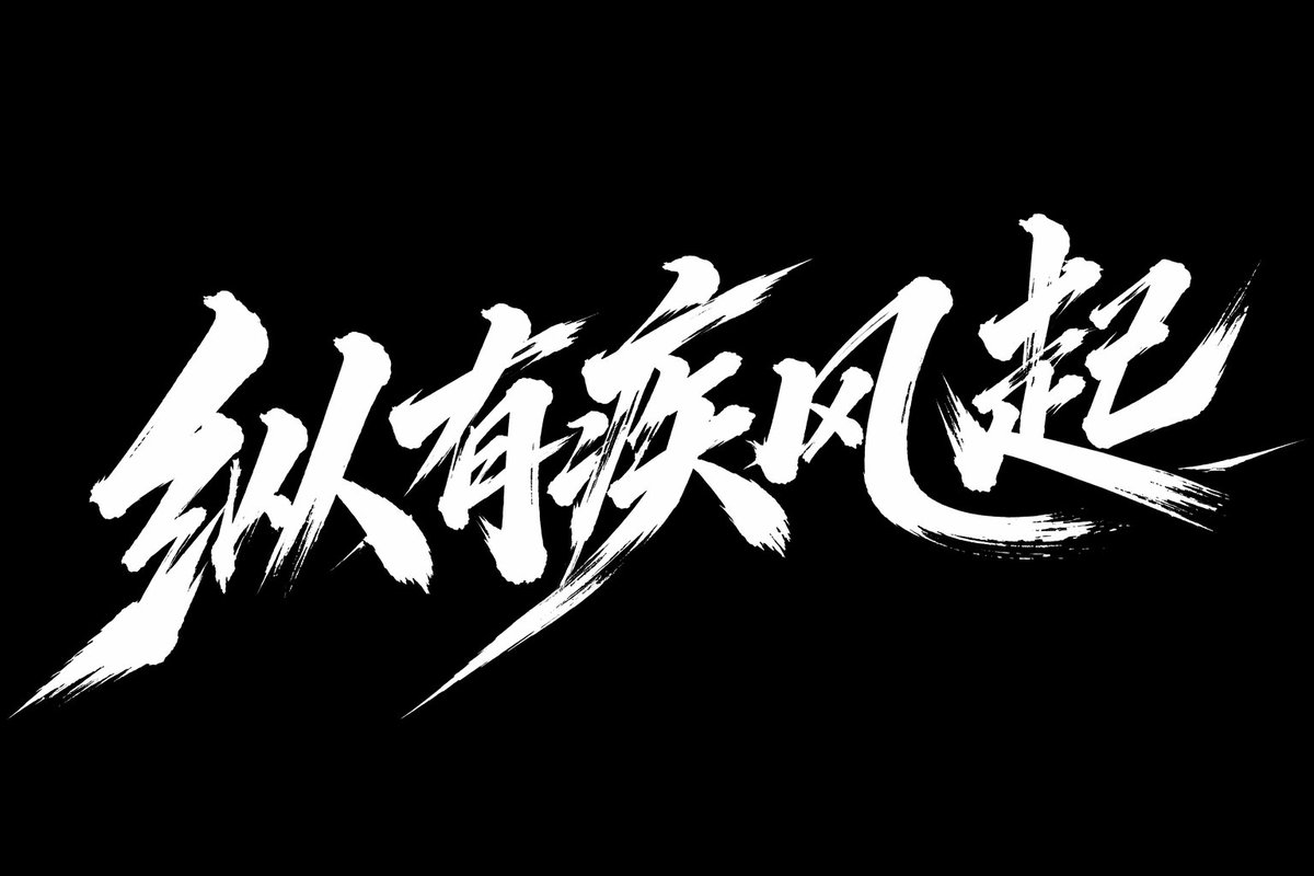
Full Prompt
[中文] 创意艺术字体“纵有疾风起”,秀丽笔手写风格,整体文字横版排列,具有强烈视觉冲击力; 深度融合手写书法笔意,笔触带毛笔书写的粗犷洒脱,如挥毫泼墨的肆意劲道; 起收笔的飞白,顿挫,尽显促销的火爆张力,文字的形态打破规整,笔画的粗细变化; dutch angle,营造出动感冲刺的气势,字形呈奔放之势; 重心上扬如蓄势待发,笔画的伸展,穿插毫无拘束,似全力冲刺的劲道; 整体架构疏密交织,紧密处如促销热潮的汹涌,留白处似优惠间隙的呼吸感; 纯净黑色背景打底,完美契合热烈氛围,艺术字的形态与色彩酣畅传递。 [English] Creative artistic typography "Zong You Ji Feng Qi", hand-written style with a fine brush, overall text arranged horizontally, with strong visual impact; Deeply integrated with the essence of handwritten calligraphy, the brushstrokes carry the rugged and free-spirited nature of brush writing, like the unrestrained vigor of splashing ink; The flying white and pauses at the start and end of the strokes fully display the explosive tension of a promotion, the form of the text breaks away from neatness, with variations in the thickness of the strokes; dutch angle, creating a dynamic sprinting momentum, the font shape shows a bold and unrestrained trend; The center of gravity rises like being ready to launch, the stretching and interlacing of the strokes are completely unconstrained, like the vigor of a full-force sprint; The overall structure is intertwined with density and sparseness, the tight parts are like the surging of a promotional craze, and the blank spaces are like the breathing sense during promotional gaps; Pure black background as the base, perfectly fitting the passionate atmosphere, the form and color of the artistic typography are conveyed with full expressiveness.