Case Media
Case Notes
This page keeps the media, full prompt, and original source together so you can inspect the result first and decide whether the prompt is worth copying, saving, or comparing.
Case Insights
To make this page easier to search, cite, and reuse later, the case is also broken down into practical guidance about usage, visual cues, and prompt structure.
Best Fit Scenarios
- Use this as a poster & illustration benchmark when you need a fast style baseline before rewriting your own prompt.
- It is especially helpful if your target overlaps with Poster, Illustration, Typography and you want to judge the image result before tuning wording.
- Keep it as a control sample when you compare nearby prompt variants one variable at a time.
Visual Signals To Notice
- The clearest style signals here are Poster, Illustration, Typography, so those should usually stay in your first rewrite.
- Pay close attention to layout rhythm, headline hierarchy, illustration texture, and how information is staged in the frame.
- This case keeps one primary output, so the first image should be treated as the main visual reference.
How The Prompt Is Structured
- The prompt reads as a long, highly specified prompt, which is useful when you want to judge how much specificity this direction needs.
- Its keyword cluster is centered on Poster, Illustration, Typography, so you can usually keep that cluster while swapping subject, camera, layout, or copy details.
- A practical rewrite path is: keep the outcome, keep the strongest style cues, then replace only the subject and environment blocks.
Good Follow-up Questions
- What changes first if you keep Poster, Illustration, Typography but switch the subject matter?
- Which part of the result comes from section-level structure (Poster & Illustration) versus tag-level style cues?
- Which related cases in the same section give you a cleaner or more extreme variation of the same direction?
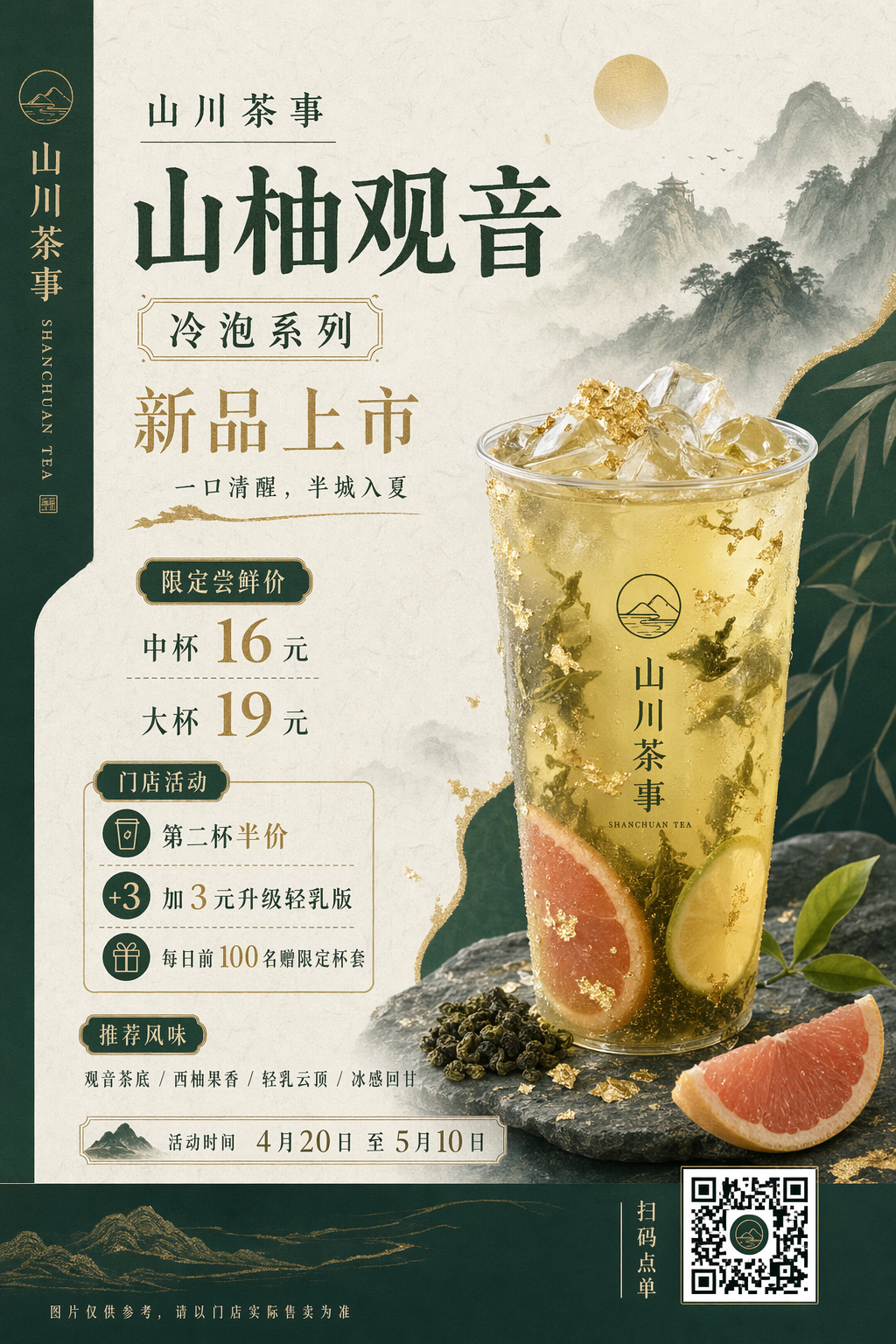
Full Prompt
Design a 3:4 vertical poster for a new Chinese trendy tea launch. Use a New Chinese visual style that feels light-luxury and restrained. The palette should be dark green, off-white, and gold, with rice-paper texture, elegant negative space, landscape accents, and modern layout design. Main subject: a visually appealing cold-brew tea with tea leaves, citrus, ice cubes, and touches of gold foil. The poster must accurately display the following exact Chinese copy: "山川茶事" / "山柚观音" / "冷泡系列" / "新品上市" "一口清醒,半城入夏" / "限定尝鲜价" "中杯 16 元" / "大杯 19 元" "门店活动" / "第二杯半价" / "加 3 元升级轻乳版" / "每日前 100 名赠限定杯套" "推荐风味" / "观音茶底 / 西柚果香 / 轻乳云顶 / 冰感回甘" "活动时间 4月20日 至 5月10日" / "扫码点单" / "SHANCHUAN TEA" Fine print: "图片仅供参考,请以门店实际售卖为准" Maintain a clear promotional hierarchy while keeping the overall feeling sophisticated rather than cheap or overly e-commerce-like. Pay special attention to small text, numbers, prices, info modules, and Chinese typography aesthetics.