Case Media
Case Notes
This page keeps the media, full prompt, and original source together so you can inspect the result first and decide whether the prompt is worth copying, saving, or comparing.
Case Insights
To make this page easier to search, cite, and reuse later, the case is also broken down into practical guidance about usage, visual cues, and prompt structure.
Best Fit Scenarios
- Use this as a poster & illustration benchmark when you need a fast style baseline before rewriting your own prompt.
- It is especially helpful if your target overlaps with Poster, Illustration, City Visual and you want to judge the image result before tuning wording.
- Keep it as a control sample when you compare nearby prompt variants one variable at a time.
Visual Signals To Notice
- The clearest style signals here are Poster, Illustration, City Visual, so those should usually stay in your first rewrite.
- Pay close attention to layout rhythm, headline hierarchy, illustration texture, and how information is staged in the frame.
- This case keeps one primary output, so the first image should be treated as the main visual reference.
How The Prompt Is Structured
- The prompt reads as a long, highly specified prompt, which is useful when you want to judge how much specificity this direction needs.
- Its keyword cluster is centered on Poster, Illustration, City Visual, so you can usually keep that cluster while swapping subject, camera, layout, or copy details.
- A practical rewrite path is: keep the outcome, keep the strongest style cues, then replace only the subject and environment blocks.
Good Follow-up Questions
- What changes first if you keep Poster, Illustration, City Visual but switch the subject matter?
- Which part of the result comes from section-level structure (Poster & Illustration) versus tag-level style cues?
- Which related cases in the same section give you a cleaner or more extreme variation of the same direction?
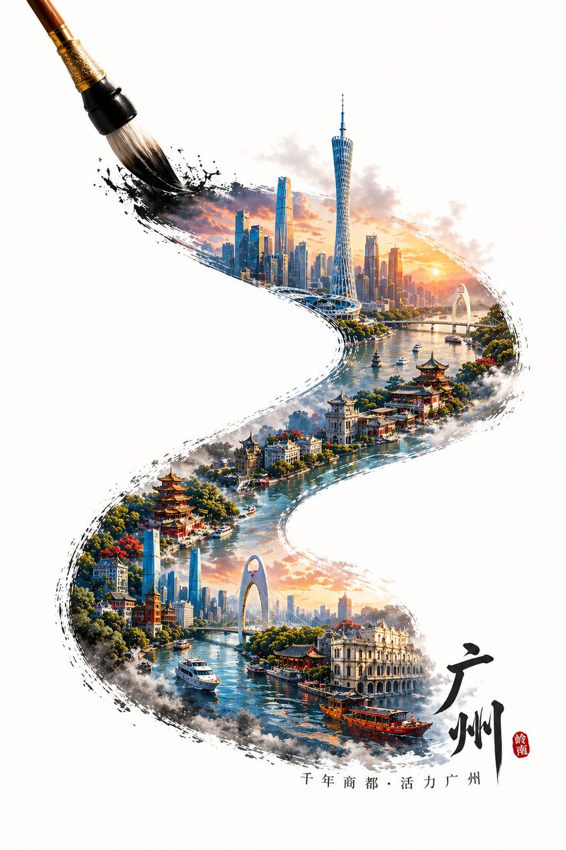
Full Prompt
A painting brush, tracing an S-shaped calligraphy stroke from the bottom right to the top left, the stroke contains microscopic Guangzhou landmark landscapes, the overall style is a 3D three-dimensional high-saturation poster style. The content in the stroke is the iconic and representative buildings of Guangzhou, integrating local traditional architectural styles with local modern architecture, forming a visual hierarchy where the new and the old blend together. If the city has a water system (such as a river/bay), incorporate the corresponding water body into the stroke, creating a misty and boundless water vapor atmosphere, enhancing the sense of spatial depth. The stroke as a whole presents a natural ink diffusion and edge fragmentation effect, while maintaining clear city structure and rich details. The tip of the brush is located at the end of the stroke in the top left corner, forming a dynamic moment of "being drawn". Outside the stroke is a large area of pure blank background, highlighting the oriental minimalist composition. Add text at the beginning of the stroke: Guangzhou and a short slogan of the city, the text is naturally arranged along the direction of the stroke. Overall style: integrating traditional Chinese style with modern three-dimensional art, high detail, high saturation but clean, vibrant colors, realistic physical light and shadow, HDR, 8K resolution, commercial-grade visual quality.