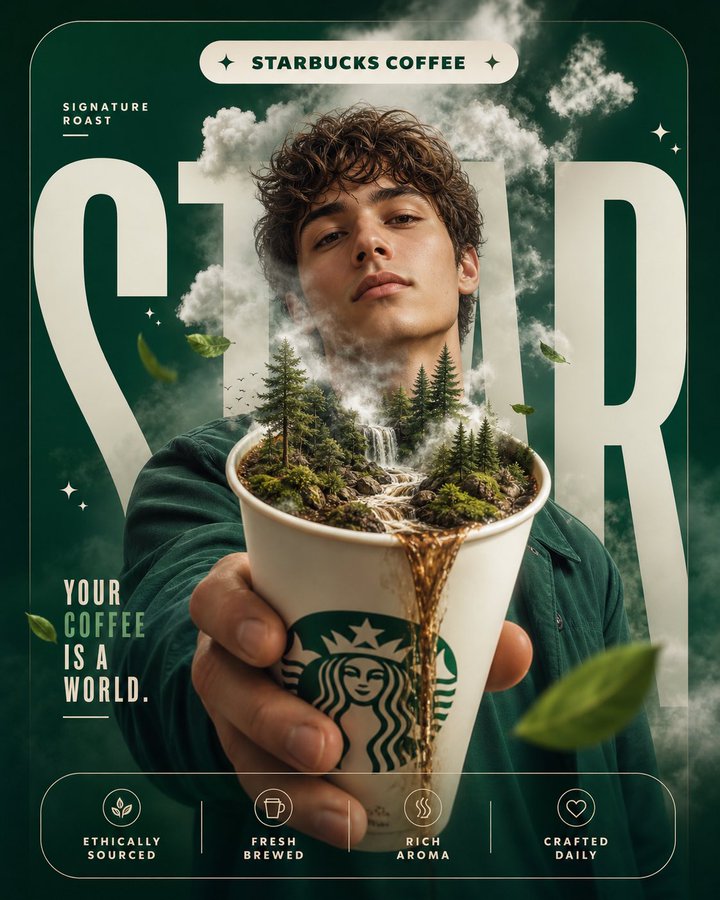
Case Media
Case Notes
This page keeps the media, full prompt, and original source together so you can inspect the result first and decide whether the prompt is worth copying, saving, or comparing.
Case Insights
To make this page easier to search, cite, and reuse later, the case is also broken down into practical guidance about usage, visual cues, and prompt structure.
Best Fit Scenarios
- Use this as a poster & illustration benchmark when you need a fast style baseline before rewriting your own prompt.
- It is especially helpful if your target overlaps with Fashion, Poster, Illustration and you want to judge the image result before tuning wording.
- Keep it as a control sample when you compare nearby prompt variants one variable at a time.
Visual Signals To Notice
- The clearest style signals here are Fashion, Poster, Illustration, so those should usually stay in your first rewrite.
- Pay close attention to layout rhythm, headline hierarchy, illustration texture, and how information is staged in the frame.
- This case keeps one primary output, so the first image should be treated as the main visual reference.
How The Prompt Is Structured
- The prompt reads as a long, highly specified prompt, which is useful when you want to judge how much specificity this direction needs.
- Its keyword cluster is centered on Fashion, Poster, Illustration, so you can usually keep that cluster while swapping subject, camera, layout, or copy details.
- A practical rewrite path is: keep the outcome, keep the strongest style cues, then replace only the subject and environment blocks.
Good Follow-up Questions
- What changes first if you keep Fashion, Poster, Illustration but switch the subject matter?
- Which part of the result comes from section-level structure (Poster & Illustration) versus tag-level style cues?
- Which related cases in the same section give you a cleaner or more extreme variation of the same direction?
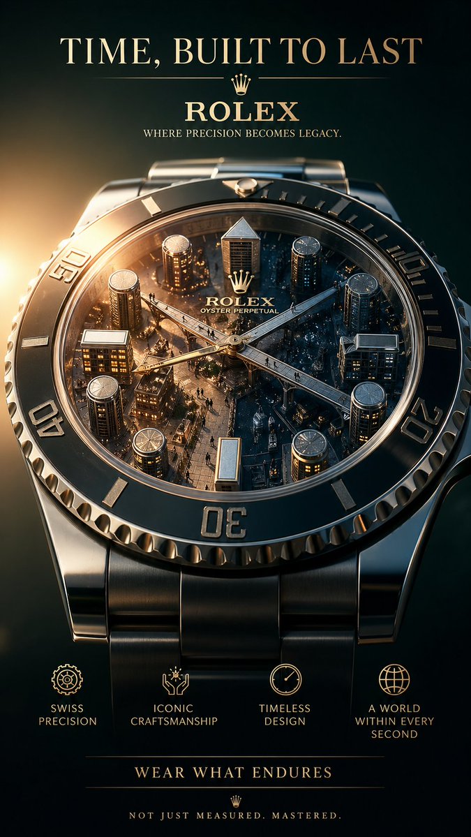
Full Prompt
Create a breathtaking 9:16 luxury advertising poster for Rolex. This must be a conceptual masterpiece, not a standard watch ad. The theme is “time built as architecture.” The poster should feel intellectual, luxurious, and visually stunning. Creative concept: The Rolex watch dial becomes an entire miniature architectural world. The bezel acts like a city boundary. The hour markers become skyscrapers. The hands of the watch become sleek bridges connecting structures. Tiny figures move through the city as if living inside time itself. A warm sunrise crosses the dial from one side while night still exists on the other side, showing multiple times of day within one world. The watch is both an object and an ecosystem. It should feel like time is something constructed, inhabited, and mastered. Composition: The watch fills a large portion of the poster, angled slightly toward camera. The city-inside-the-dial concept must be ultra-detailed and luxurious. The background should be deep and elegant with subtle gold lighting and soft shadow gradients. Color palette: Gold, dark green, black, steel silver, warm ivory light. Typography: Main headline: "TIME, BUILT TO LAST" Product title: "Rolex" Subheadline: "Where precision becomes legacy." Feature callouts: - "Swiss Precision" - "Iconic Craftsmanship" - "Timeless Design" - "A World Within Every Second" CTA: "Wear what endures" Footer copy: "Not just measured. Mastered." Style: Hyper-realistic luxury watch campaign, miniature world concept, ultra-premium lighting, macro detail, elegant editorial typography, museum-level sophistication.