Case Media
Case Notes
This page keeps the media, full prompt, and original source together so you can inspect the result first and decide whether the prompt is worth copying, saving, or comparing.
Case Insights
To make this page easier to search, cite, and reuse later, the case is also broken down into practical guidance about usage, visual cues, and prompt structure.
Best Fit Scenarios
- Use this as a portrait & photography benchmark when you need a fast style baseline before rewriting your own prompt.
- It is especially helpful if your target overlaps with Portrait, Poster, Illustration and you want to judge the image result before tuning wording.
- Keep it as a control sample when you compare nearby prompt variants one variable at a time.
Visual Signals To Notice
- The clearest style signals here are Portrait, Poster, Illustration, so those should usually stay in your first rewrite.
- Focus on framing, light direction, pose, and the distance between subject and camera.
- This case keeps one primary output, so the first image should be treated as the main visual reference.
How The Prompt Is Structured
- The prompt reads as a long, highly specified prompt, which is useful when you want to judge how much specificity this direction needs.
- Its keyword cluster is centered on Portrait, Poster, Illustration, so you can usually keep that cluster while swapping subject, camera, layout, or copy details.
- A practical rewrite path is: keep the outcome, keep the strongest style cues, then replace only the subject and environment blocks.
Good Follow-up Questions
- What changes first if you keep Portrait, Poster, Illustration but switch the subject matter?
- Which part of the result comes from section-level structure (Portrait & Photography) versus tag-level style cues?
- Which related cases in the same section give you a cleaner or more extreme variation of the same direction?
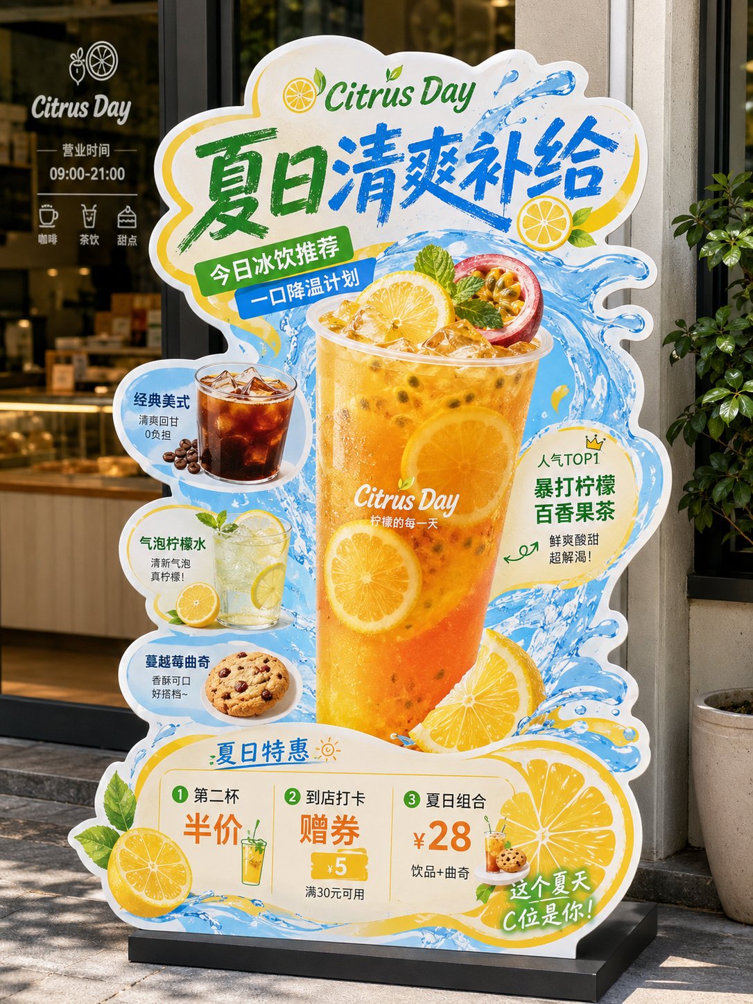
Full Prompt
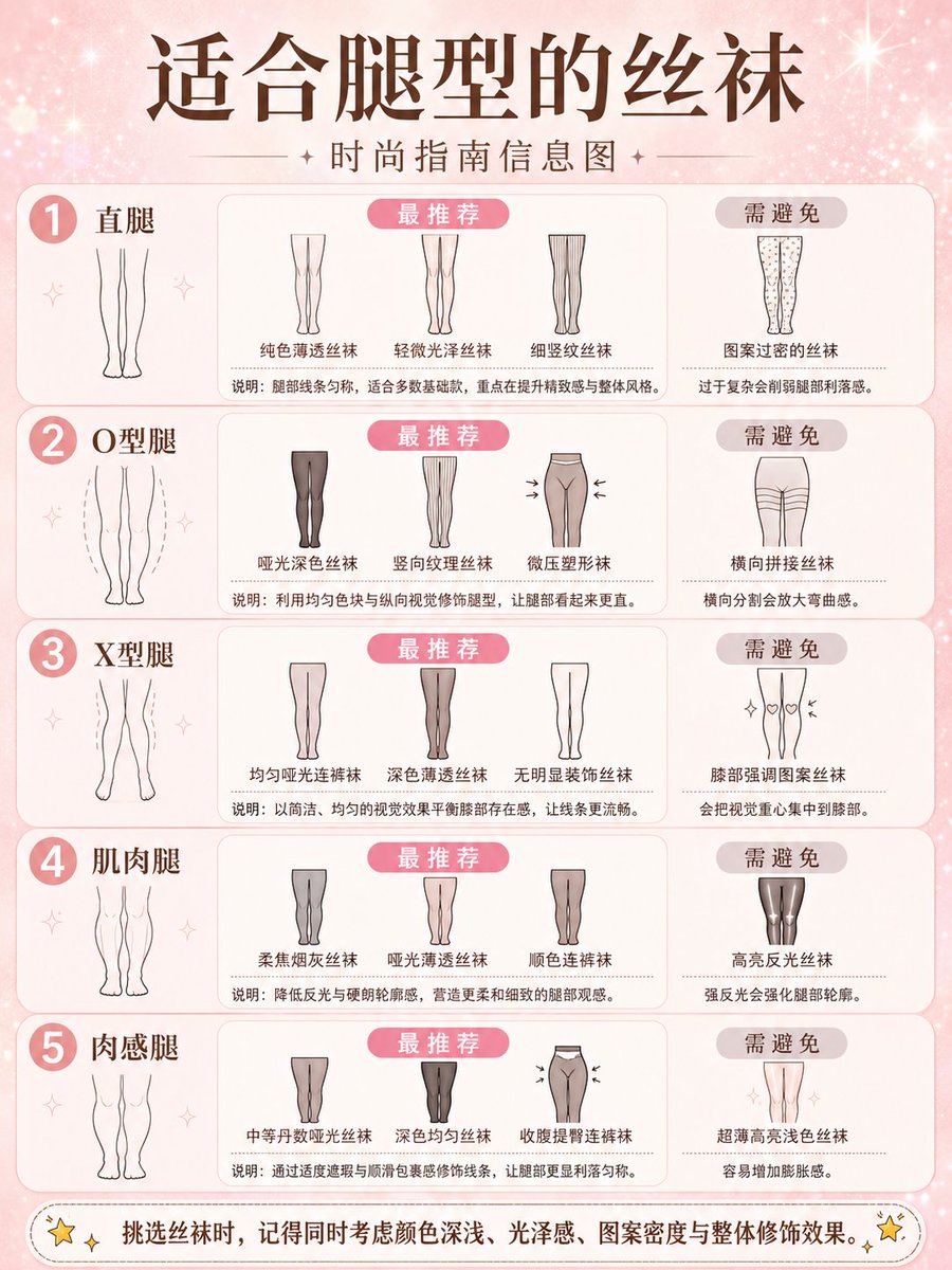
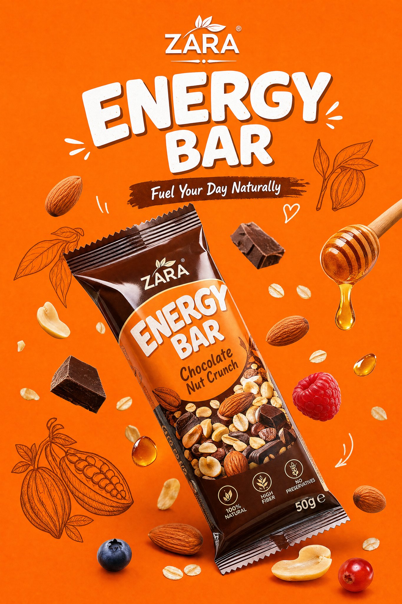
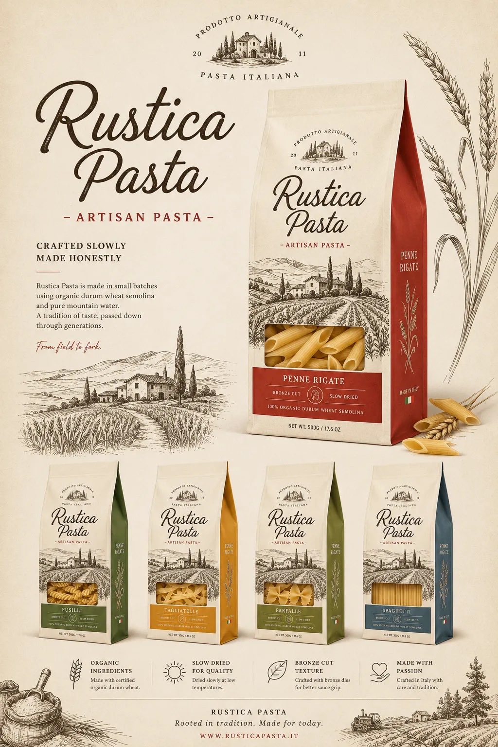
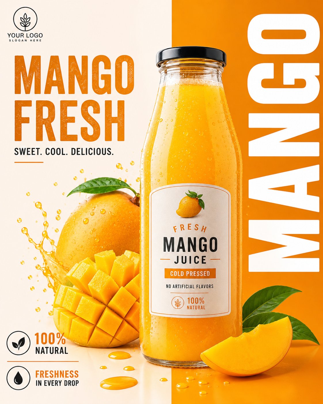
《餐饮异形展架/立牌物料》提示词: 请生成一张高完成度的「餐饮异形展架 / 立牌」设计图,用于展示餐饮门店的新品推荐、招牌产品、套餐促销或品牌活动信息。 【基础信息】 品牌名:【品牌名】 主标题:【主标题】 副标题:【副标题】 辅助短句:【短句1】|【短句2】|【短句3】 主题方向:【主题方向,例如:爆辣夜市风 / 金黄浓郁风 / 清新轻食风 / 山野自然风 / 甜品下午茶风 / 快餐促销风】 主色调:【主色调】 辅助色:【辅助色】 点缀色:【点缀色】 画幅比例:【建议 3:4 竖版】 【产品内容】 主推产品:【主推产品】 辅助产品1:【辅助产品1】 辅助产品2:【辅助产品2】 辅助产品3:【辅助产品3】 辅助产品4:【辅助产品4】 加料 / 配角产品:【加料或配角产品,例如:饮品 / 小食 / 配菜 / 酱料 / 甜品】 【卖点标签】 【卖点1】 【卖点2】 【卖点3】 【卖点4】 【卖点5】 【卖点6】 【促销信息】 【促销信息1】 【促销信息2】 【促销信息3】 【最重要要求】 避免生成门店场景效果图或墙上海报展示图。请直接生成“一张完整的异形立牌成品展示图”: - 背景必须为纯白色 - 画面中只保留一个完整的异形餐饮立牌主体 - 不要餐厅环境 - 不要商场背景 - 不要玻璃门、桌椅、墙面、人物、地面透视场景 - 不要任何真实空间背景 - 立牌主体必须完整显示 - 异形轮廓必须完整清晰 - 底座必须完整露出 - 整体像一张已经抠好的门店物料成品图 / 设计提案展示图 / 电商展示图 【画面形式】 这是一张“门店异形展架 / 立牌”的完整设计,避免普通矩形海报处理。 整体应采用明显的“不规则异形裁切轮廓”,有完整外边缘,边缘可带白色或浅色描边,具有真实门店物料感。 立牌应有明确底座,整体像可落地摆放的 KT 板 / 泡沫板 / 亚克力 / 写真喷绘展架成品。 【构图结构】 整体采用竖版、中心聚焦、信息分层清楚的结构: 1. 顶部区域: 放超大主标题,标题必须醒目、有冲击力、有餐饮 POP 招贴感。 字体可以厚重、手写感、招贴感、潮流感,但要清晰易读。 标题是整张图的第一视觉焦点。 2. 中部核心区域: 中间放最大主推产品,作为主视觉主体。 主菜必须最大、最饱满、最诱人,突出食欲感。 围绕主菜搭配 2~5 个辅助产品,形成丰富的产品组合,前后层次明确,主次分明。 3. 周边信息区域: 在主菜和辅助产品四周加入少量标签元素、推荐标、贴纸框、手写箭头、卖点说明、小标题、小气泡标签等,使其具有“餐饮门店促销物料”的视觉特征。 但要控制层级,做到“热闹但不乱”。 4. 底部促销区域: 底部放价格信息、套餐信息、活动信息或新品尝鲜信息。 价格数字要相对突出,易读清晰。 如果没有特别要求,默认不要二维码。 【视觉风格要求】 整体风格应属于“餐饮转化型视觉 + 门店 POP 异形立牌”: - 强调食欲感 - 强调信息可读性 - 强调商业落地感 - 强调门店物料感 - 强调异形轮廓感 避免极简杂志海报、电商详情页、纯平面插画海报方向。 【食物表现要求】 所有食物必须采用真实商业美食摄影质感: - 食物清晰真实 - 有食材颗粒感 - 有酱汁、汤汁、油光、热气、层次感 - 有丰富细节,如葱花、辣椒、芝士、香草、蔬菜、水果、虾仁、肉块等 - 主食要饱满,不能扁平 - 看起来必须“能激发食欲” 禁止过度插画化、卡通化、低质拼贴化。 【版式与信息层级】 整张立牌的阅读顺序应为: 主标题 → 主推产品 → 辅助产品 → 卖点标签 → 价格 / 活动信息 信息量可以较丰富,但必须有明确层级: - 主标题最大 - 主菜次大 - 辅助菜稍小 - 卖点标签较小 - 底部促销清晰醒目 【适配范围】 该模板需要适用于不同主题餐饮内容,例如: - 面 / 饭 / 粉 / 小吃 - 火锅 / 菌汤 / 地方菜 - 轻食 / 沙拉 / 咖啡简餐 - 早餐 / 套餐 / 快餐 - 茶饮 / 甜品 / 下午茶 - 节日促销 / 新品上市 / 爆品推荐 / 双人套餐 【输出要求】 请输出一张高清、清晰、商业完成度高的异形立牌设计图,满足以下条件: - 白色背景 - 完整异形轮廓 - 完整底座 - 只展示立牌本体 - 不带真实场景环境 - 不带人物 - 不带门店背景 - 默认不带二维码 - 适合用于系列案例展示、设计提案、社交媒体发布、模板复用