Case Media
Case Notes
This page keeps the media, full prompt, and original source together so you can inspect the result first and decide whether the prompt is worth copying, saving, or comparing.
Case Insights
To make this page easier to search, cite, and reuse later, the case is also broken down into practical guidance about usage, visual cues, and prompt structure.
Best Fit Scenarios
- Use this as a portrait & photography benchmark when you need a fast style baseline before rewriting your own prompt.
- It is especially helpful if your target overlaps with Portrait, Portrait & Photography and you want to judge the image result before tuning wording.
- Keep it as a control sample when you compare nearby prompt variants one variable at a time.
Visual Signals To Notice
- The clearest style signals here are Portrait, Portrait & Photography, so those should usually stay in your first rewrite.
- Focus on framing, light direction, pose, and the distance between subject and camera.
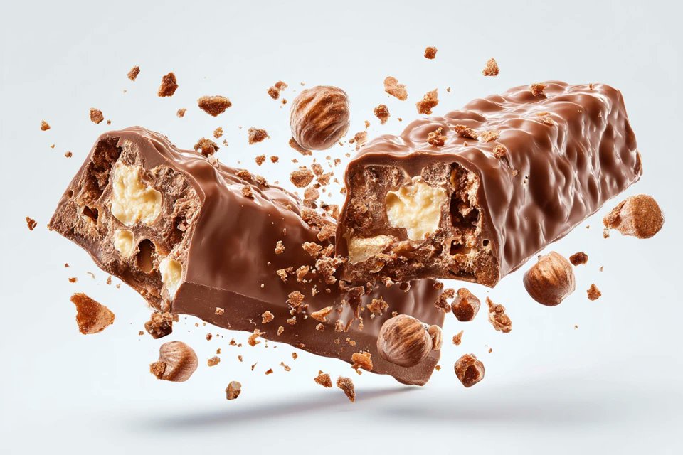
- This case keeps one primary output, so the first image should be treated as the main visual reference.
How The Prompt Is Structured
- The prompt reads as a long, highly specified prompt, which is useful when you want to judge how much specificity this direction needs.
- Its keyword cluster is centered on Portrait, Portrait & Photography, so you can usually keep that cluster while swapping subject, camera, layout, or copy details.
- A practical rewrite path is: keep the outcome, keep the strongest style cues, then replace only the subject and environment blocks.
Good Follow-up Questions
- What changes first if you keep Portrait, Portrait & Photography but switch the subject matter?
- Which part of the result comes from section-level structure (Portrait & Photography) versus tag-level style cues?
- Which related cases in the same section give you a cleaner or more extreme variation of the same direction?
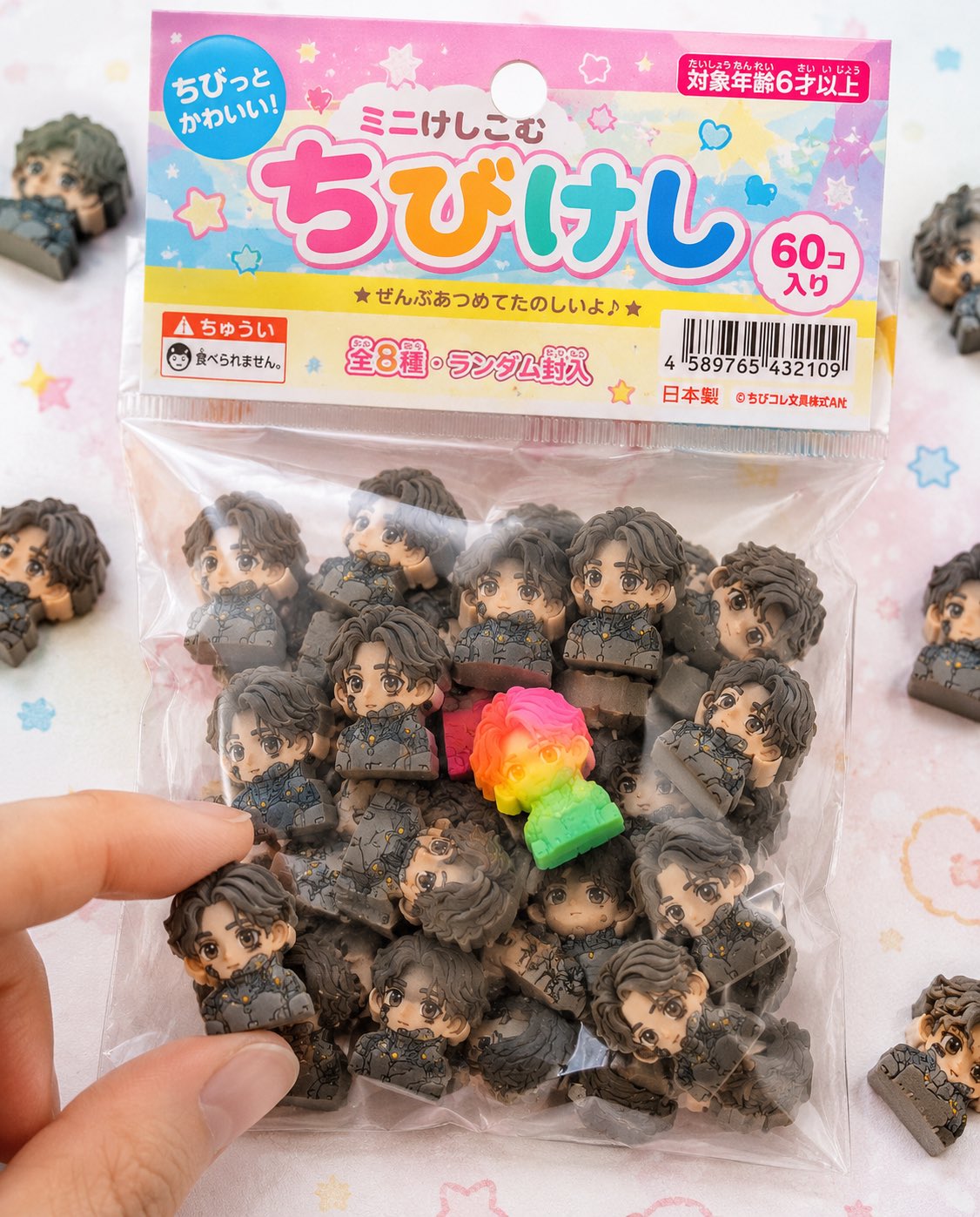
Full Prompt
添付されたキャラクターシートをSTRICTなデザインリファレンスとして使用すること。 キャラクターの顔、髪型、目の形、プロポーションは絶対に変更しない。 ■目的: キャラクターを日本の「ちび消しゴム商品」として完全に商品化し、 実際に文房具売り場やガチャで販売されているようなリアルなパッケージ商品写真を作成する。 ■コンセプト: 「100円ショップや文房具店で売られている袋入りちび消しゴム商品」 ■消しゴム本体: (※前回と同じ仕様を完全維持) - 強いデフォルメちびキャラ - 厚みのあるブロック形状 - 完全マットなラバー素材 - 微細な粒子・粉・削れ・摩耗あり - 印刷ズレ・色ブレあり - 50個以上のランダム構成 ■パッケージ(超重要): - 小さな透明ビニール袋(OPP袋) - 上部に紙ヘッダー(吊り下げ用の穴あり) - ヘッダーはややチープな印刷(軽いズレ・インクのムラ) - ビニールはシワあり、やや曇り、静電気で中身に張り付く - 一部空気が入ってふくらみあり - シール部分に軽いヨレ ■グラフィックデザイン: - 日本の子供向け文房具風デザイン - ポップでカラフル(ピンク・黄色・水色ベース) - 手書き風フォントや丸文字 - 商品名ロゴ(オリジナルでOK) - 「ミニけし」「ちびけし」などの表記 - 星・ハート・キラキラ装飾 ■情報要素(リアル感強化): - JANコード(バーコード) - 「対象年齢6才以上」 - 「食べられません」注意書き - 「全◯種」や「ランダム封入」 - 小さな会社名(架空) - MADE IN JAPAN or CHINA表記 ■構図: - パッケージがメインで画面中央 - 周囲に少しだけこぼれた消しゴム - 1〜2個は袋から出ている - 指先が1つをつまもうとしている演出 - 一部フレームアウトで自然さ ■レア要素: - 蛍光カラーやグラデーションの特別個体を1つ混ぜる - 視線誘導として目立つ位置に配置 ■ライティング: - 明るい自然光(ややハイキー) - 柔らかい影 - 商品写真のような清潔感 ■カメラ: - マクロ寄り - 浅い被写界深度 - 中央シャープ ■背景: - 白〜パステルのテーブル - ほんのりドットやポップ柄 - シンプルで清潔 ■禁止: - プラスチック感 - glossy表現 - 高級すぎる質感(安っぽさが正解) - 完璧すぎる印刷 ■出力: - 実在する商品にしか見えないレベル - コンビニや100均にありそうなリアリティ - SNSで「これ欲しい」と思わせる完成度