Case Media
Case Notes
This page keeps the media, full prompt, and original source together so you can inspect the result first and decide whether the prompt is worth copying, saving, or comparing.
Case Insights
To make this page easier to search, cite, and reuse later, the case is also broken down into practical guidance about usage, visual cues, and prompt structure.
Best Fit Scenarios
- Use this as a portrait & photography benchmark when you need a fast style baseline before rewriting your own prompt.
- It is especially helpful if your target overlaps with Portrait, Cinematic, Fashion and you want to judge the image result before tuning wording.
- Keep it as a control sample when you compare nearby prompt variants one variable at a time.
Visual Signals To Notice
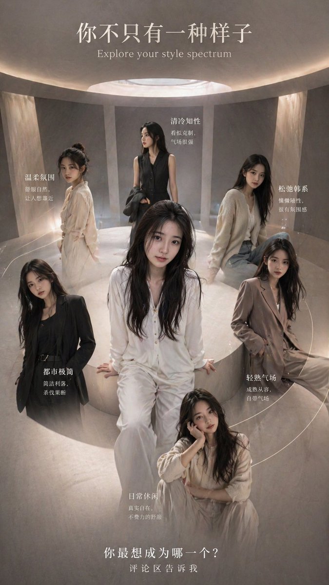
- The clearest style signals here are Portrait, Cinematic, Fashion, so those should usually stay in your first rewrite.
- Focus on framing, light direction, pose, and the distance between subject and camera.
- This case keeps one primary output, so the first image should be treated as the main visual reference.
How The Prompt Is Structured
- The prompt reads as a long, highly specified prompt, which is useful when you want to judge how much specificity this direction needs.
- Its keyword cluster is centered on Portrait, Cinematic, Fashion, so you can usually keep that cluster while swapping subject, camera, layout, or copy details.
- A practical rewrite path is: keep the outcome, keep the strongest style cues, then replace only the subject and environment blocks.
Good Follow-up Questions
- What changes first if you keep Portrait, Cinematic, Fashion but switch the subject matter?
- Which part of the result comes from section-level structure (Portrait & Photography) versus tag-level style cues?
- Which related cases in the same section give you a cleaner or more extreme variation of the same direction?
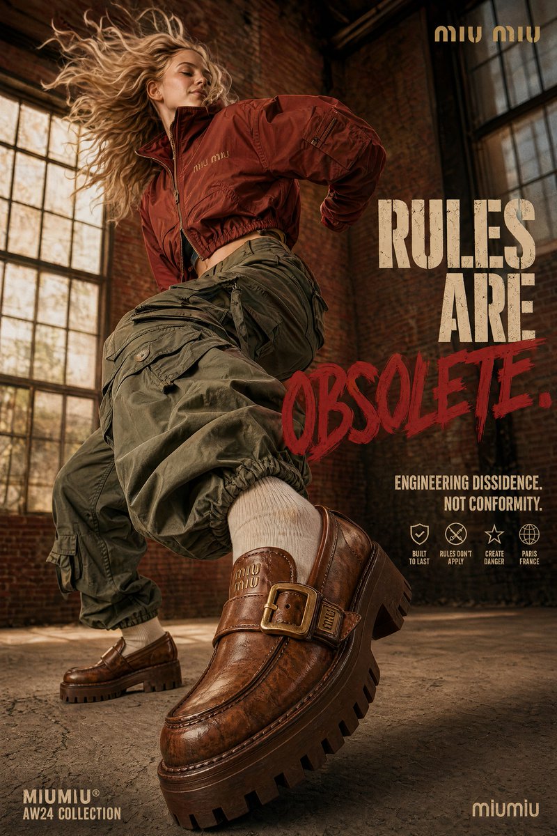
Full Prompt
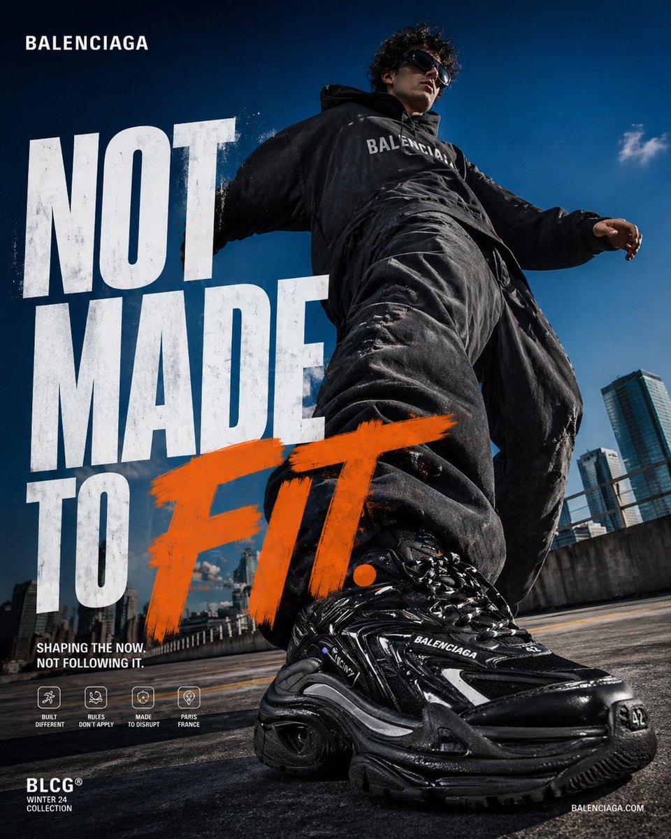
4:5 vertical poster, ultra high resolution, 8K, luxury fashion campaign, editorial + commercial hybrid, print-ready sharpness CORE IDEA: A bold, disruptive fashion statement where movement is exaggerated and dominant, but still feels controlled, raw, and premium. The subject doesn’t just move — they impose presence through scale and perspective. SCENE / ENVIRONMENT: Industrial warehouse loft (Colors shifted) Background: Exposed aged terracotta brick walls Large factory windows with patinaed brass frames (blurry, cinematic background) Environment: Distressed concrete floor with cracks (retains gray but with a slightly warmer, dusty cast) Warm-toned, diffused natural light filtering in (creating a soft contrast) Mood: Mix of realism + high-energy campaign aesthetic SUBJECT: Female fashion model in customized Miu Miu utility streetwear (Colors shifted) Outfit: Oversized cropped technical jacket in a deep, muted rust-red (Miu Miu branding subtle but present, perhaps in a gold thread) Extremely baggy multi-pocket cargo pants in a dusty olive green (replacing dark grey) Platform Miu Miu loafers in a warm, textured caramel-brown leather (replacing chunky black) Opaque cream socks (replacing sheer black) Pose: Mid-stride dynamic jump motion One platform loafer extremely close to camera (hero perspective) Body twisting dynamically Hair flying (messy but controlled) Confident smirk, gazing away from camera PRODUCT FOCUS: Platform loafer dominates foreground Ultra detailed textures (chunky leather, shiny buckles in brass, heavy wear, reflections) Glossy + matte material contrast Perspective distortion exaggerates size Front shoe = tack sharp Background shoe slightly softer TYPOGRAPHY: (Colors shifted) Primary Headline: RULES ARE OBSOLETE. Layout: Right-aligned stacked text “OBSOLETE.” large and aggressive Slight overlap with subject Font: Aggressive block sans-serif Urban stencil texture Color: Warm cream for main text (replacing silver) Accent word “OBSOLETE.” in bold painted deep crimson brush style (replacing electric blue) SECONDARY TEXT: (Colors shifted) Placed bottom-right: “ENGINEERING DISSIDENCE. NOT CONFORMITY.” (Text remains same) Small icon row (minimal, premium feel): Built to Last Rules Don’t Apply Create Danger Paris France BRANDING: (Colors shifted) Top-right: MIU MIU (clean, minimal, perhaps in gold) Bottom-left: MIUMIU® AW24 Collection (in warm cream) Bottom-right: miumiu (in warm cream) COLOR GRADING: Warm, earthy urban palette Soft shadows + deep crimsons/rusts Warm highlights from window light Slight cinematic tone LIGHTING: Natural window daylight Hard shadows for depth Specular highlights on leather and buckles CAMERA: Ultra wide-angle (18–24mm) Very low angle (ground level) Forced perspective exaggeration Depth: Foreground sharp Background slightly blurred TEXTURE / FINISH: Subtle grain (2–3%) Slight sharpening on product Micro contrast boost Clean but not overly polished DESIGN INTENT (IMPORTANT): Feels like Y-3 utility + Miu Miu playfulness hybrid Bold enough for social media Premium enough for billboard Immediate scroll-stopping impact