Case Media
Case Notes
This page keeps the media, full prompt, and original source together so you can inspect the result first and decide whether the prompt is worth copying, saving, or comparing.
Case Insights
To make this page easier to search, cite, and reuse later, the case is also broken down into practical guidance about usage, visual cues, and prompt structure.
Best Fit Scenarios
- Use this as a portrait & photography benchmark when you need a fast style baseline before rewriting your own prompt.
- It is especially helpful if your target overlaps with Neon, Portrait, City Visual and you want to judge the image result before tuning wording.
- Keep it as a control sample when you compare nearby prompt variants one variable at a time.
Visual Signals To Notice
- The clearest style signals here are Neon, Portrait, City Visual, so those should usually stay in your first rewrite.
- Focus on framing, light direction, pose, and the distance between subject and camera.
- This case keeps one primary output, so the first image should be treated as the main visual reference.
How The Prompt Is Structured
- The prompt reads as a long, highly specified prompt, which is useful when you want to judge how much specificity this direction needs.
- Its keyword cluster is centered on Neon, Portrait, City Visual, so you can usually keep that cluster while swapping subject, camera, layout, or copy details.
- A practical rewrite path is: keep the outcome, keep the strongest style cues, then replace only the subject and environment blocks.
Good Follow-up Questions
- What changes first if you keep Neon, Portrait, City Visual but switch the subject matter?
- Which part of the result comes from section-level structure (Portrait & Photography) versus tag-level style cues?
- Which related cases in the same section give you a cleaner or more extreme variation of the same direction?
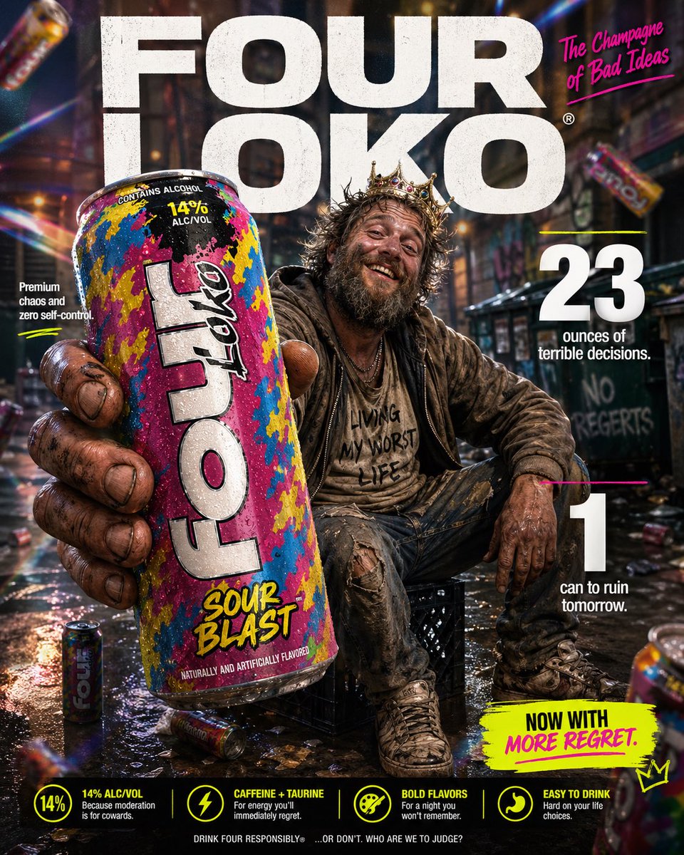
Full Prompt
High-impact parody e-commerce infographic for “{argument name="product" default="Four Loko"}” malt beverage. Foreground: An extreme close-up of a rough, weathered hand holding a tall, brightly colored can of {argument name="product" default="Four Loko"} toward the camera. The can is slightly cold with visible condensation droplets and a loud, chaotic flavor design. The hand and can have a slight macro-lens blur for depth, with the can still reading clearly as the hero product. Central Subject: In the mid-ground, a funny, disheveled {argument name="subject" default="homeless-looking man"} sitting casually on a milk crate in an urban alley. He has a scruffy beard, messy hair, layered worn clothing, and a huge unbothered grin. He should look chaotic but oddly charismatic, like the accidental king of bad decisions. He is posed like a confident lifestyle-ad model, proudly showing off the can. Background & Lighting: A ridiculously polished ad-style backdrop mixed with a grimy city alley setting. Soft-focus urban textures, dumpster shapes, graffiti hints, and scattered clutter in the distance. Add dramatic studio lighting, soft glow, rainbow prism flares, and subtle light leaks to make the whole thing look way too premium for the subject matter. A few blurred {argument name="product" default="Four Loko"} cans can float artistically in the background for extra absurdity. Typography & Layout (Bold sans-serif, white and neon accent styling): Top Center (Background): Massive, bold text reading “{argument name="brand name" default="FOUR LOKO"}” positioned behind the subject. Top Right: Bold text reading “The Champagne of Bad Ideas”. Mid-Left: “Premium chaos and zero self-control” Mid-Right: Large, bold “23” with the text “ounces of terrible decisions.” Bottom-Right: Large, bold “1" with the text “can to ruin tomorrow.” Optional small callout text near the bottom: “Now with more regret.” Style: Ultra-detailed, 8k parody commercial photography, sharp focus on the can, shallow depth of field, vibrant trashy color palette, clean advertising composition, exaggerated premium product-ad aesthetic, funny visual contrast between polished branding and the wrecked subject.