Case Media
Case Notes
This page keeps the media, full prompt, and original source together so you can inspect the result first and decide whether the prompt is worth copying, saving, or comparing.
Case Insights
To make this page easier to search, cite, and reuse later, the case is also broken down into practical guidance about usage, visual cues, and prompt structure.
Best Fit Scenarios
- Use this as a portrait & photography benchmark when you need a fast style baseline before rewriting your own prompt.
- It is especially helpful if your target overlaps with Portrait, Fashion, Poster and you want to judge the image result before tuning wording.
- Keep it as a control sample when you compare nearby prompt variants one variable at a time.
Visual Signals To Notice
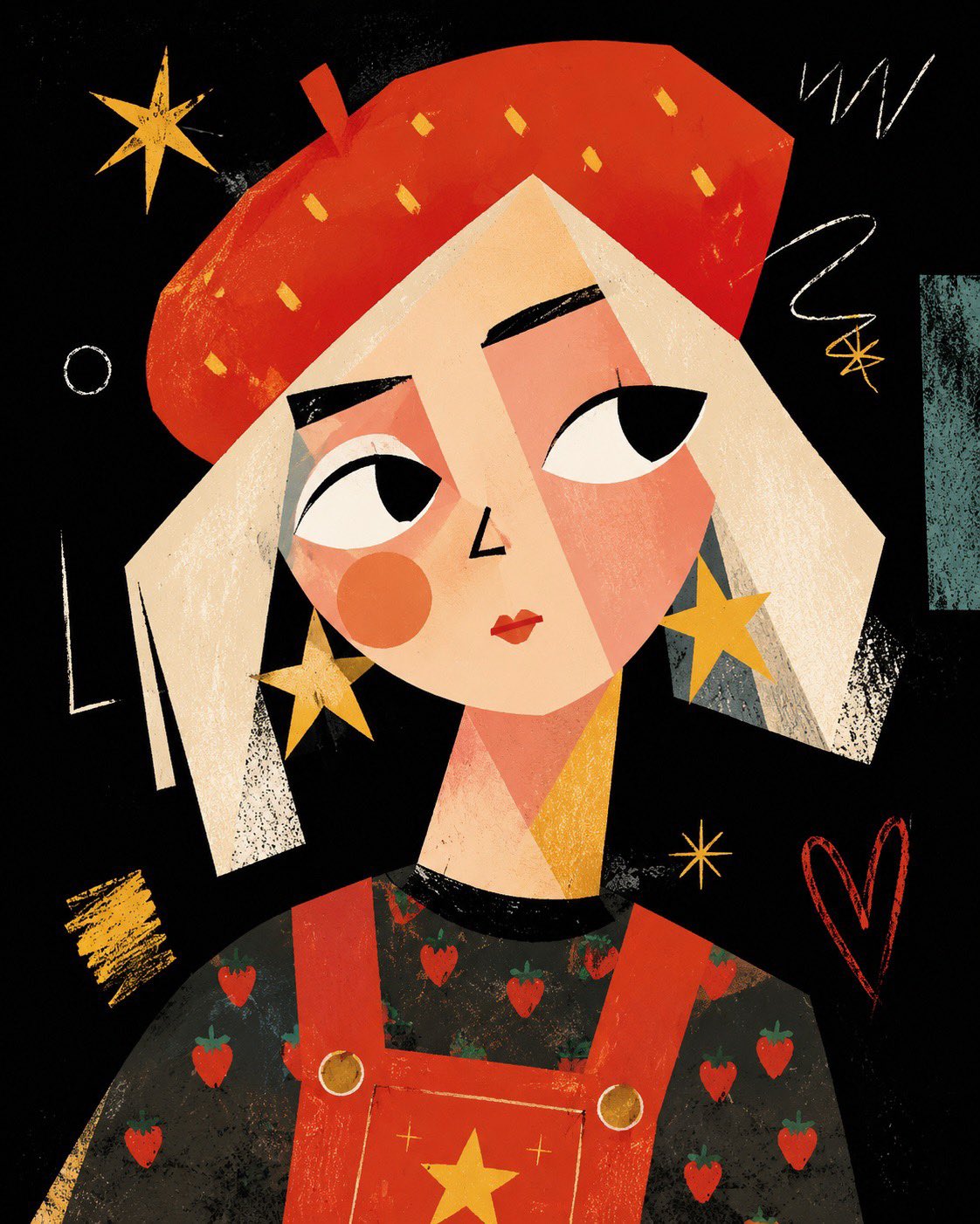
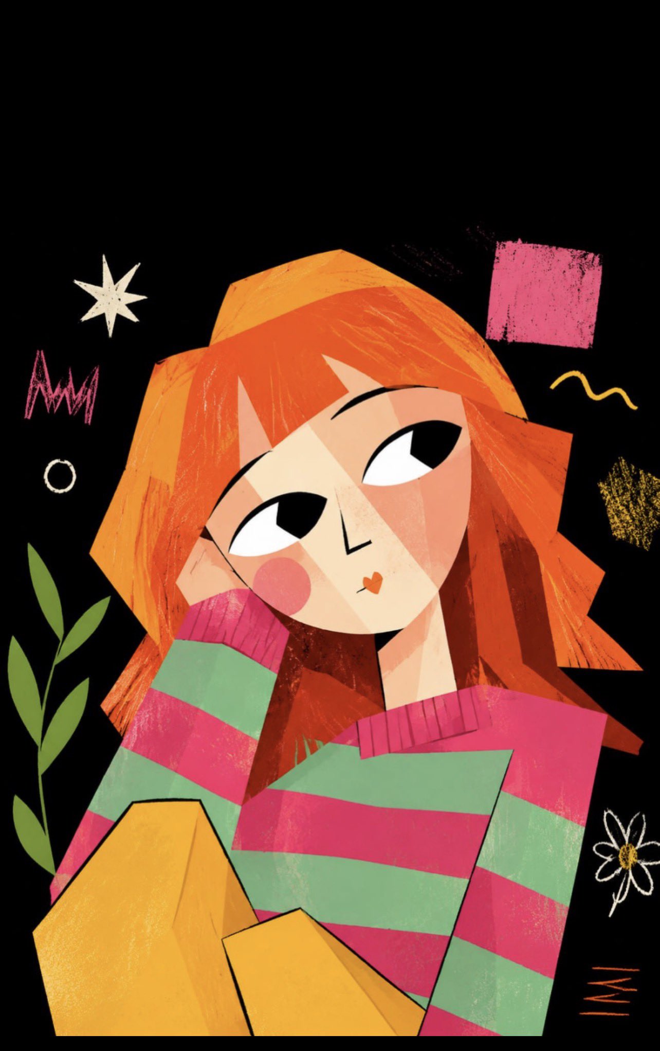
- The clearest style signals here are Portrait, Fashion, Poster, so those should usually stay in your first rewrite.
- Focus on framing, light direction, pose, and the distance between subject and camera.
- This case keeps 2 media outputs, which makes it easier to check whether the style remains stable across multiple results.
How The Prompt Is Structured
- The prompt reads as a long, highly specified prompt, which is useful when you want to judge how much specificity this direction needs.
- Its keyword cluster is centered on Portrait, Fashion, Poster, so you can usually keep that cluster while swapping subject, camera, layout, or copy details.
- A practical rewrite path is: keep the outcome, keep the strongest style cues, then replace only the subject and environment blocks.
Good Follow-up Questions
- What changes first if you keep Portrait, Fashion, Poster but switch the subject matter?
- Which part of the result comes from section-level structure (Portrait & Photography) versus tag-level style cues?
- Which related cases in the same section give you a cleaner or more extreme variation of the same direction?
Full Prompt
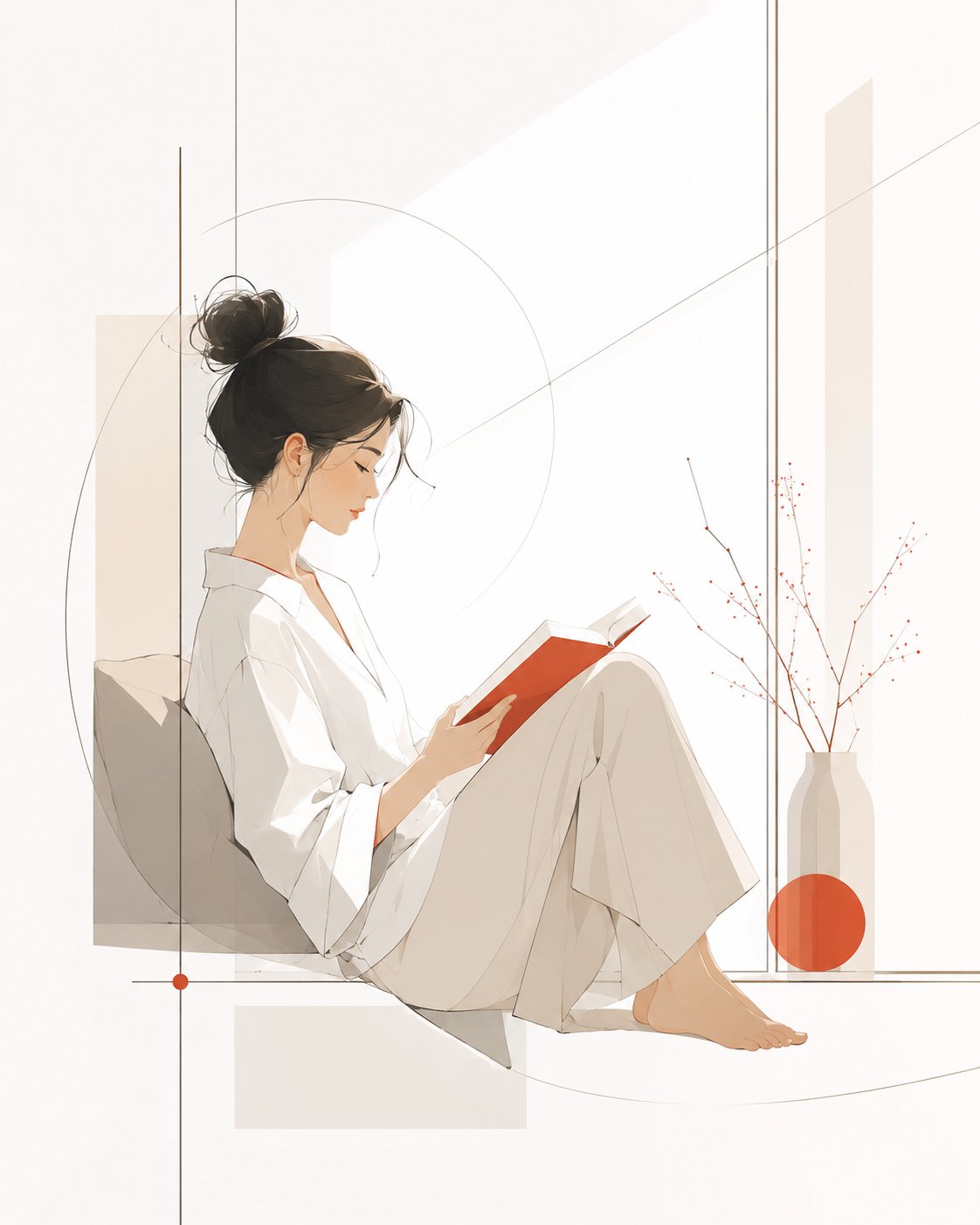
[System Name] Modern Minimalist Magazine Style Illustration Prompt Template | Premium Negative Space Edition [User Input Parameters] Subject Content: An elegant woman reading by a window Subject Temperament: Quiet, gentle, relaxed, modern Image Usage: Magazine inner page Main Tones: Creamy white, light gray, oatmeal Accent Color: Vermilion Aspect Ratio: 4:5 [Final Prompt] A modern minimalist magazine-style illustration, with the subject being {Subject Content}. The image adopts a premium editorial illustration style, shaping the subject's image with clean, smooth, and restrained lines. The contours are simple and clear, and the modeling possesses modern aesthetic beauty and artistic generalization power. It does not pursue complex details but expresses the subject's temperament through a small amount of precise lines and simple color blocks. The subject's temperament is {Subject Temperament}, and the overall visual is elegant, fresh, quiet, and restrained, with the texture of premium magazine illustrations, modern art posters, and lifestyle brand visuals. Human or object shapes should be simple but not hollow, lines naturally stretched, proportions coordinated, and postures with a slight sense of design, avoiding stiffness, cheapness, cartoonishness, or a children's illustration feel. The image background retains a large area of white space (negative space), the space is clean, transparent, and light, avoiding complex scenes and excessive decorative elements. The composition is exquisite and balanced, with the subject located at the visual center or slightly offset, creating a natural sense of visual breathing. The overall composition has a display feel like a magazine cover or an art gallery poster; the image is quiet but memorable. The color scheme is based on {Main Tones} as the primary color foundation. The overall colors are soft, low-saturation, clean, and durable, with a small amount of {Accent Color} added as a visual focus. Accent colors are only used in local key positions, such as clothing details, flowers, edges of objects, geometric color blocks, shadow transitions, or parts of the subject; do not spread them over a large area. Color relationships should be premium, restrained, and modern, avoiding gaudiness, clutter, and over-commercialization. The illustration style leans towards modern magazine inner pages, fashion editorial illustrations, minimalist art posters, and lifestyle brand visuals. The image should have a sense of light luxury, modernity, artistry, and premium negative space. The overall result is not a photo, not a 3D rendering, not a heavy oil painting, not a children's picture book, not a cute cartoon, and not cheap vector material. No text, no logo, no watermark, no border. High-definition quality, clean background, exquisite lines, balanced composition, soft colors, modern minimalist, premium magazine illustration texture, {Aspect Ratio}.