Case Media
Case Notes
This page keeps the media, full prompt, and original source together so you can inspect the result first and decide whether the prompt is worth copying, saving, or comparing.
Case Insights
To make this page easier to search, cite, and reuse later, the case is also broken down into practical guidance about usage, visual cues, and prompt structure.
Best Fit Scenarios
- Use this as a portrait & photography benchmark when you need a fast style baseline before rewriting your own prompt.
- It is especially helpful if your target overlaps with Portrait, Cinematic, Fashion and you want to judge the image result before tuning wording.
- Keep it as a control sample when you compare nearby prompt variants one variable at a time.
Visual Signals To Notice
- The clearest style signals here are Portrait, Cinematic, Fashion, so those should usually stay in your first rewrite.
- Focus on framing, light direction, pose, and the distance between subject and camera.
- This case keeps 2 media outputs, which makes it easier to check whether the style remains stable across multiple results.
How The Prompt Is Structured
- The prompt reads as a long, highly specified prompt, which is useful when you want to judge how much specificity this direction needs.
- Its keyword cluster is centered on Portrait, Cinematic, Fashion, so you can usually keep that cluster while swapping subject, camera, layout, or copy details.
- A practical rewrite path is: keep the outcome, keep the strongest style cues, then replace only the subject and environment blocks.
Good Follow-up Questions
- What changes first if you keep Portrait, Cinematic, Fashion but switch the subject matter?
- Which part of the result comes from section-level structure (Portrait & Photography) versus tag-level style cues?
- Which related cases in the same section give you a cleaner or more extreme variation of the same direction?
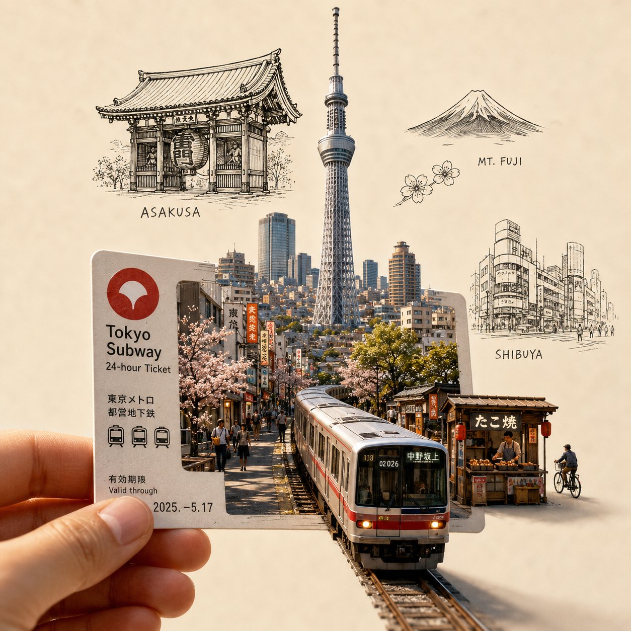
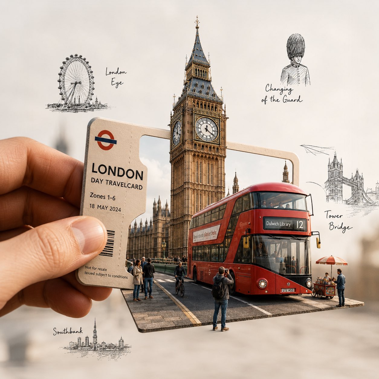
Full Prompt
Create a highly detailed, premium travel-art illustration featuring a hand holding a [CITY-SPECIFIC TICKET/PASS] in the foreground. The ticket acts as a portal to [CITY NAME], with a realistic miniature city scene emerging from the ticket. A signature transportation element ([CITY VEHICLE]) breaks out of the ticket frame in 3D perspective, extending toward the viewer. Behind the ticket, one iconic landmark ([HERO LANDMARK]) rises prominently and realistically, becoming the main architectural focal point. Surrounding the scene are only 3–4 clean hand-drawn doodle elements representing the city's identity, such as district names, local symbols, or famous locations. Use minimal doodles, lots of negative space, and avoid clutter. Include tiny realistic people interacting with the scene, such as commuters, tourists, street vendors, cyclists, or photographers, scaled appropriately to create a miniature-world effect. Style: photorealistic travel photography combined with elegant black-ink sketchbook doodles. Clean composition, premium editorial design, soft warm lighting, shallow depth of field, realistic textures, subtle shadows, Instagram-worthy travel artwork. Composition hierarchy: 1. Emerging vehicle 2. Hero landmark 3. Ticket/pass 4. Minimal doodle elements Avoid: crowded layouts, excessive text, too many landmarks, busy backgrounds, duplicated symbols, excessive arrows, stickers, or decorative icons. Aspect ratio: 1:1 square. Quality: ultra-detailed, cinematic, sharp focus, professional travel poster aesthetic.