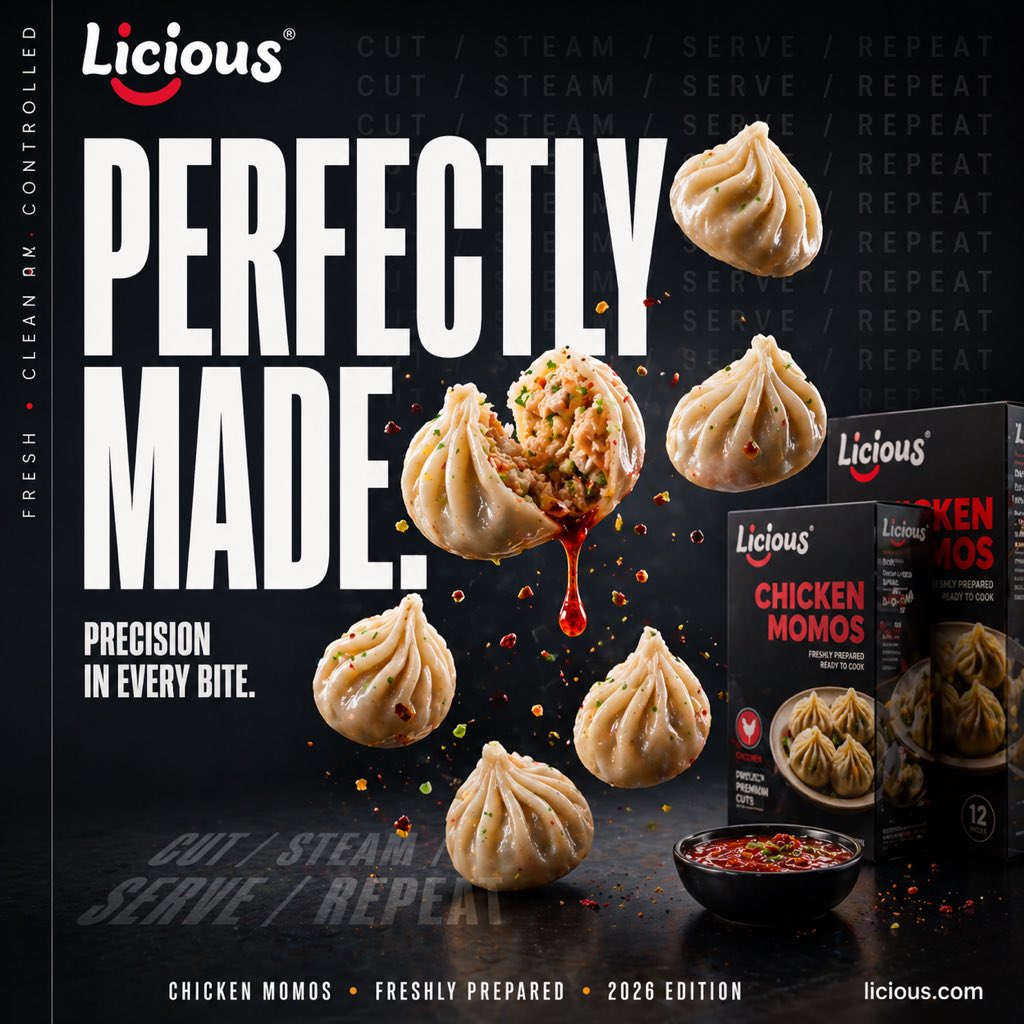
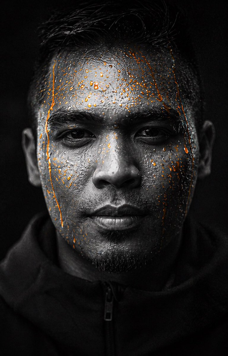
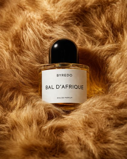
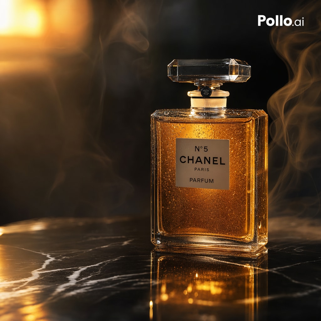
Case Media
Case Notes
This page keeps the media, full prompt, and original source together so you can inspect the result first and decide whether the prompt is worth copying, saving, or comparing.
Case Insights
To make this page easier to search, cite, and reuse later, the case is also broken down into practical guidance about usage, visual cues, and prompt structure.
Best Fit Scenarios
- Use this as a portrait & photography benchmark when you need a fast style baseline before rewriting your own prompt.
- It is especially helpful if your target overlaps with Portrait, Cinematic, Product and you want to judge the image result before tuning wording.
- Keep it as a control sample when you compare nearby prompt variants one variable at a time.
Visual Signals To Notice
- The clearest style signals here are Portrait, Cinematic, Product, so those should usually stay in your first rewrite.
- Focus on framing, light direction, pose, and the distance between subject and camera.
- This case keeps one primary output, so the first image should be treated as the main visual reference.
How The Prompt Is Structured
- The prompt reads as a long, highly specified prompt, which is useful when you want to judge how much specificity this direction needs.
- Its keyword cluster is centered on Portrait, Cinematic, Product, so you can usually keep that cluster while swapping subject, camera, layout, or copy details.
- A practical rewrite path is: keep the outcome, keep the strongest style cues, then replace only the subject and environment blocks.
Good Follow-up Questions
- What changes first if you keep Portrait, Cinematic, Product but switch the subject matter?
- Which part of the result comes from section-level structure (Portrait & Photography) versus tag-level style cues?
- Which related cases in the same section give you a cleaner or more extreme variation of the same direction?
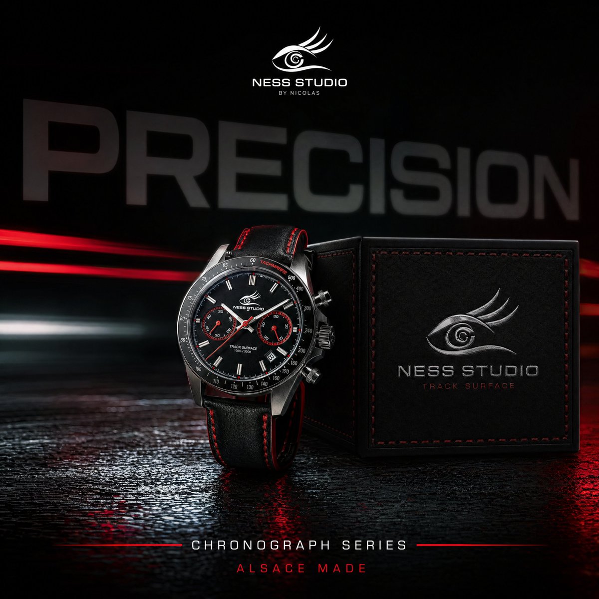
Full Prompt
A dramatic luxury product advertising image for a motorsport-inspired chronograph wristwatch in a dark studio. Center-left foreground, show a single stainless steel chronograph watch standing upright at a slight three-quarter angle, with a black dial, two red-accent subdials, slim silver hour markers, a tachymeter bezel, and visible crown and pushers on the right side. The watch has a black leather strap with bold red stitching along both edges and a sporty premium finish. To the right of the watch, place one black square presentation box slightly behind it, textured like leather, with red stitching around the lid and a silver embossed eye-shaped logo above the text “NESS STUDIO” and smaller red text “TRACK SURFACE.” At the top center of the composition, add the same silver eye logo with the words “NESS STUDIO” and smaller “BY NICOLAS.” Across the background, place one oversized blurred word, {argument name="headline text" default="PRECISION"}, in large gray capital letters spanning nearly the full width. The scene is set against a deep black background with cinematic red and white horizontal light streaks crossing behind the products from left to right, suggesting speed and racetrack energy. Use a glossy wet ground plane with reflective texture, catching red highlights and mirrorlike reflections beneath the watch and box. At the bottom center, add the text “CHRONOGRAPH SERIES” in clean white spaced capitals with thin red horizontal lines extending on both sides, and below it smaller red capitals reading {argument name="tagline text" default="ALSACE MADE"}. Color palette: black, charcoal gray, silver steel, vivid racing red, and a touch of white. Lighting should be high-contrast and premium, with crisp specular highlights on the metal case, subtle soft fill on the box, and moody shadows. Overall style: ultra-polished commercial product photography, luxury watch campaign, sharp focus on the products, sleek branding, high-end automotive aesthetic.