Case Media
Case Notes
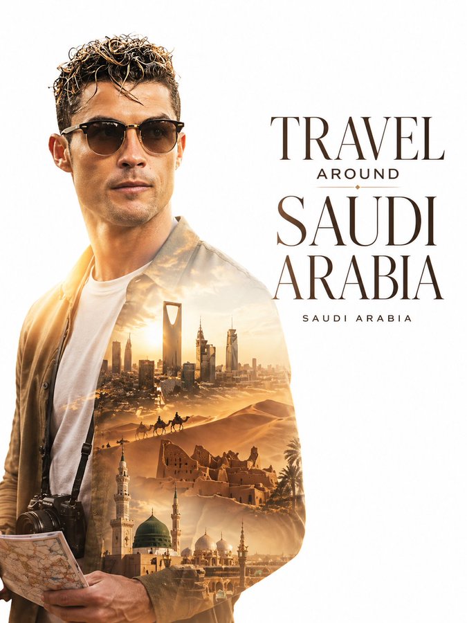
This page keeps the media, full prompt, and original source together so you can inspect the result first and decide whether the prompt is worth copying, saving, or comparing.
Case Insights
To make this page easier to search, cite, and reuse later, the case is also broken down into practical guidance about usage, visual cues, and prompt structure.
Best Fit Scenarios
- Use this as a portrait & photography benchmark when you need a fast style baseline before rewriting your own prompt.
- It is especially helpful if your target overlaps with Portrait, Cinematic, Fashion and you want to judge the image result before tuning wording.
- Keep it as a control sample when you compare nearby prompt variants one variable at a time.
Visual Signals To Notice
- The clearest style signals here are Portrait, Cinematic, Fashion, so those should usually stay in your first rewrite.
- Focus on framing, light direction, pose, and the distance between subject and camera.
- This case keeps one primary output, so the first image should be treated as the main visual reference.
How The Prompt Is Structured
- The prompt reads as a long, highly specified prompt, which is useful when you want to judge how much specificity this direction needs.
- Its keyword cluster is centered on Portrait, Cinematic, Fashion, so you can usually keep that cluster while swapping subject, camera, layout, or copy details.
- A practical rewrite path is: keep the outcome, keep the strongest style cues, then replace only the subject and environment blocks.
Good Follow-up Questions
- What changes first if you keep Portrait, Cinematic, Fashion but switch the subject matter?
- Which part of the result comes from section-level structure (Portrait & Photography) versus tag-level style cues?
- Which related cases in the same section give you a cleaner or more extreme variation of the same direction?
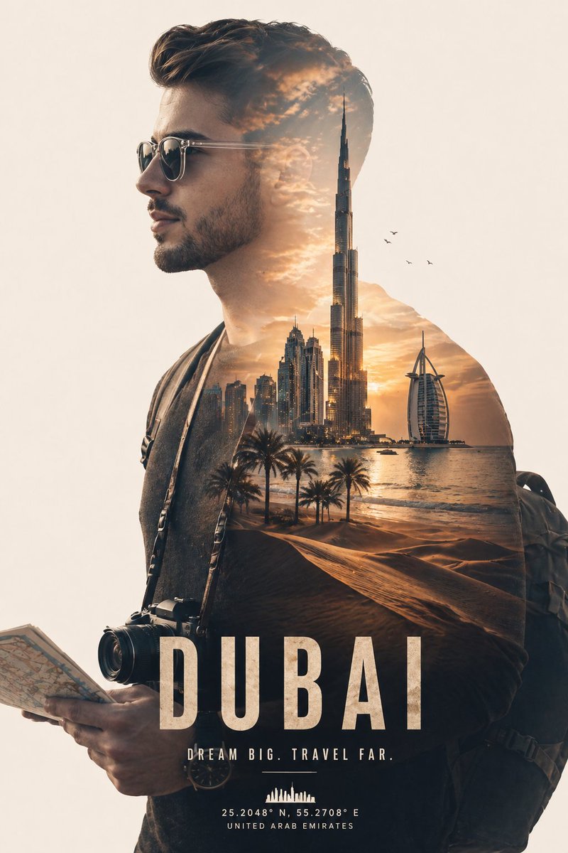
Full Prompt
Create a minimalist double exposure travel poster for [COUNTRY NAME]. Layout Composition: The main subject (based on the attached photo) is placed on the LEFT side of the canvas as a clean, sharp profile silhouette of a stylish international traveler. The face should be recognizable from the uploaded image. The traveler wears modern, minimal travel fashion (simple outfit, neat style), with subtle accessories like sunglasses, a camera strap, or holding a folded map. Double Exposure Effect (Inside Silhouette): Fill the silhouette with a soft, cinematic double exposure of iconic [COUNTRY NAME] visuals, including: [CITY SKYLINE / LANDMARKS] [NATURAL LANDSCAPES] [TRADITIONAL ARCHITECTURE] [CULTURAL ELEMENTS] [COUNTRY-SPECIFIC COLOR TONES & ATMOSPHERE] The composition inside should be soft, blended, not cluttered, with smooth transitions and clear visual hierarchy. ⸻ RIGHT SIDE (Text Area): Keep the right side clean with strong negative space for typography. Add a modern editorial headline in large, crisp font: “TRAVEL AROUND [COUNTRY NAME]” Below it, add a smaller subtext: “[COUNTRY NAME]” Typography style: Clean, premium, magazine-style Balanced spacing High-end travel campaign aesthetic ⸻ Background & Style: Bright or pure white background Soft gradient lighting and glow Cinematic, elegant tone Minimal distractions Smooth blending between subject and background ⸻ Final Look: Sophisticated, modern double exposure poster, premium travel campaign style, ultra-detailed, clean composition, balanced negative space, print-ready, 4K resolution. Face and body exactly same as uploaded image. Make the aspect ratio 3:4