Case Media
Case Notes
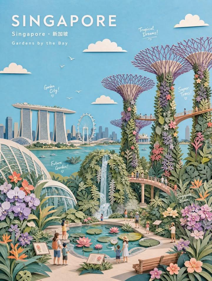
This page keeps the media, full prompt, and original source together so you can inspect the result first and decide whether the prompt is worth copying, saving, or comparing.
Case Insights
To make this page easier to search, cite, and reuse later, the case is also broken down into practical guidance about usage, visual cues, and prompt structure.
Best Fit Scenarios
- Use this as a portrait & photography benchmark when you need a fast style baseline before rewriting your own prompt.
- It is especially helpful if your target overlaps with Neon, Portrait, Fashion and you want to judge the image result before tuning wording.
- Keep it as a control sample when you compare nearby prompt variants one variable at a time.
Visual Signals To Notice
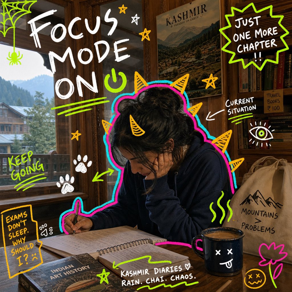
- The clearest style signals here are Neon, Portrait, Fashion, so those should usually stay in your first rewrite.
- Focus on framing, light direction, pose, and the distance between subject and camera.
- This case keeps 2 media outputs, which makes it easier to check whether the style remains stable across multiple results.
How The Prompt Is Structured
- The prompt reads as a long, highly specified prompt, which is useful when you want to judge how much specificity this direction needs.
- Its keyword cluster is centered on Neon, Portrait, Fashion, so you can usually keep that cluster while swapping subject, camera, layout, or copy details.
- A practical rewrite path is: keep the outcome, keep the strongest style cues, then replace only the subject and environment blocks.
Good Follow-up Questions
- What changes first if you keep Neon, Portrait, Fashion but switch the subject matter?
- Which part of the result comes from section-level structure (Portrait & Photography) versus tag-level style cues?
- Which related cases in the same section give you a cleaner or more extreme variation of the same direction?
Full Prompt
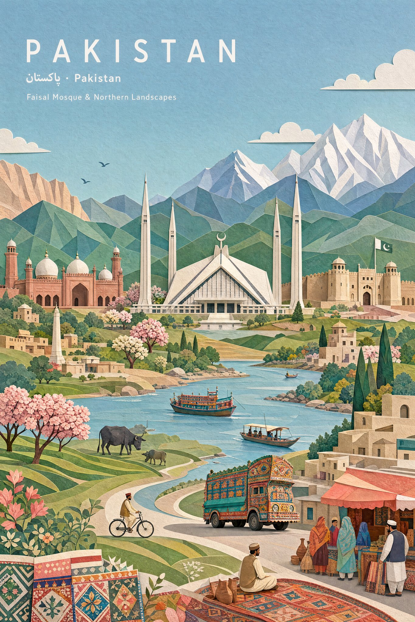
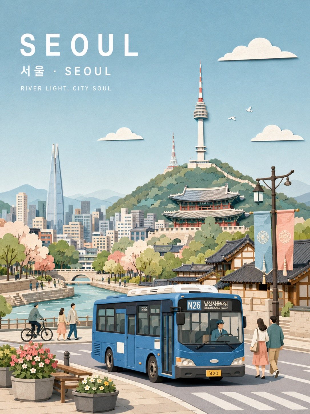
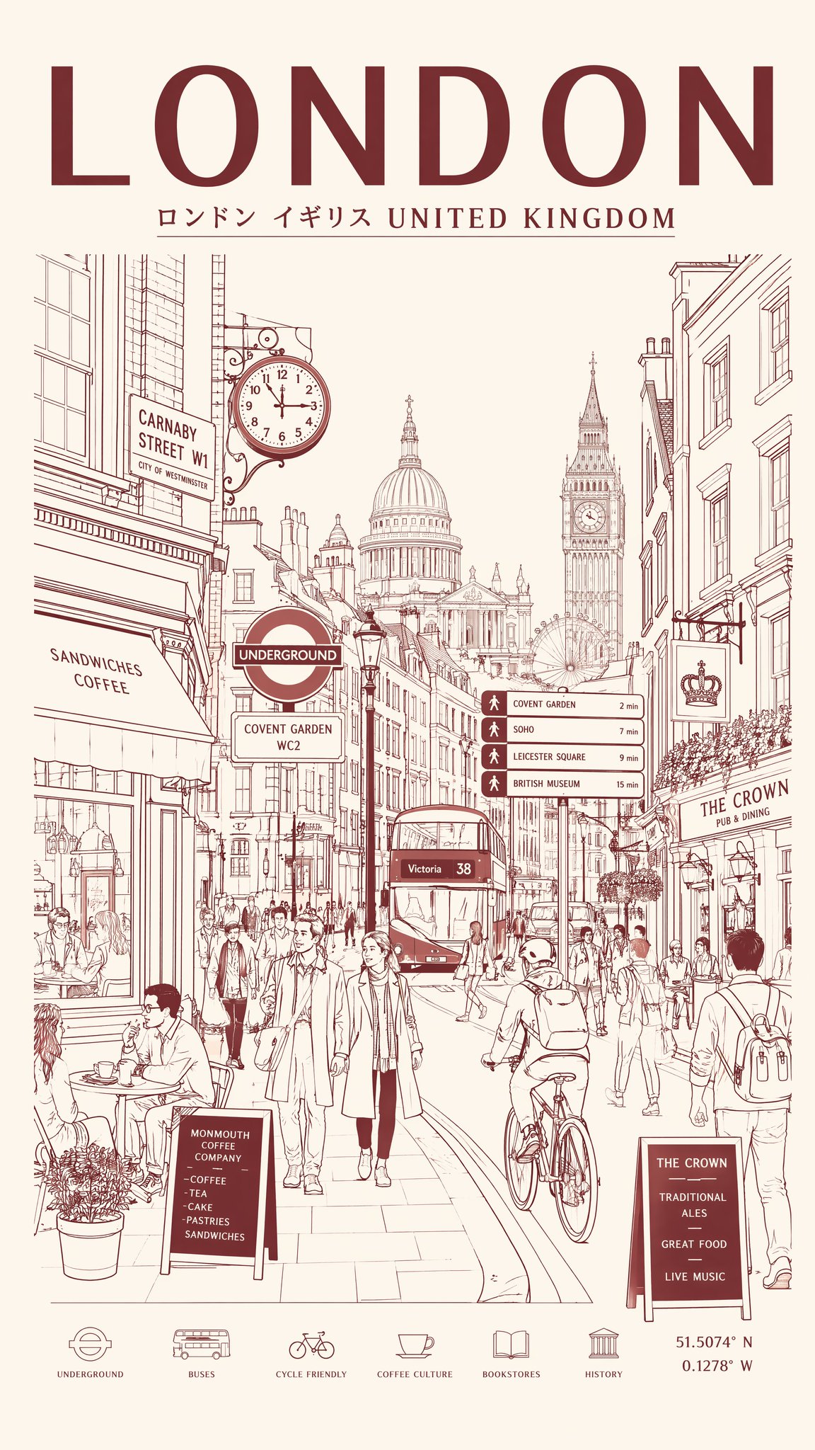
Create a museum-quality handcrafted 3D paper-collage botanical travel poster of [CITY/LOCATION], [COUNTRY], reimagined as a dreamy [BOTANICAL THEME] garden paradise. CORE CONCEPT Represent the [seasonal/cultural] spirit of [LOCATION] through its famous [botanical features], charming garden atmosphere, and 2-3 iconic botanical elements. Each overlapping [leaf/petal/plant element] creates a distinct paper-cut layer, emphasizing the natural depth of botanical collage art. STYLE - Minimal pastel paper-collage illustration - Layered paper-cut artwork with emphasis on overlapping [botanical elements] - Paper diorama aesthetic with subtle 3D relief - Flat geometric color shapes with clean silhouettes - Soft tactile paper texture, visible paper grain, matte gouache finish - Gentle cut-paper shadows - Storybook botanical-poster mood - Premium editorial illustration - Whimsical garden atmosphere - NO photorealism, NO CGI, NO glossy rendering COMPOSITION - Wide landscape or portrait format - Large open pastel sky (35-45% of composition) - Clear foreground, midground, background layers - Generous breathing space, balanced negative space - Relaxed, elegant, cheerful composition (never overcrowded) FOREGROUND (35-40% of composition) Place 2-3 representative botanical features as primary subjects: [BOTANICAL FEATURE 1] = [Main flower/plant field with overlapping layered petals/leaves] [BOTANICAL FEATURE 2] = [Garden market stall/greenhouse/structure with botanical displays] [BOTANICAL FEATURE 3] = [Secondary botanical element - herb garden/tree grove/water feature] Add location-specific garden objects: - [Cultural garden items: e.g., flower market stall, garden tools, pottery, bicycle, watering cans, benches, etc.] MIDGROUND Create simplified [location]-themed botanical garden environment: - Winding garden pathways - Layered paper trees with seasonal foliage - Tiny paper people (families, couples, children, gardeners) - Festival bunting - Decorative fences - Waterways if appropriate Keep all elements minimal, graphic, clean, paper-crafted BACKGROUND Feature simplified paper-cut versions of: [PRIMARY LANDMARK] = [Main iconic landmark] [SECONDARY LANDMARKS] = [Supporting landmarks - 2-4 items] Landmarks should support the botanical narrative without dominating Keep architecture elegant, simplified, instantly recognizable SKY - Large pastel sky - 2-5 simple paper clouds - Tiny paper birds/butterflies - Optional small paper elements floating - Calm, airy, cheerful atmosphere COLOR PALETTE Base colors: soft sky blue, warm cream, light beige, off-white, powder mint, sage green, dusty coral, soft peach, pale stone gray, butter yellow Plus location-specific accent colors: [CITY ACCENT COLORS] = [3-5 signature colors of the location] BOTANICAL COLORS Use soft garden-inspired pastel tones (never hyper-saturated) Keep colors refined, nostalgic, editorial Each petal/leaf is a separate paper layer with visible edges TYPOGRAPHY Upper-left corner: [CITY NAME in English] Below: [Local Language Name] · [English Name] Below: [Botanical Garden Series Title] White geometric sans-serif typography Wide letter spacing, minimal, elegant, poster-like DOODLE TEXT Add 3-5 small handwritten white doodle captions naturally integrated: Examples: "[Greeting]!", "Hello [City]!", "[Botanical element] Dreams!", "[Season/Theme] Magic!", "Bloom Day!" Use playful handwritten white doodle style Keep doodles small, airy, charming (not overcrowded) LIGHTING Bright soft [time of day] daylight Warm ambient illumination Clean atmosphere, soft shadows, gentle paper depth Optimistic [season/mood] garden mood MOOD dreamy, collectible, travel-inspired, cultured, optimistic, whimsical, refined, premium, editorial, botanical, nostalgic, family-friendly AVOID photorealism, crowded garden scenes, heavy outlines, advertisements, brand logos, watermarks, neon colors, dark lighting, messy details,