Case Media
Case Notes
This page keeps the media, full prompt, and original source together so you can inspect the result first and decide whether the prompt is worth copying, saving, or comparing.
Case Insights
To make this page easier to search, cite, and reuse later, the case is also broken down into practical guidance about usage, visual cues, and prompt structure.
Best Fit Scenarios
- Use this as a portrait & photography benchmark when you need a fast style baseline before rewriting your own prompt.
- It is especially helpful if your target overlaps with Portrait, Illustration, Minimal and you want to judge the image result before tuning wording.
- Keep it as a control sample when you compare nearby prompt variants one variable at a time.
Visual Signals To Notice
- The clearest style signals here are Portrait, Illustration, Minimal, so those should usually stay in your first rewrite.
- Focus on framing, light direction, pose, and the distance between subject and camera.
- This case keeps one primary output, so the first image should be treated as the main visual reference.
How The Prompt Is Structured
- The prompt reads as a long, highly specified prompt, which is useful when you want to judge how much specificity this direction needs.
- Its keyword cluster is centered on Portrait, Illustration, Minimal, so you can usually keep that cluster while swapping subject, camera, layout, or copy details.
- A practical rewrite path is: keep the outcome, keep the strongest style cues, then replace only the subject and environment blocks.
Good Follow-up Questions
- What changes first if you keep Portrait, Illustration, Minimal but switch the subject matter?
- Which part of the result comes from section-level structure (Portrait & Photography) versus tag-level style cues?
- Which related cases in the same section give you a cleaner or more extreme variation of the same direction?
Full Prompt
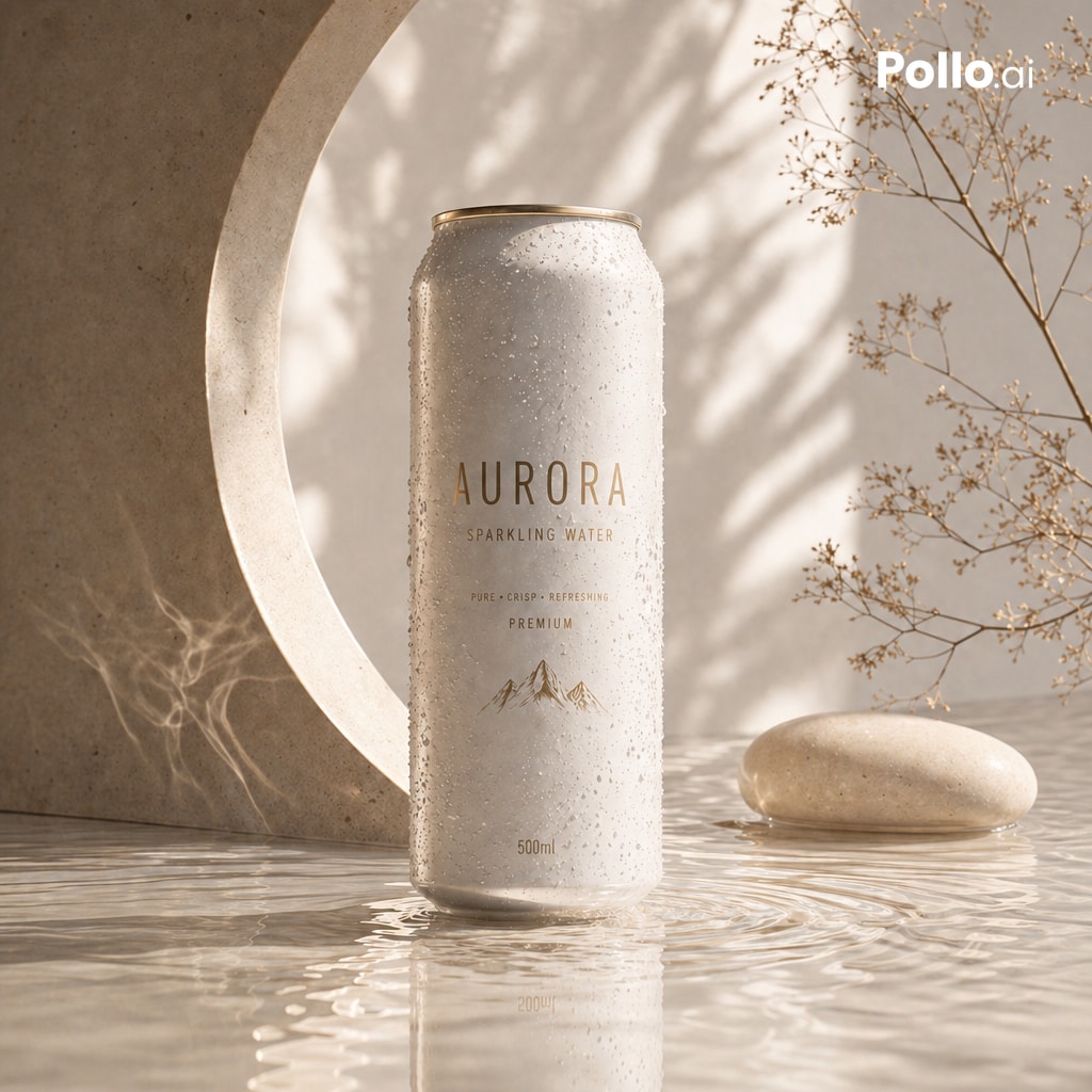
Create a premium photorealistic beverage advertisement featuring a single tall slim aluminum can of {argument name="product name" default="AURORA"} {argument name="beverage type" default="sparkling water"} standing upright at the center on a shallow reflective water surface. The can is matte warm off-white with fine condensation droplets covering it, a subtle gold rim at the top, minimalist luxury typography, and visible label text: “AURORA”, “SPARKLING WATER”, “PURE • CRISP • REFRESHING”, “PREMIUM”, “500ml”, plus a delicate gold mountain line illustration. Use a serene neutral spa-like setting with beige stone and plaster materials: a large circular stone arch or cutout on the left behind the can, soft ripples and reflection in the water below, one smooth oval beige pebble on the right, and one airy dried botanical branch with tiny seed heads reaching in from the upper right. Add a small white {argument name="brand watermark" default="Pollo.ai"} logo in the top-right corner. Lighting should be warm golden morning sunlight with soft botanical shadows cast across the background wall and can, elegant high-end product photography, shallow depth of field, natural highlights, calm atmosphere, creamy beige monochrome palette, ultra-detailed condensation, realistic reflections, square composition, no people.