Case Media
Case Notes
This page keeps the media, full prompt, and original source together so you can inspect the result first and decide whether the prompt is worth copying, saving, or comparing.
Case Insights
To make this page easier to search, cite, and reuse later, the case is also broken down into practical guidance about usage, visual cues, and prompt structure.
Best Fit Scenarios
- Use this as a portrait & photography benchmark when you need a fast style baseline before rewriting your own prompt.
- It is especially helpful if your target overlaps with Portrait, Minimal, Typography and you want to judge the image result before tuning wording.
- Keep it as a control sample when you compare nearby prompt variants one variable at a time.
Visual Signals To Notice
- The clearest style signals here are Portrait, Minimal, Typography, so those should usually stay in your first rewrite.
- Focus on framing, light direction, pose, and the distance between subject and camera.
- This case keeps one primary output, so the first image should be treated as the main visual reference.
How The Prompt Is Structured
- The prompt reads as a long, highly specified prompt, which is useful when you want to judge how much specificity this direction needs.
- Its keyword cluster is centered on Portrait, Minimal, Typography, so you can usually keep that cluster while swapping subject, camera, layout, or copy details.
- A practical rewrite path is: keep the outcome, keep the strongest style cues, then replace only the subject and environment blocks.
Good Follow-up Questions
- What changes first if you keep Portrait, Minimal, Typography but switch the subject matter?
- Which part of the result comes from section-level structure (Portrait & Photography) versus tag-level style cues?
- Which related cases in the same section give you a cleaner or more extreme variation of the same direction?
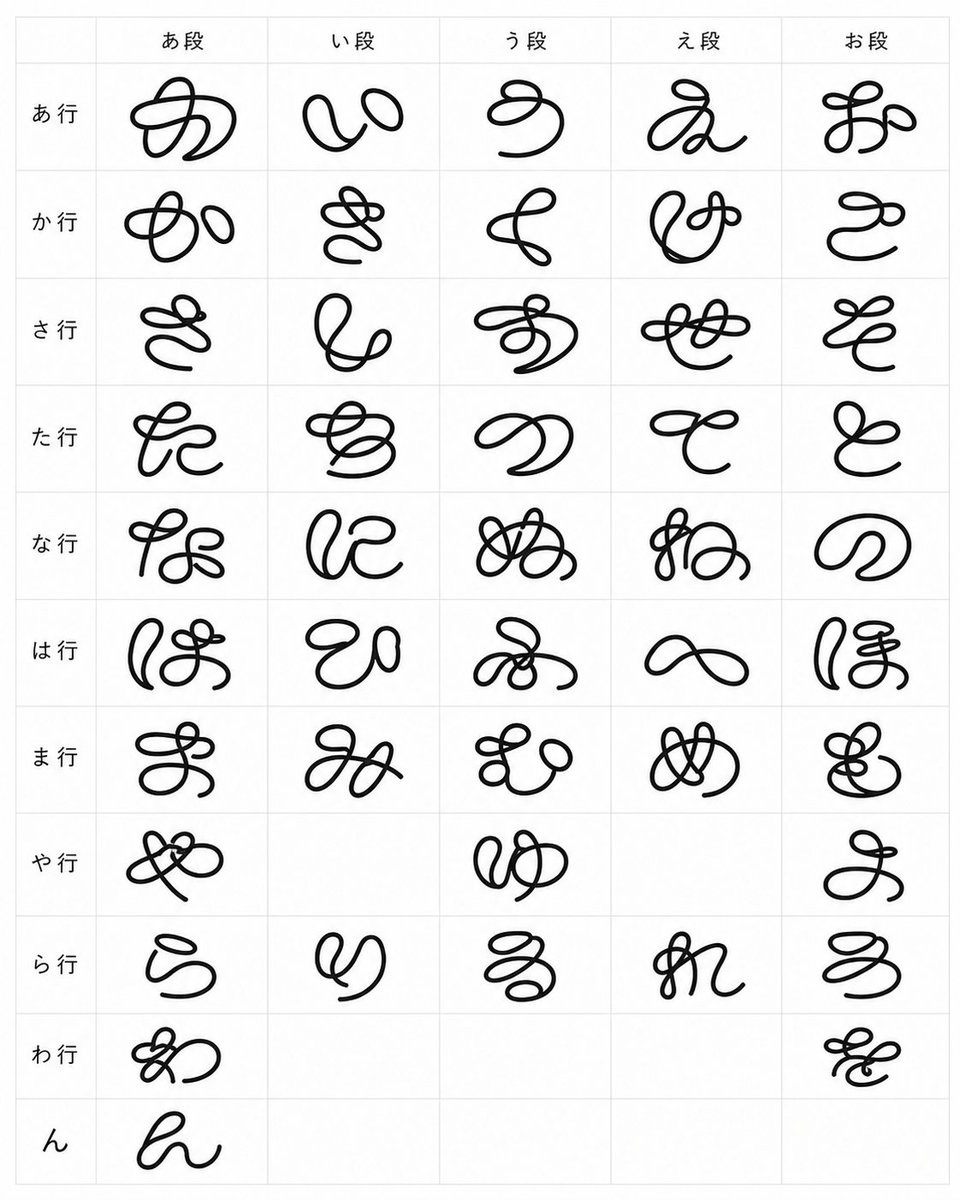
Full Prompt
{"type":"typographic specimen chart","subject":"a complete Japanese hiragana syllabary table rendered as an experimental strange loop-line font","style":{"background":"clean white paper","grid":"thin pale gray table lines","ink":"solid black, smooth rounded monoline strokes","letterform":"hand-drawn cursive glyphs made from exaggerated loops, knots, swirls, and continuous marker-like strokes, playful but still based on hiragana","composition":"flat front-facing scan-like view, centered, minimal, no shadows"},"layout":{"format":"portrait rectangular chart","columns":{"count":5,"headers":["あ段","い段","う段","え段","お段"]},"rows":{"count":11,"labels":["あ行","か行","さ行","た行","な行","は行","ま行","や行","ら行","わ行","ん"]},"cells":{"total visible glyphs":46,"description":"one large black custom hiragana glyph per occupied cell, centered within each grid square; leave the historically empty gojuon cells blank","row contents":[{"row label":"あ行","count":5,"glyphs":["あ","い","う","え","お"]},{"row label":"か行","count":5,"glyphs":["か","き","く","け","こ"]},{"row label":"さ行","count":5,"glyphs":["さ","し","す","せ","そ"]},{"row label":"た行","count":5,"glyphs":["た","ち","つ","て","と"]},{"row label":"な行","count":5,"glyphs":["な","に","ぬ","ね","の"]},{"row label":"は行","count":5,"glyphs":["は","ひ","ふ","へ","ほ"]},{"row label":"ま行","count":5,"glyphs":["ま","み","む","め","も"]},{"row label":"や行","count":3,"glyphs":["や","ゆ","よ"],"blank columns":["い段","え段"]},{"row label":"ら行","count":5,"glyphs":["ら","り","る","れ","ろ"]},{"row label":"わ行","count":2,"glyphs":["わ","を"],"blank columns":["い段","う段","え段"]},{"row label":"ん","count":1,"glyphs":["ん"],"blank columns":["い段","う段","え段","お段"]}]}},"text":{"header font":"small neat standard Japanese sans-serif labels","glyph font":"{argument name=\"experimental font style\" default=\"strange looping monoline hiragana\"}","stroke color":"{argument name=\"stroke color\" default=\"black\"}","grid color":"{argument name=\"grid color\" default=\"very light gray\"}"},"rendering instructions":"Generate a crisp high-resolution image of the table only. Keep the chart readable and evenly spaced, with generous margins, thin grid borders, and each custom glyph large enough to fill most of its cell while preserving a handmade looped-calligraphy look."}