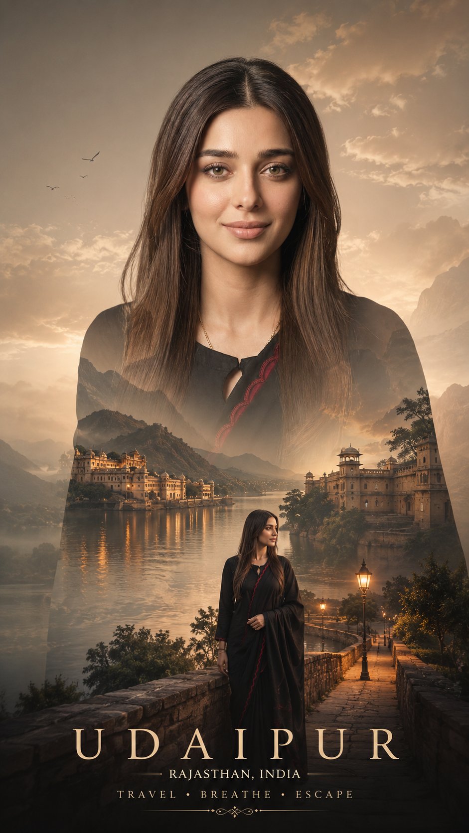
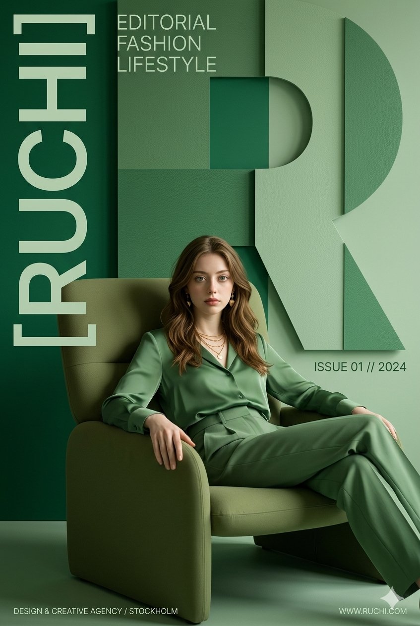
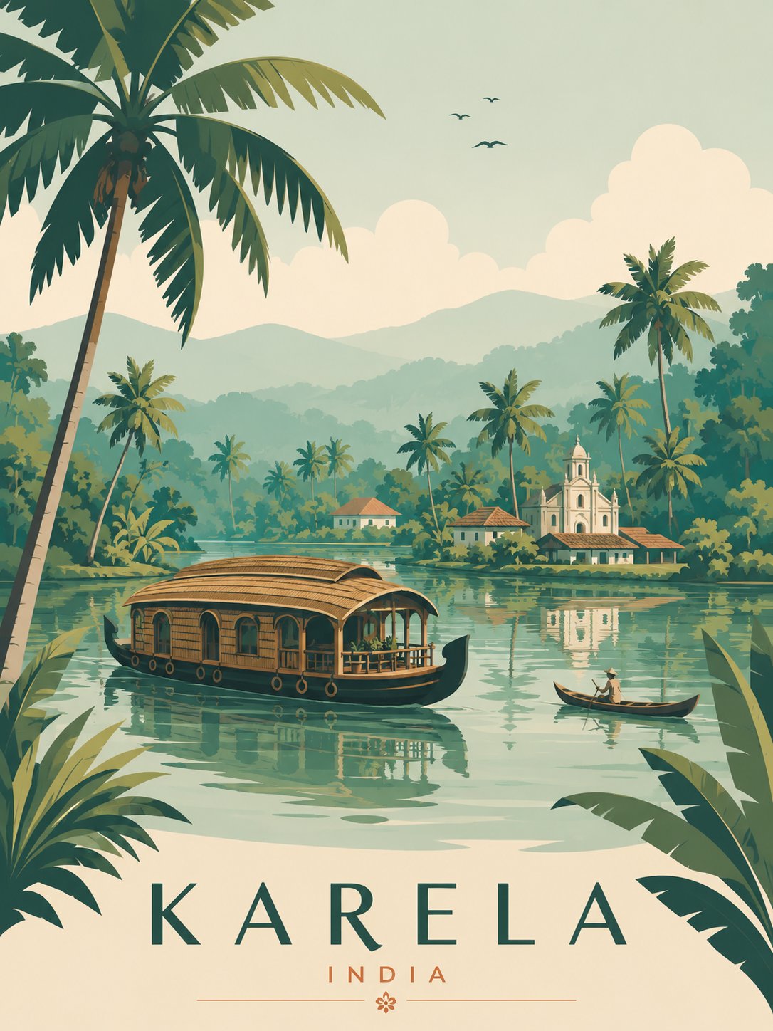
Case Media
Case Notes
This page keeps the media, full prompt, and original source together so you can inspect the result first and decide whether the prompt is worth copying, saving, or comparing.
Case Insights
To make this page easier to search, cite, and reuse later, the case is also broken down into practical guidance about usage, visual cues, and prompt structure.
Best Fit Scenarios
- Use this as a portrait & photography benchmark when you need a fast style baseline before rewriting your own prompt.
- It is especially helpful if your target overlaps with Portrait, Poster, City Visual and you want to judge the image result before tuning wording.
- Keep it as a control sample when you compare nearby prompt variants one variable at a time.
Visual Signals To Notice
- The clearest style signals here are Portrait, Poster, City Visual, so those should usually stay in your first rewrite.
- Focus on framing, light direction, pose, and the distance between subject and camera.
- This case keeps 2 media outputs, which makes it easier to check whether the style remains stable across multiple results.
How The Prompt Is Structured
- The prompt reads as a long, highly specified prompt, which is useful when you want to judge how much specificity this direction needs.
- Its keyword cluster is centered on Portrait, Poster, City Visual, so you can usually keep that cluster while swapping subject, camera, layout, or copy details.
- A practical rewrite path is: keep the outcome, keep the strongest style cues, then replace only the subject and environment blocks.
Good Follow-up Questions
- What changes first if you keep Portrait, Poster, City Visual but switch the subject matter?
- Which part of the result comes from section-level structure (Portrait & Photography) versus tag-level style cues?
- Which related cases in the same section give you a cleaner or more extreme variation of the same direction?
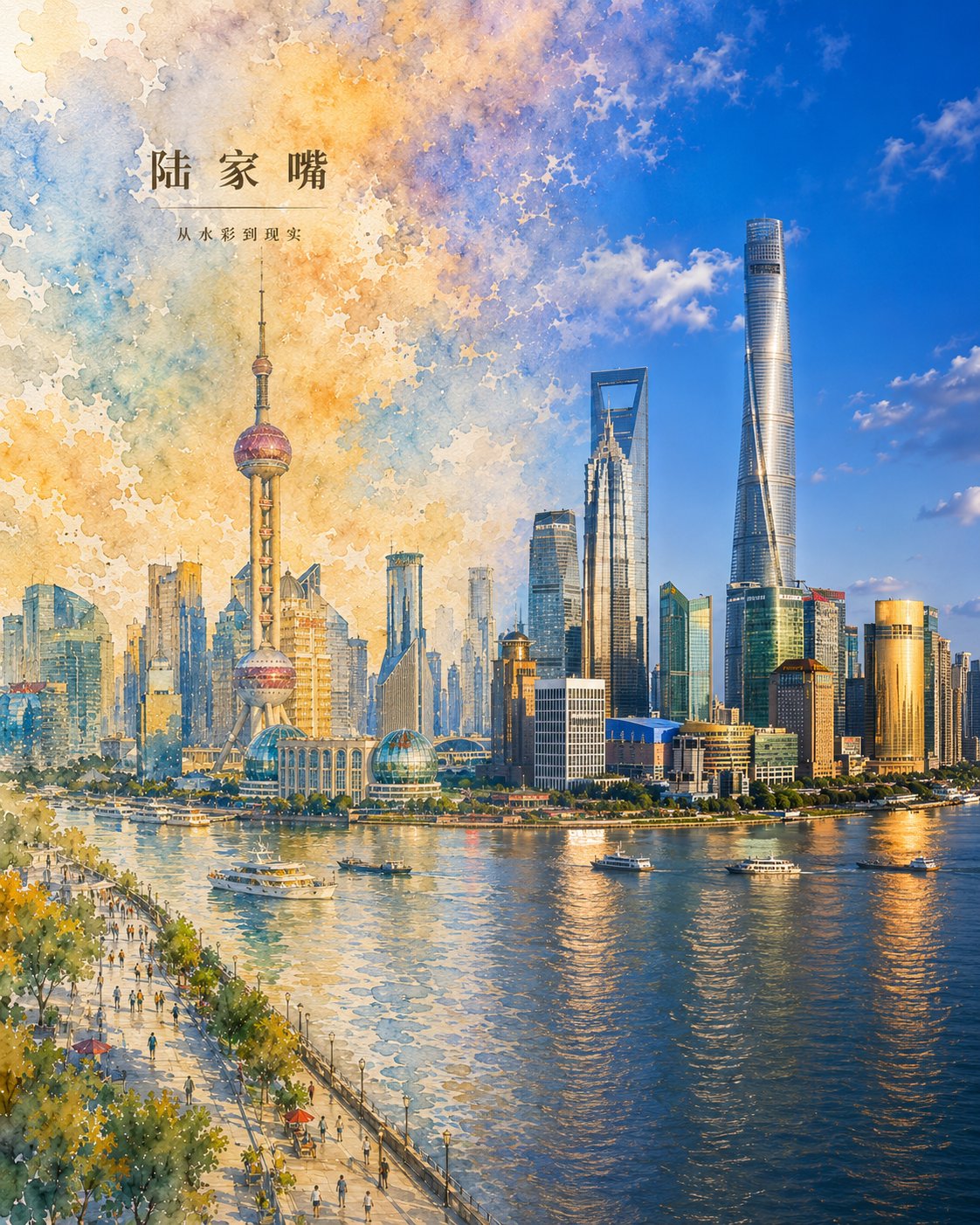
Full Prompt
Generate a vertical city poster in the style of 'Blending Void and Reality' featuring [City Title]. Core Concept: The image presents a natural transition from 'high-fidelity realistic watercolor' on the left to a 'high-definition real cityscape' on the right within the same spatial environment, showing the city awakening from imagination into reality. Composition: Vertical 4:5 ratio, full-bleed without large white paper backgrounds. Left 1/3: Detailed realistic watercolor city with complete architecture, roads, and spatial layers. Middle: A seamless, layered transition zone where textures of sky, buildings, and water blend naturally. Right 1/3: High-definition realistic cityscape with natural lighting and modern photographic detail. Visual Style: Realistic watercolor textures (paper grain, brushstrokes) versus clear, transparent modern photography. The vibe is clean, high-end, and artistic. Palette: Sky blue, urban gray, vegetation green, and water blue with soft warm highlights. Text Requirements: Minimalist overlay with Main Title [City Title] and Subtitle 'From Watercolor to Reality' using elegant, restrained fonts. Content: Accurately depict the most recognizable landmarks and geographical features of [City Title]. Avoid: Large blank spaces, sharp cuts or collage-like edges, gibberish text, and low resolution.