Case Media
Case Notes
This page keeps the media, full prompt, and original source together so you can inspect the result first and decide whether the prompt is worth copying, saving, or comparing.
Case Insights
To make this page easier to search, cite, and reuse later, the case is also broken down into practical guidance about usage, visual cues, and prompt structure.
Best Fit Scenarios
- Use this as a portrait & photography benchmark when you need a fast style baseline before rewriting your own prompt.
- It is especially helpful if your target overlaps with Portrait, Poster, Minimal and you want to judge the image result before tuning wording.
- Keep it as a control sample when you compare nearby prompt variants one variable at a time.
Visual Signals To Notice
- The clearest style signals here are Portrait, Poster, Minimal, so those should usually stay in your first rewrite.
- Focus on framing, light direction, pose, and the distance between subject and camera.
- This case keeps one primary output, so the first image should be treated as the main visual reference.
How The Prompt Is Structured
- The prompt reads as a long, highly specified prompt, which is useful when you want to judge how much specificity this direction needs.
- Its keyword cluster is centered on Portrait, Poster, Minimal, so you can usually keep that cluster while swapping subject, camera, layout, or copy details.
- A practical rewrite path is: keep the outcome, keep the strongest style cues, then replace only the subject and environment blocks.
Good Follow-up Questions
- What changes first if you keep Portrait, Poster, Minimal but switch the subject matter?
- Which part of the result comes from section-level structure (Portrait & Photography) versus tag-level style cues?
- Which related cases in the same section give you a cleaner or more extreme variation of the same direction?
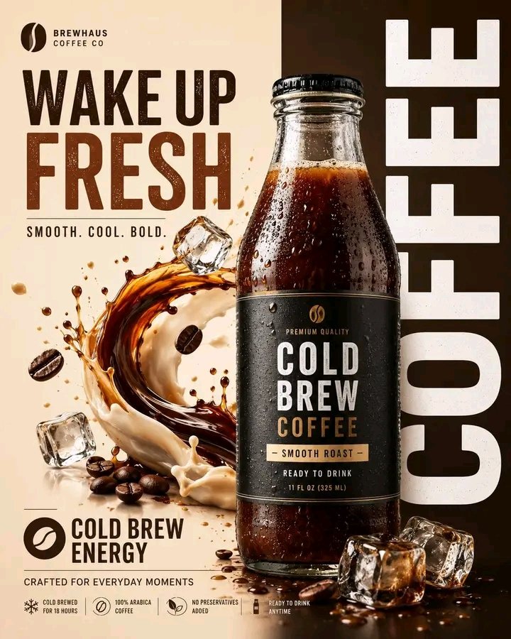
Full Prompt
Create a bold modern advertising poster for [PRODUCT NAME] in a premium commercial beverage style. Use a realistic printed poster composition in **4:5 portrait ratio** with balanced spacing and clean studio aesthetics. Split the background into two sections: Left side: soft white or light cream Right side: bold [MAIN COLOR] Place the [PRODUCT TYPE] slightly right of center, overlapping both sections. Fill it with [PRODUCT COLOR] liquid, with glossy reflections, realistic highlights, soft shadows, and premium lighting. Add a large fresh [MAIN INGREDIENT] slice behind the product on the left. Surround with small [LEAVES / SPLASHES / FRUIT PIECES] for a juicy fresh look. Typography: Large vertical white text on right: “[FLAVOR NAME]” Small headline top-left: “[SHORT HEADLINE]” Small feature text bottom-left: “[FEATURE TEXT]” Minimal logo placeholder in top-left Style: modern beverage campaign, vibrant contrast, premium product photography, sharp details, clean layout, realistic textures, energetic and fresh. Negative prompt: blurry text, distorted bottle, extra labels, messy background, cartoon look, watermark, duplicated objects, unreadable typography.