Case Media
Case Notes
This page keeps the media, full prompt, and original source together so you can inspect the result first and decide whether the prompt is worth copying, saving, or comparing.
Case Insights
To make this page easier to search, cite, and reuse later, the case is also broken down into practical guidance about usage, visual cues, and prompt structure.
Best Fit Scenarios
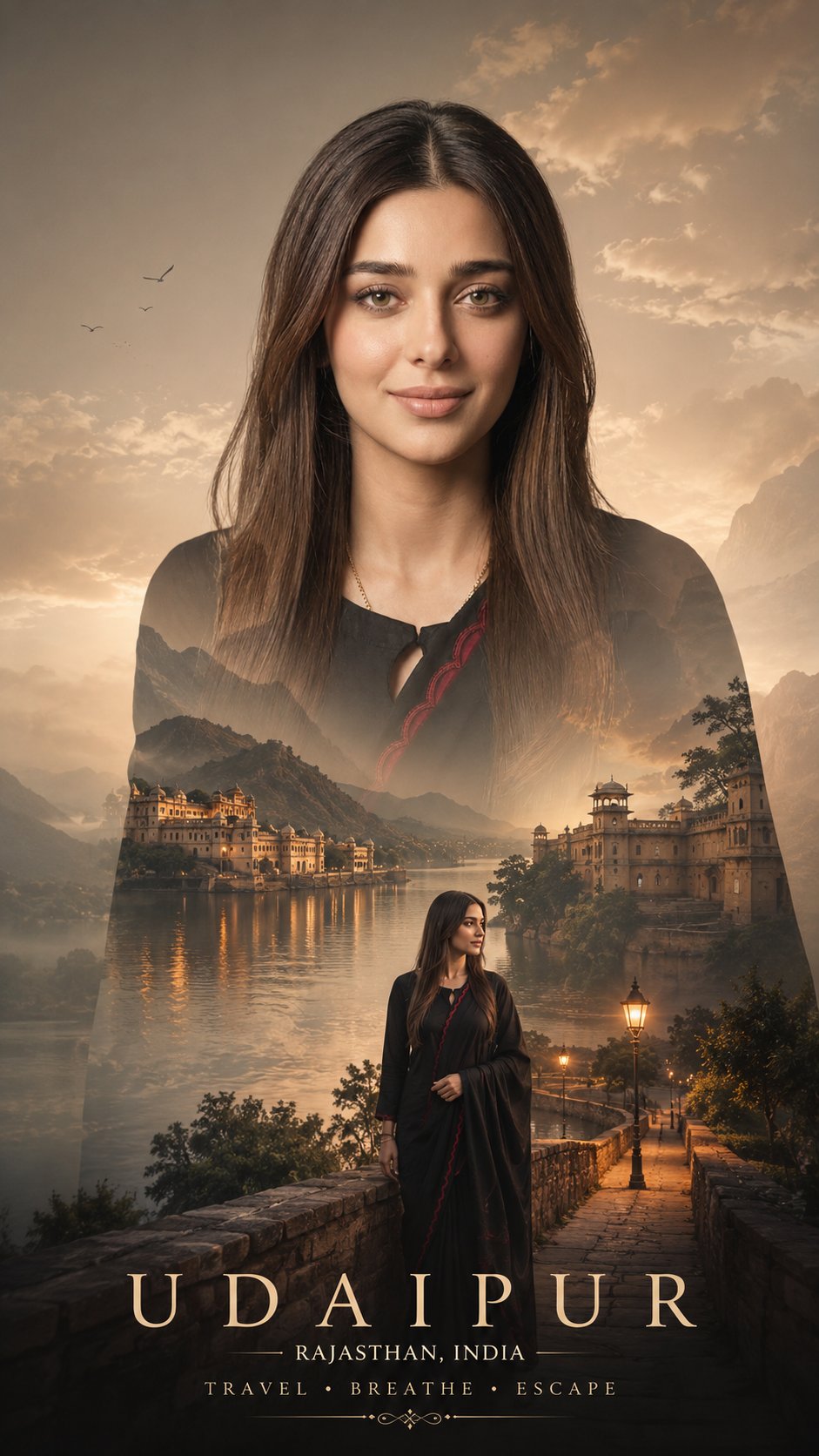
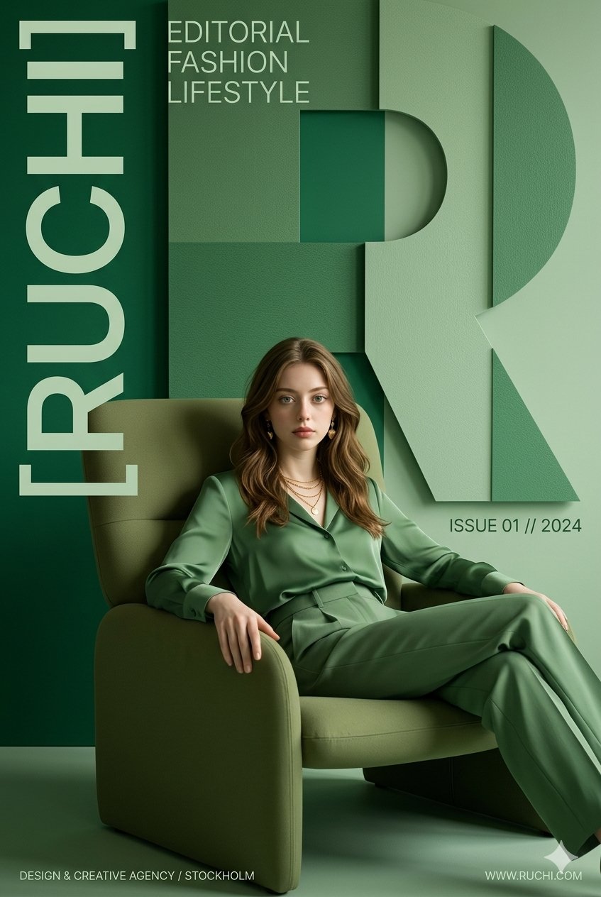
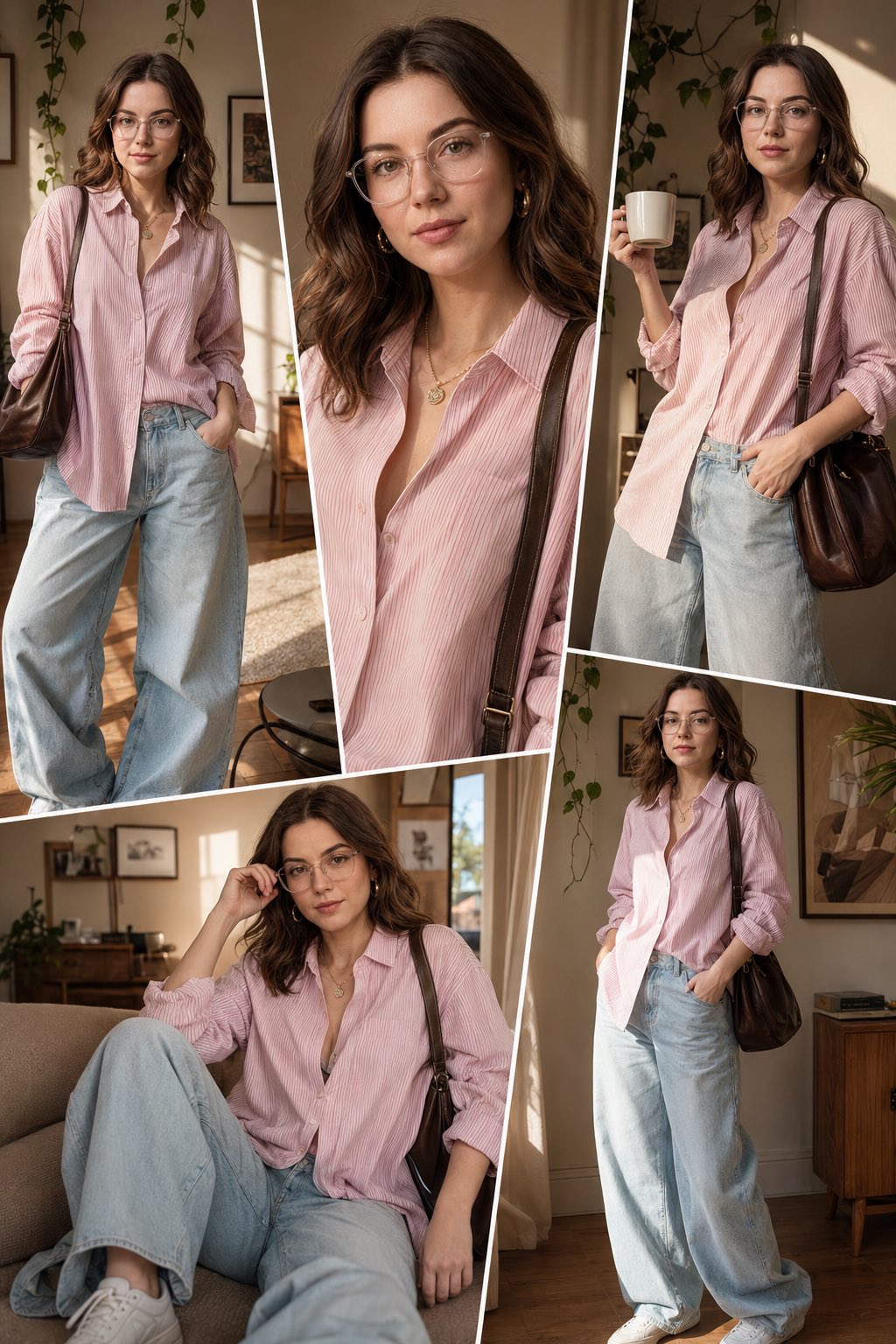
- Use this as a portrait & photography benchmark when you need a fast style baseline before rewriting your own prompt.
- It is especially helpful if your target overlaps with Portrait, Cinematic, Fashion and you want to judge the image result before tuning wording.
- Keep it as a control sample when you compare nearby prompt variants one variable at a time.
Visual Signals To Notice
- The clearest style signals here are Portrait, Cinematic, Fashion, so those should usually stay in your first rewrite.
- Focus on framing, light direction, pose, and the distance between subject and camera.
- This case keeps 2 media outputs, which makes it easier to check whether the style remains stable across multiple results.
How The Prompt Is Structured
- The prompt reads as a long, highly specified prompt, which is useful when you want to judge how much specificity this direction needs.
- Its keyword cluster is centered on Portrait, Cinematic, Fashion, so you can usually keep that cluster while swapping subject, camera, layout, or copy details.
- A practical rewrite path is: keep the outcome, keep the strongest style cues, then replace only the subject and environment blocks.
Good Follow-up Questions
- What changes first if you keep Portrait, Cinematic, Fashion but switch the subject matter?
- Which part of the result comes from section-level structure (Portrait & Photography) versus tag-level style cues?
- Which related cases in the same section give you a cleaner or more extreme variation of the same direction?
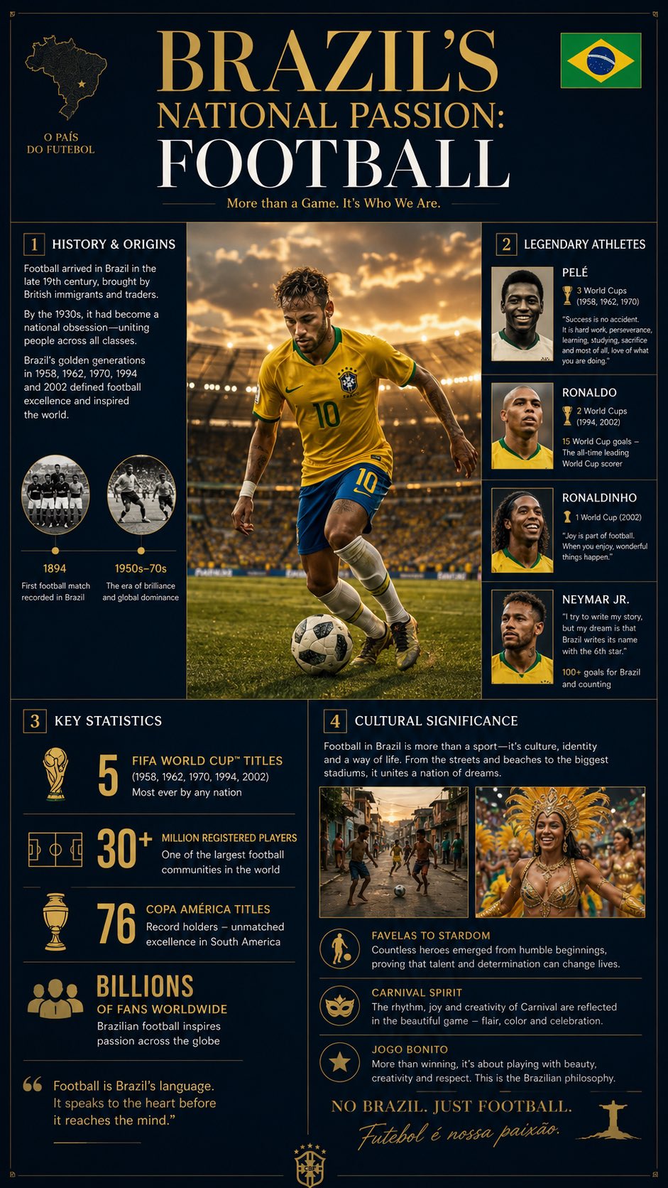
Full Prompt
Create a premium editorial infographic in a high-end magazine style about [COUNTRY]’s most iconic national [SPORT] Use a sophisticated dark navy blue, beige, and warm gold color palette with clean minimalist typography and subtle grid lines. Layout structure (perfectly balanced, cinematic composition for vertical format): - Central large hero image: A hyper-realistic, cinematic golden-hour photograph of [SPORT] in action — [detailed action scene description with iconic player or moment, stadium/venue, national colors, dramatic lighting], extremely detailed, National Geographic level photography, 8k resolution. The image should be vertically oriented and fill the central space beautifully. - Top banner: Elegant title “[COUNTRY]’s National Passion: [SPORT]” in bold modern serif font with the [COUNTRY] flag subtly integrated. Four structured content panels surrounding the central image in a clean vertical asymmetrical grid: 1. History & Origins (above center): Short paragraph on [brief history: when introduced, key milestones, how it became national obsession]. Include 1–2 small historical icons or timeline markers. 2. Legendary Athletes (upper right or below top banner): [Athlete 1], [Athlete 2], [Athlete 3], [Athlete 4] — small portrait thumbnails with key achievements and one signature quote or record each. 3. Key Statistics (below central image, left side): Clean infographic-style stats in bold numbers: - [Stat 1] - [Stat 2] - [Stat 3] - [Stat 4] Use small relevant icons (trophy, stadium, crowd, sport-specific items, etc.). 4. Cultural Significance (below central image, right side): [How the sport shapes national identity, traditions, rivalries, daily life, and culture]. Include 1–2 small cultural photos or symbols. Design rules: - Luxurious editorial magazine aesthetic (think National Geographic × Kinfolk × Bloomberg Businessweek) - Thin gold accent lines, subtle shadows, generous white space - Small [COUNTRY] flag in the top-right corner - Professional sans-serif body text, elegant serif headings - Overall ultra-clean, balanced, premium feel with cinematic depth and rich texture - Aspect ratio 9:16 (vertical, mobile-friendly), ultra-high detail, no text distortion, sharp typography