Case Media
Case Notes
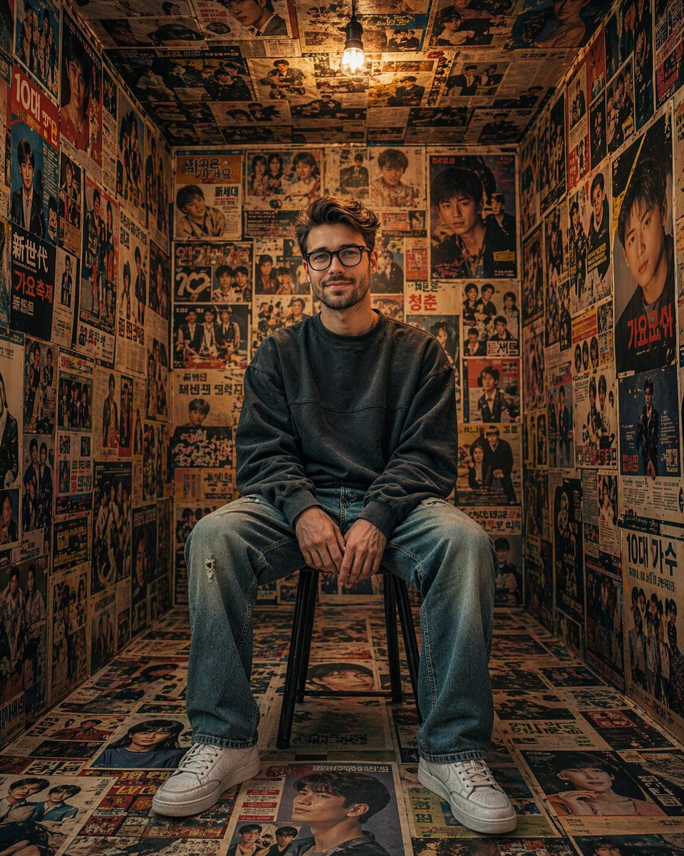
This page keeps the media, full prompt, and original source together so you can inspect the result first and decide whether the prompt is worth copying, saving, or comparing.
Case Insights
To make this page easier to search, cite, and reuse later, the case is also broken down into practical guidance about usage, visual cues, and prompt structure.
Best Fit Scenarios
- Use this as a portrait & photography benchmark when you need a fast style baseline before rewriting your own prompt.
- It is especially helpful if your target overlaps with 35mm, Portrait, Cinematic and you want to judge the image result before tuning wording.
- Keep it as a control sample when you compare nearby prompt variants one variable at a time.
Visual Signals To Notice
- The clearest style signals here are 35mm, Portrait, Cinematic, so those should usually stay in your first rewrite.
- Focus on framing, light direction, pose, and the distance between subject and camera.
- This case keeps one primary output, so the first image should be treated as the main visual reference.
How The Prompt Is Structured
- The prompt reads as a long, highly specified prompt, which is useful when you want to judge how much specificity this direction needs.
- Its keyword cluster is centered on 35mm, Portrait, Cinematic, so you can usually keep that cluster while swapping subject, camera, layout, or copy details.
- A practical rewrite path is: keep the outcome, keep the strongest style cues, then replace only the subject and environment blocks.
Good Follow-up Questions
- What changes first if you keep 35mm, Portrait, Cinematic but switch the subject matter?
- Which part of the result comes from section-level structure (Portrait & Photography) versus tag-level style cues?
- Which related cases in the same section give you a cleaner or more extreme variation of the same direction?
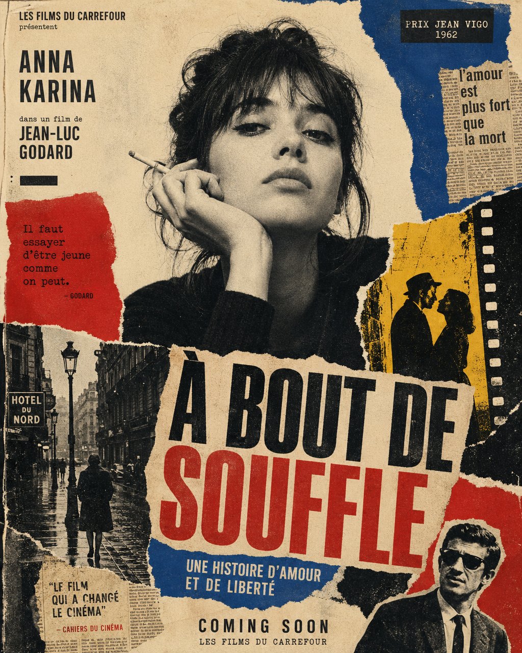
Full Prompt
Create a vertical poster composition on aged cream paper with a handmade analog feel. Use rough ripped paper edges, layered magazine cutouts, photocopy grain, halftone texture, ink bleed, and slightly imperfect screen-print registration. Keep the subject as the main black-and-white photographic portrait, placed prominently in the center or upper center. Surround the subject with graphic blocks of deep red, cobalt blue, warm yellow, black, and ivory. Add supporting collage fragments such as a rainy European street, film-strip borders, newspaper clippings, urban silhouettes, and cinematic details, arranged like a handmade 1960s art-house movie poster. Use bold condensed typography with a strong visual hierarchy. Add large headline text: "[MAIN TITLE]". Add smaller subtitle text: "[SUBTITLE]". Add bottom text: "[BRAND NAME / EVENT NAME / COMING SOON / DATE]". If needed, include a small top line reading "[TAGLINE]". The final result should feel cinematic, intellectual, rebellious, and editorial — like a lost 1960s European film poster with a strong point of view. Keep it raw, tactile, printed, imperfect, and handmade. Avoid a glossy modern finish.