Case Media
Case Notes
This page keeps the media, full prompt, and original source together so you can inspect the result first and decide whether the prompt is worth copying, saving, or comparing.
Case Insights
To make this page easier to search, cite, and reuse later, the case is also broken down into practical guidance about usage, visual cues, and prompt structure.
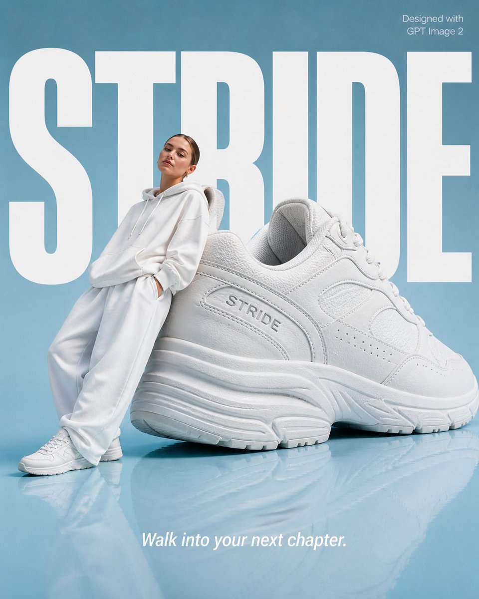
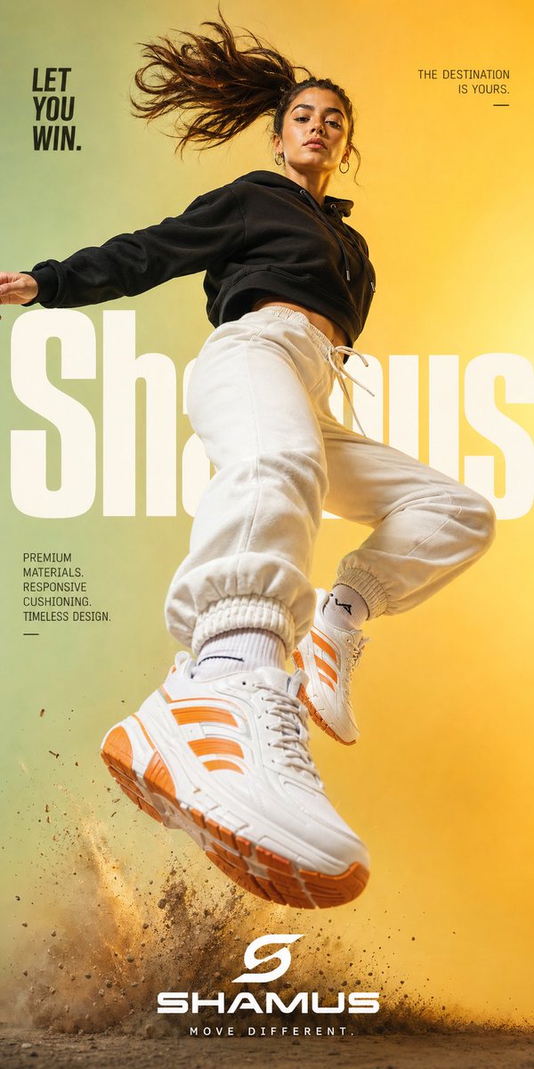
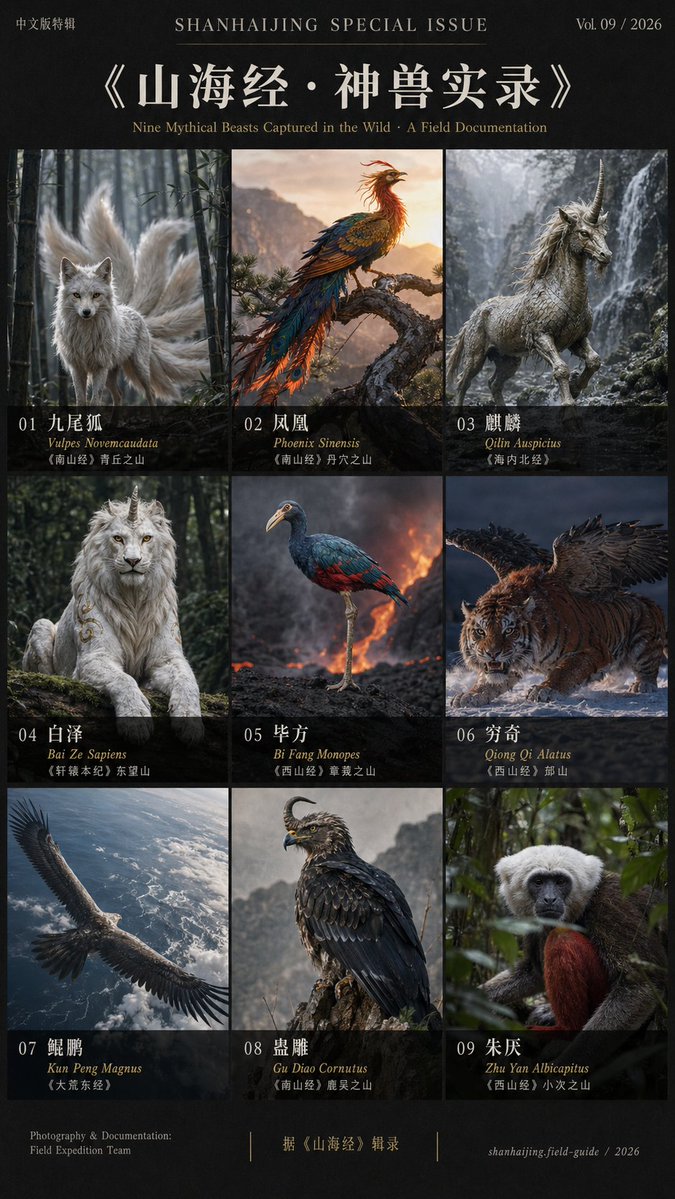
Best Fit Scenarios
- Use this as a portrait & photography benchmark when you need a fast style baseline before rewriting your own prompt.
- It is especially helpful if your target overlaps with Portrait, Fashion, Poster and you want to judge the image result before tuning wording.
- Keep it as a control sample when you compare nearby prompt variants one variable at a time.
Visual Signals To Notice
- The clearest style signals here are Portrait, Fashion, Poster, so those should usually stay in your first rewrite.
- Focus on framing, light direction, pose, and the distance between subject and camera.
- This case keeps 4 media outputs, which makes it easier to check whether the style remains stable across multiple results.
How The Prompt Is Structured
- The prompt reads as a long, highly specified prompt, which is useful when you want to judge how much specificity this direction needs.
- Its keyword cluster is centered on Portrait, Fashion, Poster, so you can usually keep that cluster while swapping subject, camera, layout, or copy details.
- A practical rewrite path is: keep the outcome, keep the strongest style cues, then replace only the subject and environment blocks.
Good Follow-up Questions
- What changes first if you keep Portrait, Fashion, Poster but switch the subject matter?
- Which part of the result comes from section-level structure (Portrait & Photography) versus tag-level style cues?
- Which related cases in the same section give you a cleaner or more extreme variation of the same direction?
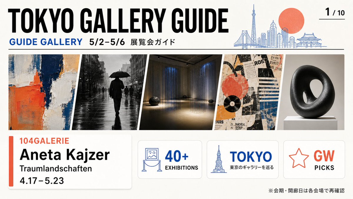
Full Prompt
{"type":"wide editorial brochure cover for a Tokyo art gallery guide","format":"16:9 landscape flyer, clean print-ready design, off-white paper background, crisp vector typography mixed with photographic art thumbnails","style":"modern Japanese magazine layout, bold condensed sans-serif headline, blue and coral accent colors, thin black dividers, rounded information cards, generous margins","parameters":{"main headline":"{argument name=\"main headline\" default=\"TOKYO GALLERY GUIDE\"}","date range":"{argument name=\"date range\" default=\"5/2–5/6\"}","featured gallery":"{argument name=\"featured gallery\" default=\"104GALERIE\"}","featured artist":"{argument name=\"featured artist\" default=\"Aneta Kaizer\"}","featured exhibition":"{argument name=\"featured exhibition\" default=\"Traumlandschaften\"}"},"layout":{"top_header":{"position":"top third","elements_count":5,"elements":["huge black title text: TOKYO GALLERY GUIDE","blue subheading: GUIDE GALLERY","black date text: 5/2–5/6","Japanese label: 展覧会ガイド","page indicator at top right: 1 / 10 with a short underline"],"illustration":"thin blue line-art Tokyo skyline on the right including Rainbow Bridge, Tokyo Skytree, modern towers, and a temple-like roof, with a large flat coral-red sun behind the skyline"},"main_image_strip":{"position":"middle","count":5,"description":"five slanted rectangular exhibition preview images separated by white diagonal gutters","items":["abstract impasto painting with cream, navy, orange, and beige blocks","black-and-white rainy street photograph with a silhouetted person holding an umbrella","dim contemporary installation room with vertical hanging light strands and small dark sculptural objects on the floor","collage-style graphic poster with torn paper textures, orange circle, black record shape, blue stripes, and vintage typography","black donut-shaped abstract sculpture on a white pedestal against a gray studio background"]},"bottom_cards":{"position":"bottom third","count":4,"items":[{"type":"large featured exhibition card","position":"bottom left","contents_count":5,"contents":["vertical coral accent bar","gallery name in coral: 104GALERIE","artist name in large black type: Aneta Kaizer","exhibition title: Traumlandschaften","dates: 4.17–5.23"]},{"type":"stat card","position":"bottom center-left","contents_count":3,"contents":["blue line icon of a framed artwork on a museum rope stand","large blue text: 40+","small black label: EXHIBITIONS"]},{"type":"location card","position":"bottom center-right","contents_count":3,"contents":["blue Tokyo Tower line icon","large blue text: TOKYO","Japanese subtitle: 東京のギャラリーを巡る"]},{"type":"recommendation card","position":"bottom right","contents_count":3,"contents":["coral outlined star icon","large coral text: GW","black text: PICKS"]}]},"footer_note":{"position":"bottom right edge","text":"※会期・開廊日は各会場で再確認"}},"composition_notes":"Use precise alignment and high contrast. The header spans nearly the full width, the image strip occupies a long horizontal band, and the four rounded cards sit evenly along the bottom with subtle shadows. Keep the overall look like a curated gallery event pamphlet cover, professional and information-rich."}