Case Media
Case Notes
This page keeps the media, full prompt, and original source together so you can inspect the result first and decide whether the prompt is worth copying, saving, or comparing.
Case Insights
To make this page easier to search, cite, and reuse later, the case is also broken down into practical guidance about usage, visual cues, and prompt structure.
Best Fit Scenarios
- Use this as a portrait & photography benchmark when you need a fast style baseline before rewriting your own prompt.
- It is especially helpful if your target overlaps with Portrait, Fashion, Poster and you want to judge the image result before tuning wording.
- Keep it as a control sample when you compare nearby prompt variants one variable at a time.
Visual Signals To Notice
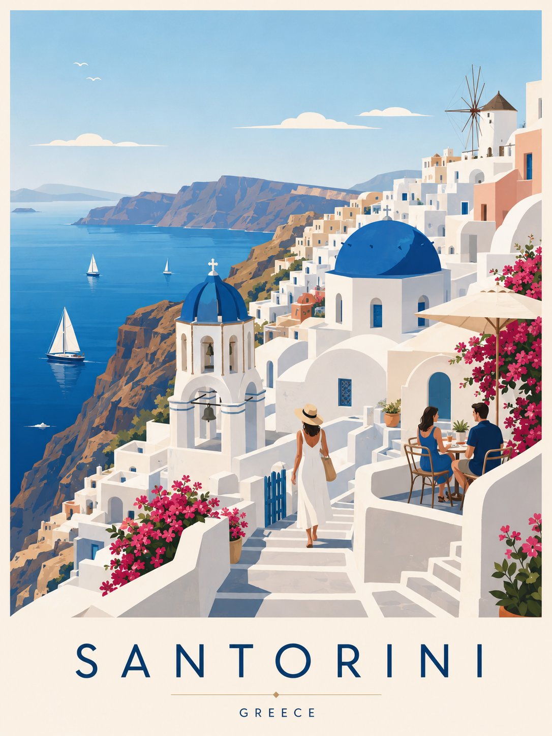
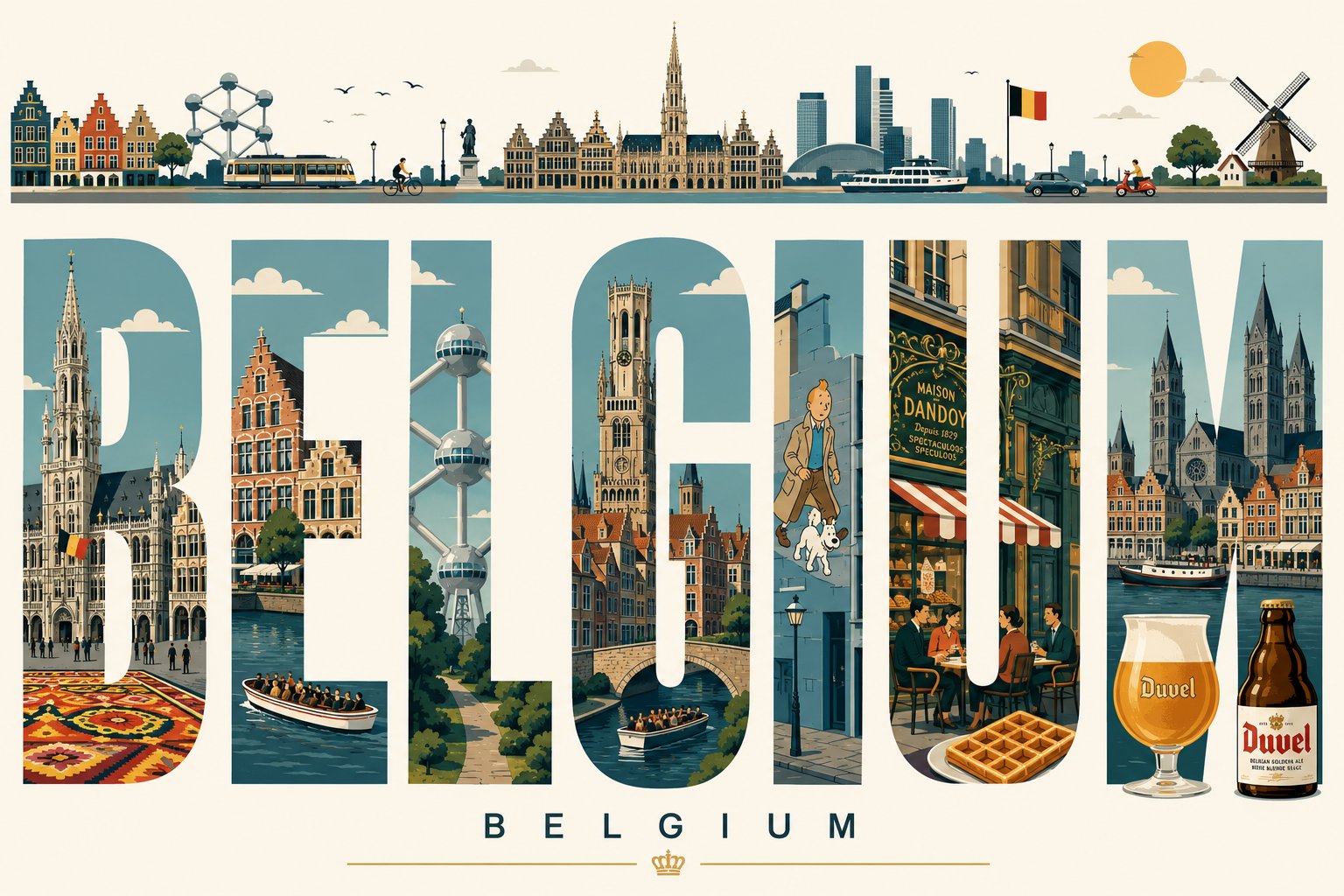
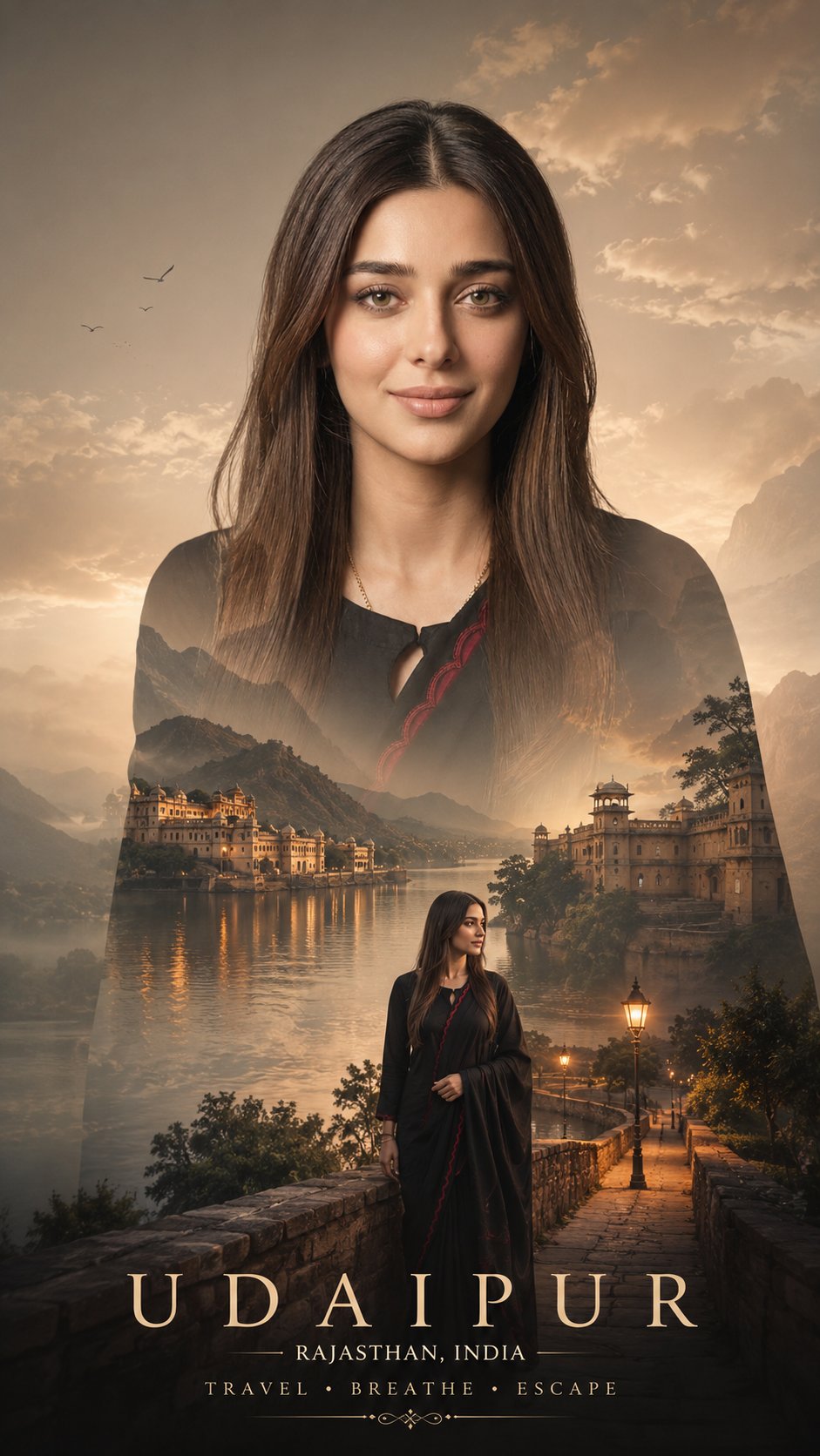
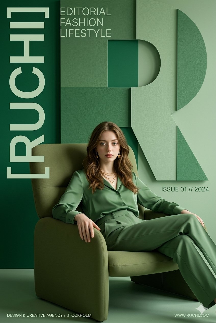
- The clearest style signals here are Portrait, Fashion, Poster, so those should usually stay in your first rewrite.
- Focus on framing, light direction, pose, and the distance between subject and camera.
- This case keeps 2 media outputs, which makes it easier to check whether the style remains stable across multiple results.
How The Prompt Is Structured
- The prompt reads as a long, highly specified prompt, which is useful when you want to judge how much specificity this direction needs.
- Its keyword cluster is centered on Portrait, Fashion, Poster, so you can usually keep that cluster while swapping subject, camera, layout, or copy details.
- A practical rewrite path is: keep the outcome, keep the strongest style cues, then replace only the subject and environment blocks.
Good Follow-up Questions
- What changes first if you keep Portrait, Fashion, Poster but switch the subject matter?
- Which part of the result comes from section-level structure (Portrait & Photography) versus tag-level style cues?
- Which related cases in the same section give you a cleaner or more extreme variation of the same direction?
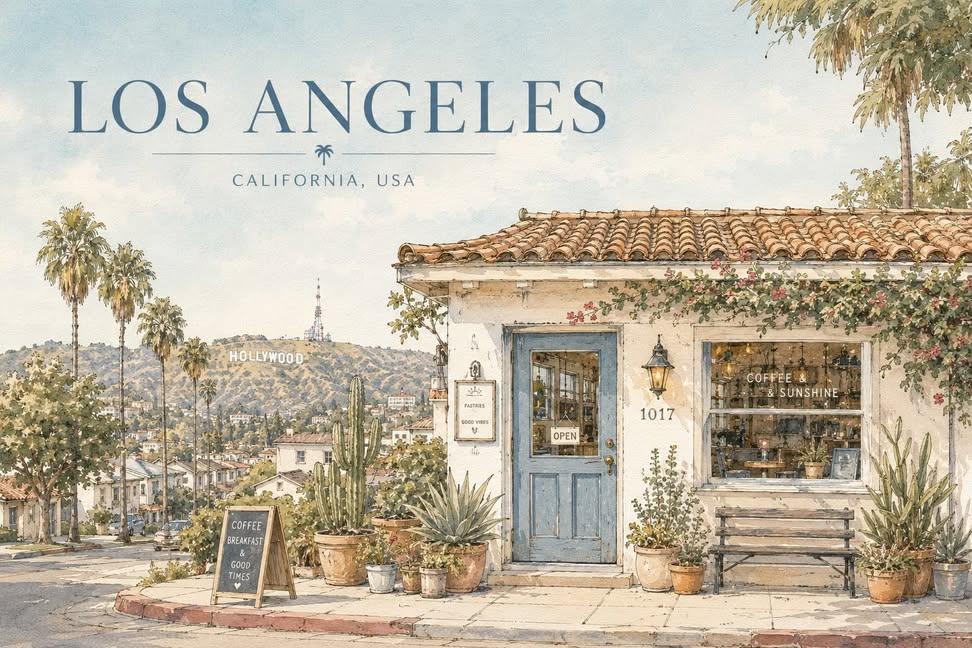
Full Prompt
[CITY] = Seoul [COUNTRY] = South Korea [LANDMARK] = a recognizable landmark or scenic element of [CITY] Create a serene architectural travel illustration inspired by [CITY], [COUNTRY], in a soft hand-drawn watercolor and ink style. Main concept: Show a quiet, charming street-side house or small building inspired by the everyday atmosphere of [CITY], [COUNTRY], while subtly incorporating [LANDMARK] in the composition. The landmark should appear naturally in the background, distance, or surrounding scenery, so the image clearly feels connected to [CITY], [COUNTRY] without losing the calm residential mood. Visual style: delicate hand-drawn architectural illustration, soft watercolor washes, thin ink outlines, slightly imperfect sketch lines, warm sunlit atmosphere, gentle pastel palette, subtle paper texture, quiet travel sketchbook aesthetic, minimal yet detailed composition, calm editorial illustration mood, poetic everyday scenery, cozy and refined visual tone, no photorealism, no harsh contrast, no saturated colors, no dramatic lighting. Scene: A peaceful small house, café, studio, or local building with simple walls, a tiled or regionally inspired roof, painted doors or windows, and several potted plants arranged naturally in front. Include subtle local architectural details and everyday design elements that feel authentic to [CITY], [COUNTRY]. Incorporate [LANDMARK] as a softly integrated city symbol — for example, visible above rooftops, in the distance, or as part of the surrounding skyline or landscape. The overall scene should feel quiet, elegant, warm, and locally rooted. Composition: landscape travel-poster format, wide horizontal layout, large open sky occupying the upper half or upper-left area, main building placed across the lower portion of the composition, balanced negative space, front-facing or slightly angled composition, potted plants and small objects along the base, landmark subtly placed in the background or upper distance, clean and spacious layout, minimal but emotionally rich composition. Typography: Include the city name “[CITY]” clearly in the image. Render “[CITY]” as elegant travel-poster typography, large but refined, placed prominently in the sky area or upper portion of the composition. Optionally include “[COUNTRY]” in smaller text beneath or near the city name. The text should feel integrated into the poster design, not like a random overlay. Use clean, tasteful lettering that matches the calm watercolor travel-poster mood. Color palette: pale sky blue, warm cream, terracotta, muted blue accents, olive and soft green, light earthy browns, soft natural neutrals. Texture: visible watercolor paper grain, transparent paint layering, soft handmade brush texture, gentle ink-and-wash finish. Mood: peaceful, sunny, quiet, nostalgic, cozy, refined, poetic, calm everyday travel atmosphere. Important: The image should express both the intimate charm of a local building and the identity of [CITY], [COUNTRY] through the inclusion of [LANDMARK]. Do not make the landmark too dominant; it should support the mood rather than overpower the house scene. The city name “[CITY]” must be visible and clearly readable in the final image. Aspect ratio: 4:3 or 3:2