Case Media
Case Notes
This page keeps the media, full prompt, and original source together so you can inspect the result first and decide whether the prompt is worth copying, saving, or comparing.
Case Insights
To make this page easier to search, cite, and reuse later, the case is also broken down into practical guidance about usage, visual cues, and prompt structure.
Best Fit Scenarios
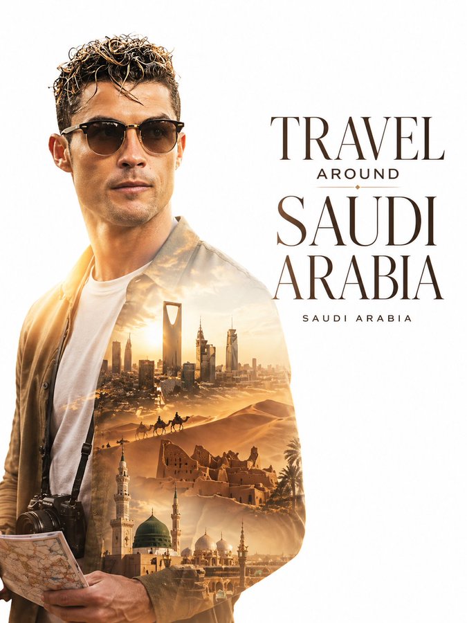
- Use this as a portrait & photography benchmark when you need a fast style baseline before rewriting your own prompt.
- It is especially helpful if your target overlaps with Portrait, Cinematic, Fashion and you want to judge the image result before tuning wording.
- Keep it as a control sample when you compare nearby prompt variants one variable at a time.
Visual Signals To Notice
- The clearest style signals here are Portrait, Cinematic, Fashion, so those should usually stay in your first rewrite.
- Focus on framing, light direction, pose, and the distance between subject and camera.
- This case keeps one primary output, so the first image should be treated as the main visual reference.
How The Prompt Is Structured
- The prompt reads as a long, highly specified prompt, which is useful when you want to judge how much specificity this direction needs.
- Its keyword cluster is centered on Portrait, Cinematic, Fashion, so you can usually keep that cluster while swapping subject, camera, layout, or copy details.
- A practical rewrite path is: keep the outcome, keep the strongest style cues, then replace only the subject and environment blocks.
Good Follow-up Questions
- What changes first if you keep Portrait, Cinematic, Fashion but switch the subject matter?
- Which part of the result comes from section-level structure (Portrait & Photography) versus tag-level style cues?
- Which related cases in the same section give you a cleaner or more extreme variation of the same direction?
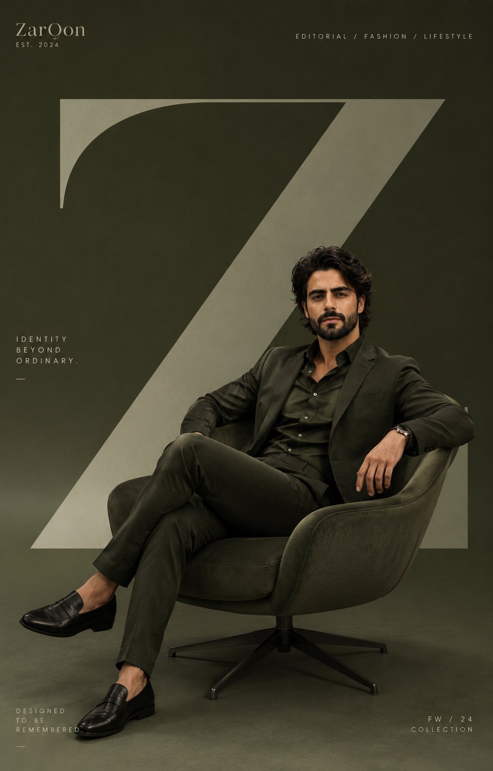
Full Prompt
Create a premium modern editorial branding poster for [ZarOon]. TOPIC: [EDITORIAL / FASHION / LIFESTYLE THEME] STYLE & ART DIRECTION: Contemporary minimalist editorial design Monochromatic branding aesthetic Clean luxury composition Modern creative-agency visual identity Soft studio photography style Oversized abstract typography integration Minimal geometric branding High-end lifestyle campaign aesthetic Scandinavian-inspired visual simplicity Modern art-direction poster design MAIN SUBJECT: A stylish realistic young man seated prominently in a designer chair Fashion-forward outfit matching the monochromatic palette Relaxed confident pose Contemporary editorial styling Premium realistic studio photography Modern expressive fashion aesthetic Strong personality and visual identity Soft realistic shadows beneath the subject and furniture Large designer furniture piece integrated as part of the composition LAYOUT & COMPOSITION: Same exact minimalist composition and visual structure as the reference design Large oversized abstract letter "Z" or typography shape dominating the background Subject placed asymmetrically in the foreground Spacious negative space Minimal branding details in the corners Strong visual balance between typography and subject Editorial magazine-inspired hierarchy Clean modern alignment Minimal clutter and highly refined spacing TEXT & TYPOGRAPHY: Oversized geometric typography Minimal branding text Thin modern sans-serif fonts Abstract letterform integration Small editorial metadata text Luxury contemporary typography hierarchy DEPTH & LIGHTING: Soft cinematic studio lighting Gentle monochromatic shadows Smooth gradient lighting Premium editorial depth Soft realistic reflections Contemporary luxury atmosphere EXTRA DESIGN DETAILS: Minimal grain texture Clean modern gradients Abstract geometric branding Soft monochromatic transitions Designer furniture aesthetic Minimal art-poster mood COLOR PALETTE: Green color Tonal monochromatic variations Soft neutral highlights Clean editorial contrast QUALITY: Ultra realistic editorial photography Premium branding poster Behance-quality modern composition Contemporary fashion campaign quality Same exact visual identity and layout as the reference Ultra high resolution