Case Media
Case Notes
This page keeps the media, full prompt, and original source together so you can inspect the result first and decide whether the prompt is worth copying, saving, or comparing.
Case Insights
To make this page easier to search, cite, and reuse later, the case is also broken down into practical guidance about usage, visual cues, and prompt structure.
Best Fit Scenarios
- Use this as a portrait & photography benchmark when you need a fast style baseline before rewriting your own prompt.
- It is especially helpful if your target overlaps with Portrait, Fashion, Poster and you want to judge the image result before tuning wording.
- Keep it as a control sample when you compare nearby prompt variants one variable at a time.
Visual Signals To Notice
- The clearest style signals here are Portrait, Fashion, Poster, so those should usually stay in your first rewrite.
- Focus on framing, light direction, pose, and the distance between subject and camera.
- This case keeps one primary output, so the first image should be treated as the main visual reference.
How The Prompt Is Structured
- The prompt reads as a long, highly specified prompt, which is useful when you want to judge how much specificity this direction needs.
- Its keyword cluster is centered on Portrait, Fashion, Poster, so you can usually keep that cluster while swapping subject, camera, layout, or copy details.
- A practical rewrite path is: keep the outcome, keep the strongest style cues, then replace only the subject and environment blocks.
Good Follow-up Questions
- What changes first if you keep Portrait, Fashion, Poster but switch the subject matter?
- Which part of the result comes from section-level structure (Portrait & Photography) versus tag-level style cues?
- Which related cases in the same section give you a cleaner or more extreme variation of the same direction?
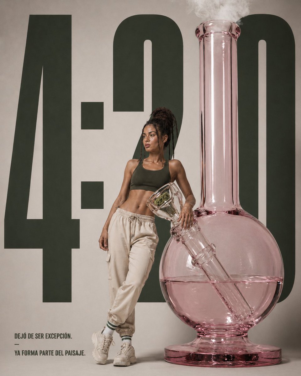
Full Prompt
A high-end editorial product poster in a minimalist studio, featuring an oversized translucent pink glass bong standing on the right side of the frame, nearly as tall as the composition, with a round water chamber half-filled with pale pink liquid, a long vertical neck releasing soft white smoke from the top, and a diagonal downstem visible inside the glass. A slim athletic woman with dark skin and long dreadlocks tied up in a high bun stands leaning casually against the bong near the center-left, her face intentionally obscured with a soft rectangular blur, wearing a dark olive sports bra, loose cream jogger pants, white crew socks with green stripes, and chunky off-white sneakers. She poses with one leg crossed in front of the other and one arm resting on the bong’s angled bowl. Behind them, place enormous bold dark green condensed numbers reading {argument name="headline text" default="4:20"} spanning almost the full height of the background on a warm light beige wall. In the lower left corner, add a small block of uppercase Spanish copy in a clean sans-serif font reading {argument name="quote" default="DEJÓ DE SER EXCEPCIÓN. — YA FORMA PARTE DEL PAISAJE."}. The overall look should feel like a luxury lifestyle ad campaign: clean composition, muted earthy palette, soft diffused studio lighting, subtle shadows, sharp product detail, fashion-editorial styling, realistic glass reflections, and a polished contemporary cannabis culture aesthetic.