Case Media
Case Notes
This page keeps the media, full prompt, and original source together so you can inspect the result first and decide whether the prompt is worth copying, saving, or comparing.
Case Insights
To make this page easier to search, cite, and reuse later, the case is also broken down into practical guidance about usage, visual cues, and prompt structure.
Best Fit Scenarios
- Use this as a portrait & photography benchmark when you need a fast style baseline before rewriting your own prompt.
- It is especially helpful if your target overlaps with Portrait, Cinematic, Fashion and you want to judge the image result before tuning wording.
- Keep it as a control sample when you compare nearby prompt variants one variable at a time.
Visual Signals To Notice
- The clearest style signals here are Portrait, Cinematic, Fashion, so those should usually stay in your first rewrite.
- Focus on framing, light direction, pose, and the distance between subject and camera.
- This case keeps one primary output, so the first image should be treated as the main visual reference.
How The Prompt Is Structured
- The prompt reads as a long, highly specified prompt, which is useful when you want to judge how much specificity this direction needs.
- Its keyword cluster is centered on Portrait, Cinematic, Fashion, so you can usually keep that cluster while swapping subject, camera, layout, or copy details.
- A practical rewrite path is: keep the outcome, keep the strongest style cues, then replace only the subject and environment blocks.
Good Follow-up Questions
- What changes first if you keep Portrait, Cinematic, Fashion but switch the subject matter?
- Which part of the result comes from section-level structure (Portrait & Photography) versus tag-level style cues?
- Which related cases in the same section give you a cleaner or more extreme variation of the same direction?
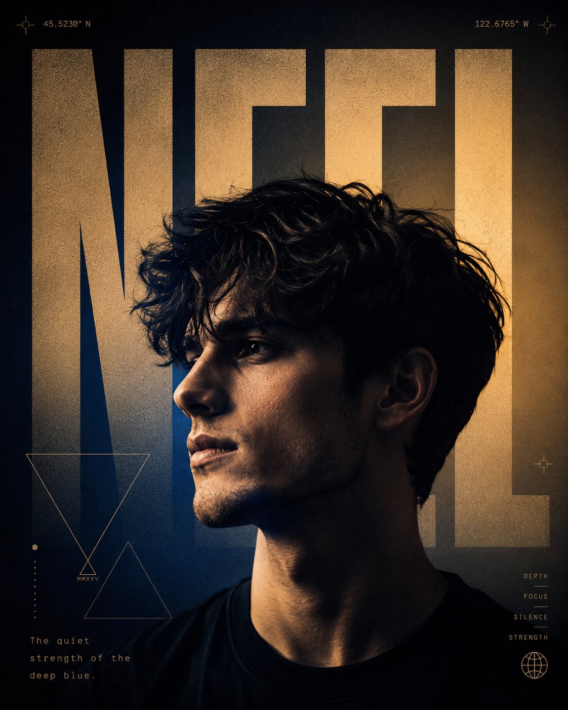
Full Prompt
Ultra-premium 4:5 vertical editorial typography poster. Subject: A high-fidelity, photorealistic side-profile portrait of a young man with a clear, realistic skin texture and a dark, modern hairstyle. He has an intense, contemplative expression. The rendering must be indistinguishable from a real photograph. Lighting & Atmosphere: Dramatic, cinematic chiaroscuro lighting that creates deep shadows and striking highlights on the face and neck. The palette is a blend of deep sapphire blue and warm, golden amber gradient background. Aesthetic: Modern luxury editorial, featuring a clean Swiss layout with premium grain texture and asymmetrical composition. Typography (Name): The name '[NEEL]' is rendered in giant, ultra-tall, bold brutalist typography. The text is integrated directly into the composition, partially in front of and partially behind the subject to create depth. Additional Elements (Add-ons): Symbols: Minimalist geometric elements (like intersecting triangles) and sleek coordinate markers (e.g., 45.5230° N, 122.6765° W) placed in the corners in a micro-typography font. Poetic Line: A short poetic line of meaning: "The quiet strength of the deep blue." is subtly placed near the bottom. Overall Vibe: Premium, bold, modern, and visually striking, inspired by A24 posters and luxury perfume advertisements.