Case Media
Case Notes
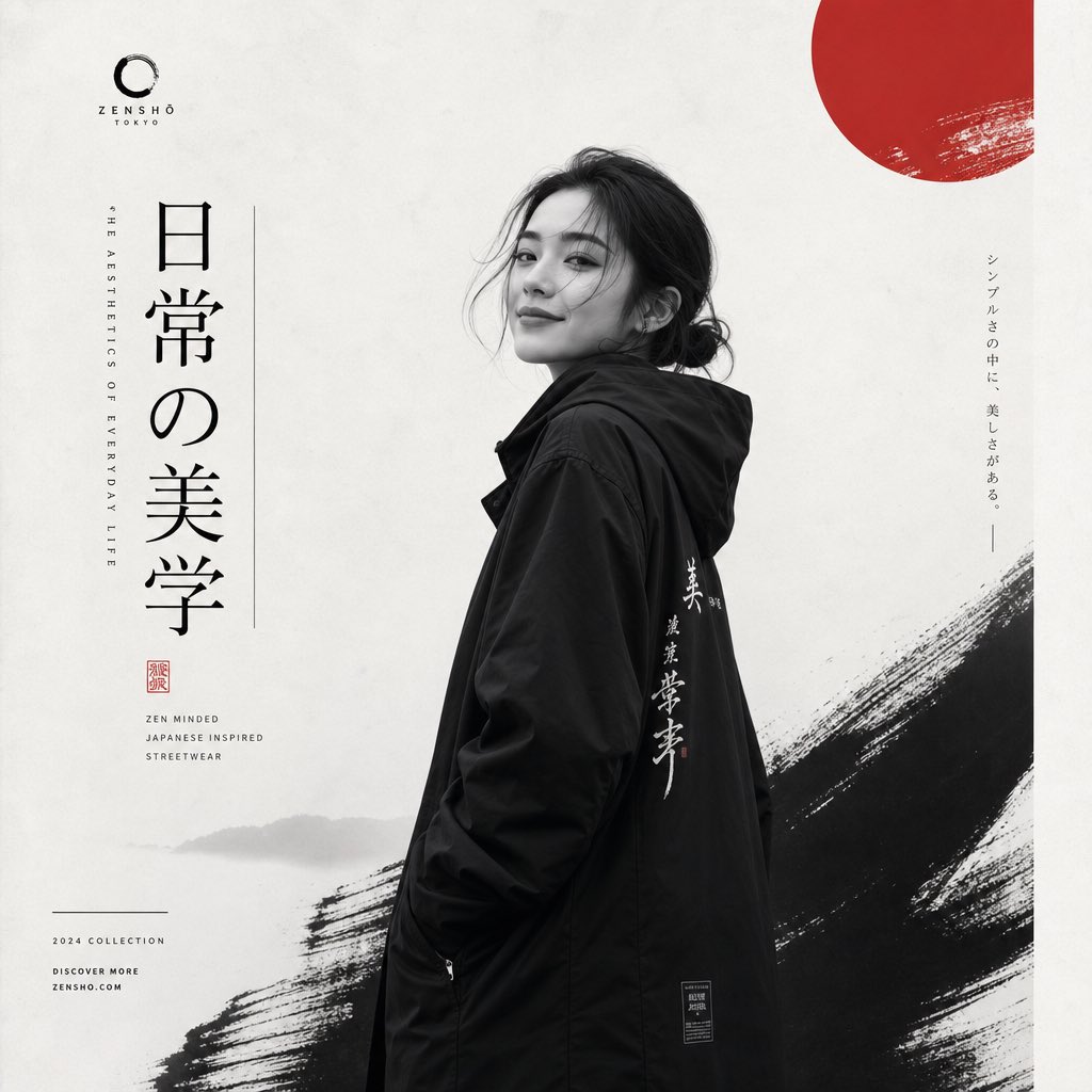
This page keeps the media, full prompt, and original source together so you can inspect the result first and decide whether the prompt is worth copying, saving, or comparing.
Case Insights
To make this page easier to search, cite, and reuse later, the case is also broken down into practical guidance about usage, visual cues, and prompt structure.
Best Fit Scenarios
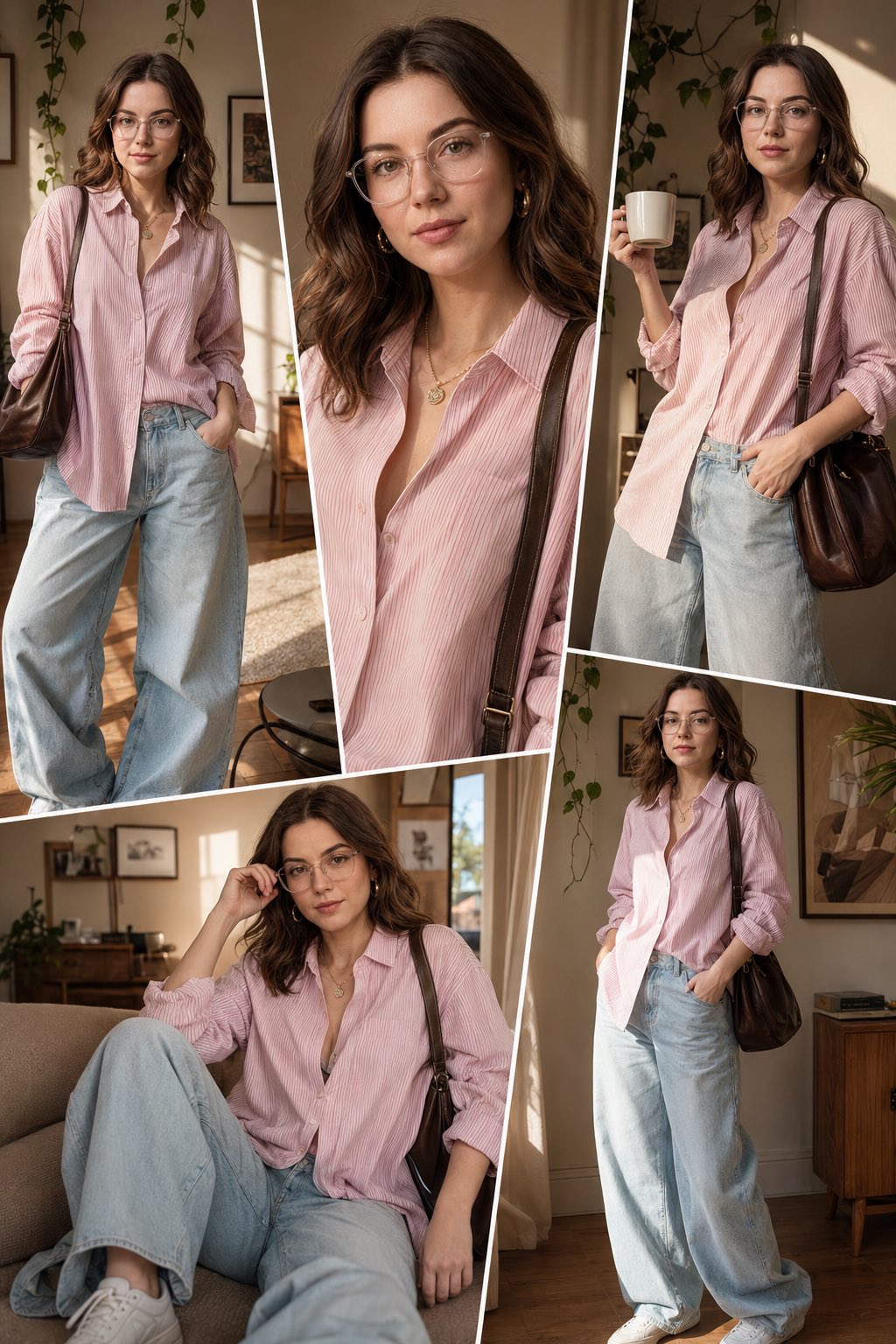
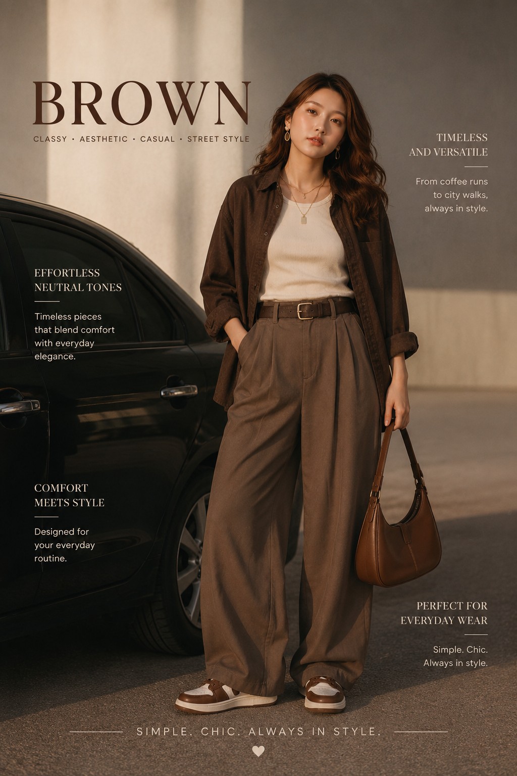
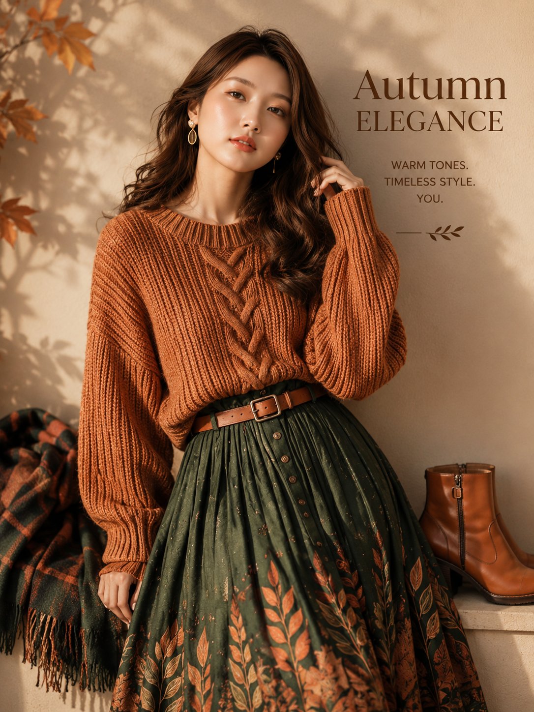
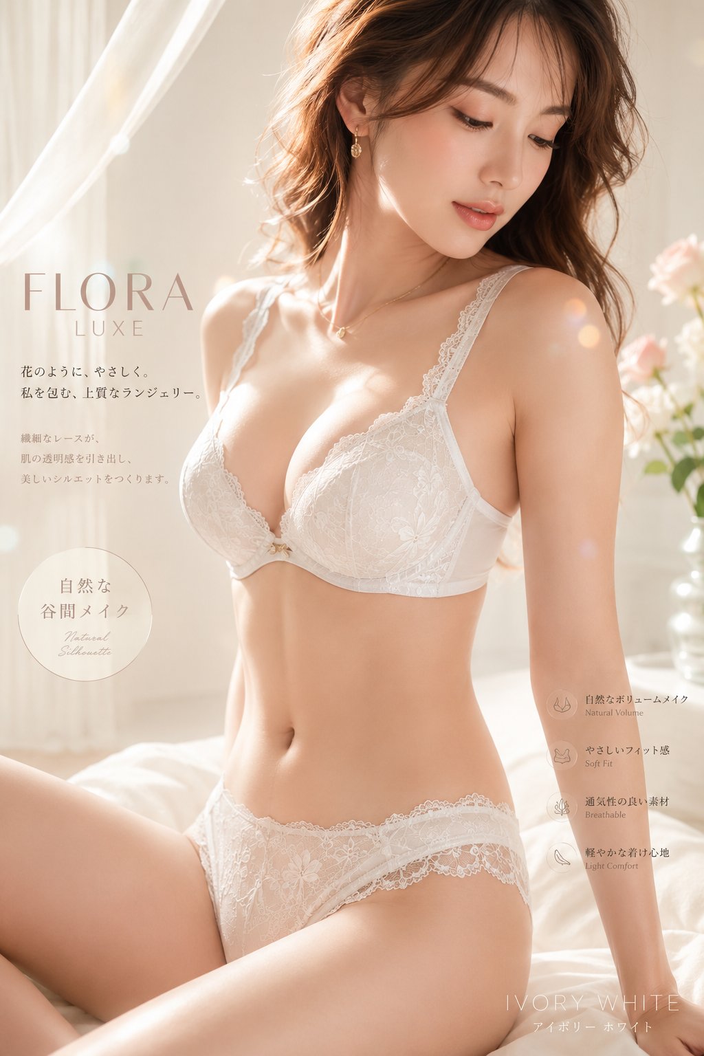
- Use this as a portrait & photography benchmark when you need a fast style baseline before rewriting your own prompt.
- It is especially helpful if your target overlaps with Portrait, Cinematic, Fashion and you want to judge the image result before tuning wording.
- Keep it as a control sample when you compare nearby prompt variants one variable at a time.
Visual Signals To Notice
- The clearest style signals here are Portrait, Cinematic, Fashion, so those should usually stay in your first rewrite.
- Focus on framing, light direction, pose, and the distance between subject and camera.
- This case keeps one primary output, so the first image should be treated as the main visual reference.
How The Prompt Is Structured
- The prompt reads as a long, highly specified prompt, which is useful when you want to judge how much specificity this direction needs.
- Its keyword cluster is centered on Portrait, Cinematic, Fashion, so you can usually keep that cluster while swapping subject, camera, layout, or copy details.
- A practical rewrite path is: keep the outcome, keep the strongest style cues, then replace only the subject and environment blocks.
Good Follow-up Questions
- What changes first if you keep Portrait, Cinematic, Fashion but switch the subject matter?
- Which part of the result comes from section-level structure (Portrait & Photography) versus tag-level style cues?
- Which related cases in the same section give you a cleaner or more extreme variation of the same direction?
Full Prompt
Create a premium Japanese-inspired minimalist fashion editorial poster featuring a stylish young woman as the main subject. IMAGE TYPE: minimal Japanese fashion branding poster, monochrome editorial campaign design, luxury lifestyle poster. TOPIC: streetwear, minimal fashion, Japanese lifestyle, zen clothing, contemporary fashion. STYLE & ART DIRECTION: same exact composition and visual hierarchy as the reference image, Japanese minimalist editorial aesthetic, Scandinavian-meets-Japanese branding style, monochrome photography composition, calm luxury fashion atmosphere, fine-art gallery poster design, Behance-quality editorial branding, zen-inspired visual storytelling. MAIN SUBJECT / HERO ELEMENT: a stylish female smily fashion model with calm emotional body language, elegant streetwear or minimalist lifestyle styling, black-and-white editorial photography, Japanese-inspired urban atmosphere, subtle confident expression, with a red-circle visual accent integrated into the composition. LAYOUT & COMPOSITION: single standalone vertical poster inspired by luxury campaign structures, large negative space dominance, minimal asymmetrical layout, brush-stroke framing textures, Japanese typography placement, gallery-style spacing rhythm, clean editorial hierarchy, minimal visual clutter. TEXT & TYPOGRAPHY: thin minimalist serif typography, vertical Japanese kanji typography, minimal sans-serif supporting text, luxury editorial spacing, small micro-text details, fashion-magazine inspired hierarchy, elegant monochrome typography system. DEPTH & LIGHTING: soft natural grayscale lighting, calm atmospheric shadows, minimal contrast mood, fine-art photography lighting, soft editorial highlights, cinematic monochrome ambiance. EXTRA DESIGN DETAILS: Japanese red sun symbol, brush-stroke textures, minimal paper texture overlays, soft grain details, editorial framing accents, fine-art poster balance, zen-inspired minimal shapes, gallery exhibition atmosphere. COLOR PALETTE: pure white, deep black, soft grayscale, Japanese red accent, minimal neutral harmony. CAMERA & RENDERING: editorial monochrome photography, fine-art fashion portrait style, minimal cinematic realism, soft luxury rendering, Behance-quality poster execution, high-end fashion editorial composition. QUALITY CONTROLS: Behance-quality fashion poster, premium minimalist branding, ultra-clean editorial composition, high-resolution monochrome design, same exact visual DNA as the reference, fine-art Japanese poster atmosphere.