Case Media
Case Notes
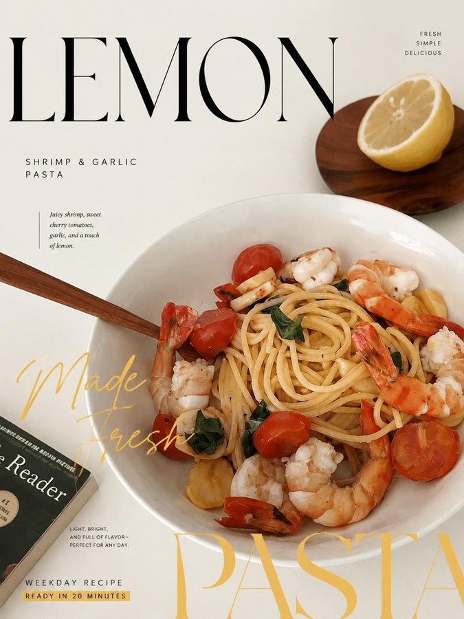
This page keeps the media, full prompt, and original source together so you can inspect the result first and decide whether the prompt is worth copying, saving, or comparing.
Case Insights
To make this page easier to search, cite, and reuse later, the case is also broken down into practical guidance about usage, visual cues, and prompt structure.
Best Fit Scenarios
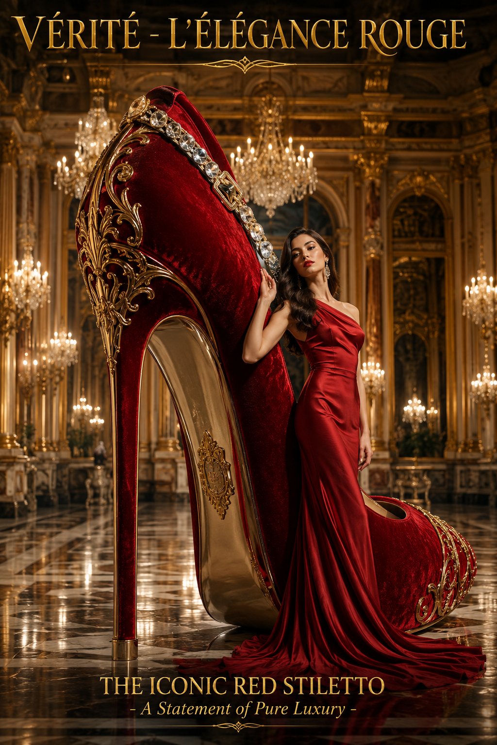
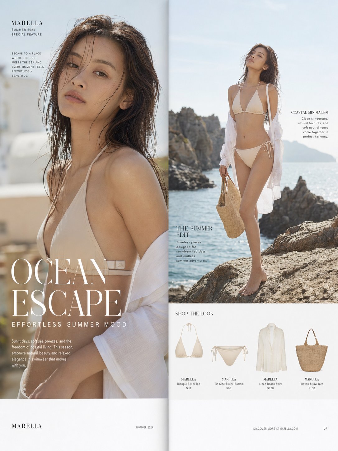
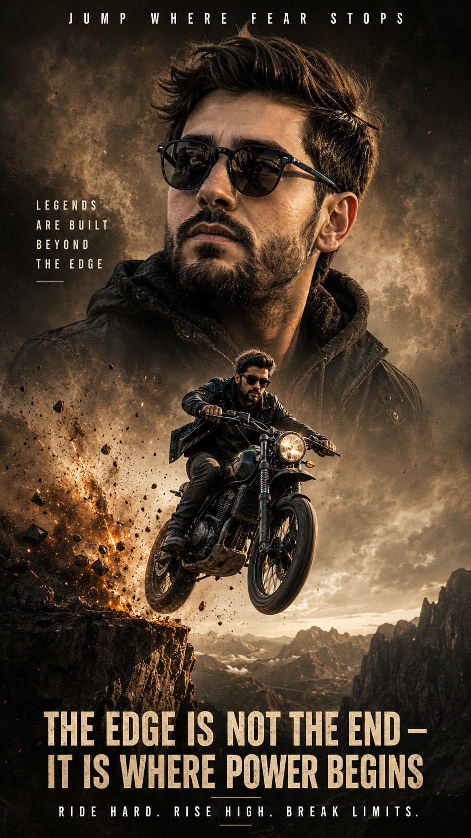
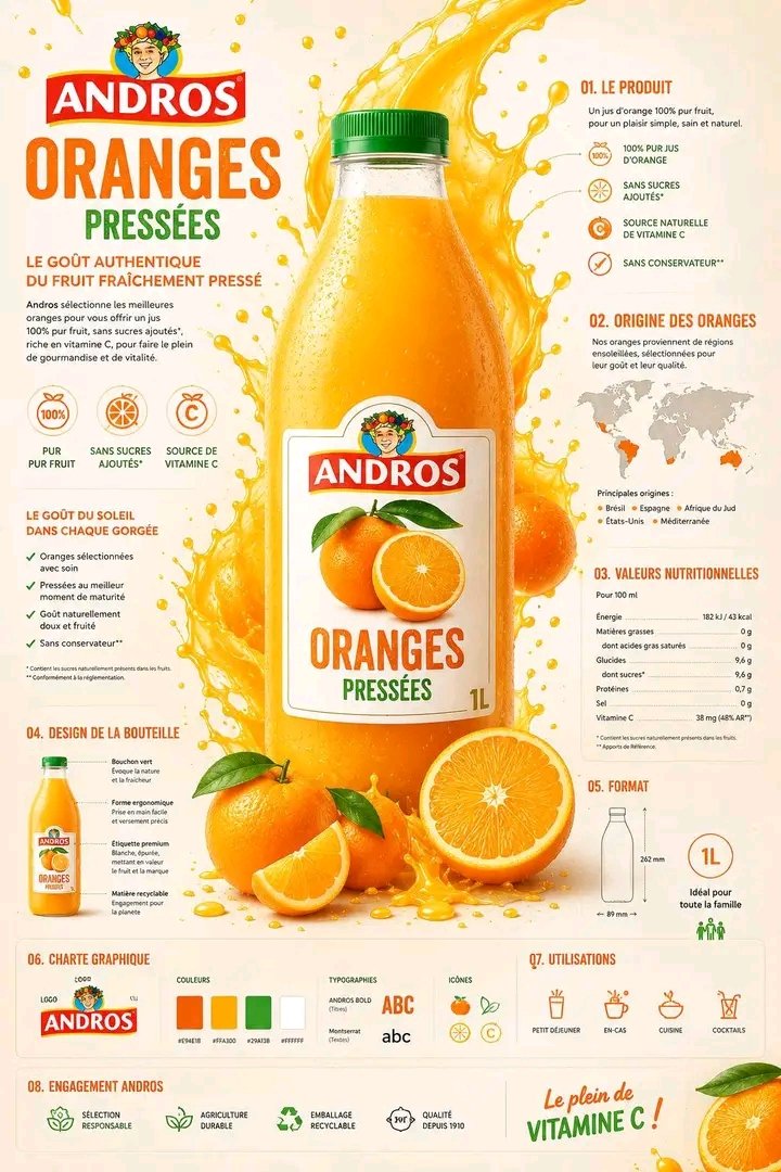
- Use this as a portrait & photography benchmark when you need a fast style baseline before rewriting your own prompt.
- It is especially helpful if your target overlaps with Portrait, Cinematic, Fashion and you want to judge the image result before tuning wording.
- Keep it as a control sample when you compare nearby prompt variants one variable at a time.
Visual Signals To Notice
- The clearest style signals here are Portrait, Cinematic, Fashion, so those should usually stay in your first rewrite.
- Focus on framing, light direction, pose, and the distance between subject and camera.
- This case keeps one primary output, so the first image should be treated as the main visual reference.
How The Prompt Is Structured
- The prompt reads as a long, highly specified prompt, which is useful when you want to judge how much specificity this direction needs.
- Its keyword cluster is centered on Portrait, Cinematic, Fashion, so you can usually keep that cluster while swapping subject, camera, layout, or copy details.
- A practical rewrite path is: keep the outcome, keep the strongest style cues, then replace only the subject and environment blocks.
Good Follow-up Questions
- What changes first if you keep Portrait, Cinematic, Fashion but switch the subject matter?
- Which part of the result comes from section-level structure (Portrait & Photography) versus tag-level style cues?
- Which related cases in the same section give you a cleaner or more extreme variation of the same direction?
Full Prompt
Designer-grade modern poster layout with strong visual hierarchy, asymmetric composition, intentional imbalance, editorial rhythm, and luxury fashion magazine aesthetics. Avoid generic AI poster style, centered layouts, boring placement, floating elements, cheap event-poster feel, or template-based composition. Use a clear structure with hero zone, typography zone, breathing space, supporting detail area, and balanced graphic flow. Apply aggressive negative space, modular grid systems, layered visual rhythm, controlled chaos, cinematic cropping, and premium brand-level composition. Typography must feel like a design element — oversized headlines, ultra-small metadata, cropped text, vertical or rotated typography, overlapping layers, edge-aligned placement, broken grid layouts, and strong size contrast. Create tension, movement, and visual flow instead of clean predictable alignment. Use bold editorial cropping, unexpected framing, object overflow, and cinematic close-ups. Inspired by luxury fashion campaigns.