Case Media
Case Notes
This page keeps the media, full prompt, and original source together so you can inspect the result first and decide whether the prompt is worth copying, saving, or comparing.
Case Insights
To make this page easier to search, cite, and reuse later, the case is also broken down into practical guidance about usage, visual cues, and prompt structure.
Best Fit Scenarios
- Use this as a portrait & photography benchmark when you need a fast style baseline before rewriting your own prompt.
- It is especially helpful if your target overlaps with Portrait, Poster, Illustration and you want to judge the image result before tuning wording.
- Keep it as a control sample when you compare nearby prompt variants one variable at a time.
Visual Signals To Notice
- The clearest style signals here are Portrait, Poster, Illustration, so those should usually stay in your first rewrite.
- Focus on framing, light direction, pose, and the distance between subject and camera.
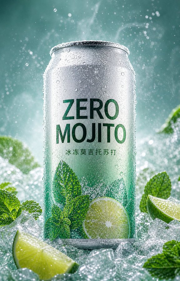
- This case keeps one primary output, so the first image should be treated as the main visual reference.
How The Prompt Is Structured
- The prompt reads as a long, highly specified prompt, which is useful when you want to judge how much specificity this direction needs.
- Its keyword cluster is centered on Portrait, Poster, Illustration, so you can usually keep that cluster while swapping subject, camera, layout, or copy details.
- A practical rewrite path is: keep the outcome, keep the strongest style cues, then replace only the subject and environment blocks.
Good Follow-up Questions
- What changes first if you keep Portrait, Poster, Illustration but switch the subject matter?
- Which part of the result comes from section-level structure (Portrait & Photography) versus tag-level style cues?
- Which related cases in the same section give you a cleaner or more extreme variation of the same direction?
Full Prompt
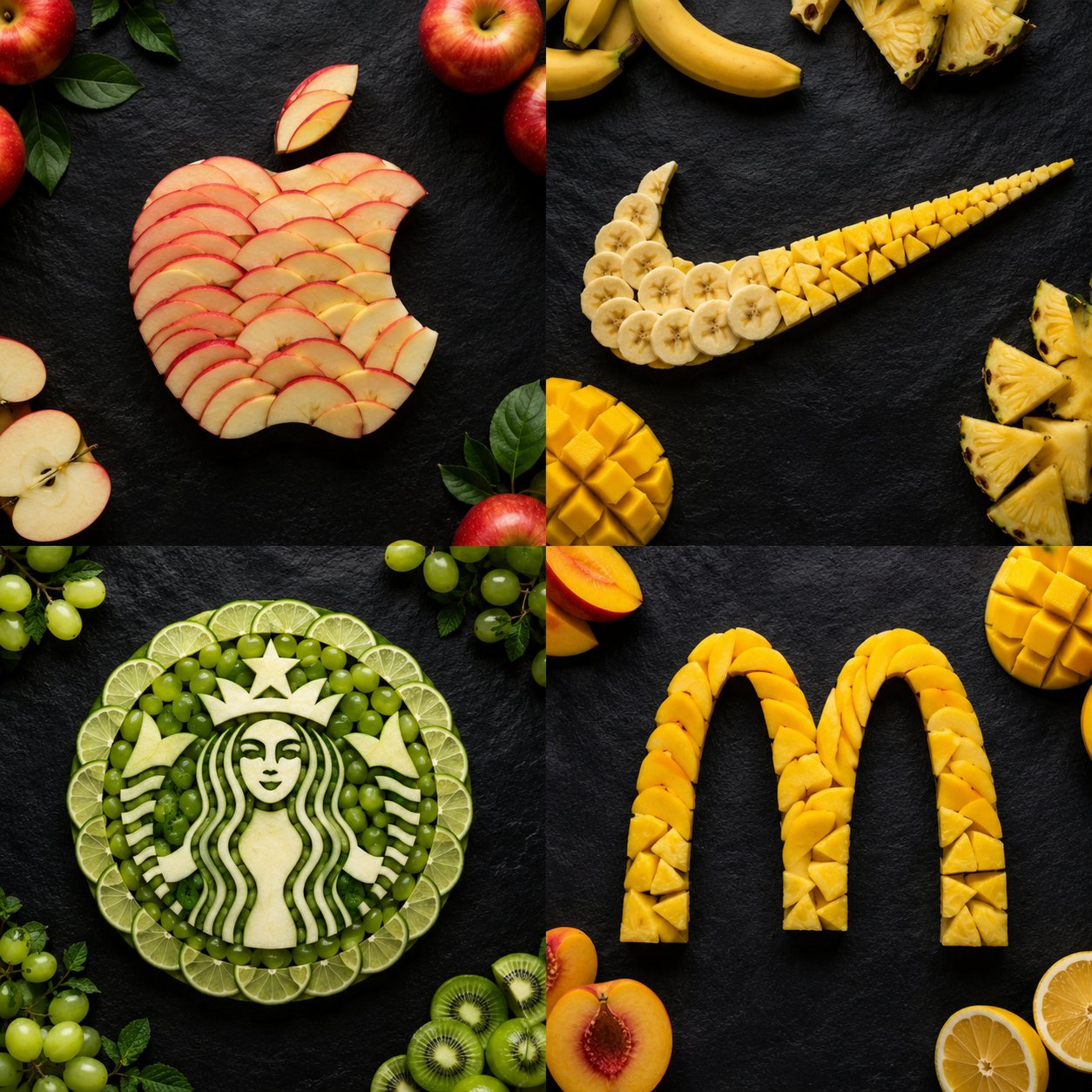
Create a premium 2x2 grid poster featuring four iconic brand logos recreated entirely from fresh fruit slices. Each logo must be instantly recognizable and meticulously crafted from fruits that match the brand's colors and personality. Hyper-realistic food art, luxury commercial advertising, overhead flat-lay photography, dramatic studio lighting, ultra-detailed textures, clean composition, dark slate background, magazine-cover quality, photorealistic, 8K. Top Left: Apple logo made entirely from thin red apple slices with realistic layering and natural fruit textures. Top Right: Nike swoosh created from banana slices, pineapple wedges, and mango pieces, forming a clean, dynamic shape. Bottom Left: Starbucks emblem crafted from kiwi slices, green grapes, lime rounds, and green apple pieces, with intricate fruit-art detailing. Bottom Right: McDonald's golden arches formed from mango slices, pineapple chunks, and yellow peach slices, perfectly arranged to maintain the iconic shape. Each quadrant should contain only one fruit logo with complementary fruit pieces subtly scattered around it. Professional food styling, realistic shadows, fresh juicy appearance, luxury branding aesthetic, award-winning creative direction, perfect symmetry, high-end advertising campaign look. Negative Prompt: blurry, distorted logos, messy fruit placement, cartoon style, illustration, CGI appearance, low resolution, incorrect logo shapes, watermark, text artifacts, cluttered composition, oversaturated colors, poor lighting, duplicate elements.