Case Media
Case Notes
This page keeps the media, full prompt, and original source together so you can inspect the result first and decide whether the prompt is worth copying, saving, or comparing.
Case Insights
To make this page easier to search, cite, and reuse later, the case is also broken down into practical guidance about usage, visual cues, and prompt structure.
Best Fit Scenarios
- Use this as a portrait & photography benchmark when you need a fast style baseline before rewriting your own prompt.
- It is especially helpful if your target overlaps with Portrait, Cinematic, Poster and you want to judge the image result before tuning wording.
- Keep it as a control sample when you compare nearby prompt variants one variable at a time.
Visual Signals To Notice
- The clearest style signals here are Portrait, Cinematic, Poster, so those should usually stay in your first rewrite.
- Focus on framing, light direction, pose, and the distance between subject and camera.
- This case keeps 2 media outputs, which makes it easier to check whether the style remains stable across multiple results.
How The Prompt Is Structured
- The prompt reads as a long, highly specified prompt, which is useful when you want to judge how much specificity this direction needs.
- Its keyword cluster is centered on Portrait, Cinematic, Poster, so you can usually keep that cluster while swapping subject, camera, layout, or copy details.
- A practical rewrite path is: keep the outcome, keep the strongest style cues, then replace only the subject and environment blocks.
Good Follow-up Questions
- What changes first if you keep Portrait, Cinematic, Poster but switch the subject matter?
- Which part of the result comes from section-level structure (Portrait & Photography) versus tag-level style cues?
- Which related cases in the same section give you a cleaner or more extreme variation of the same direction?
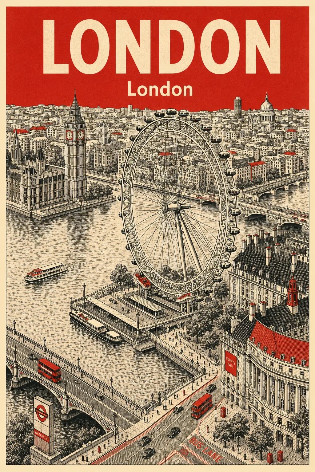
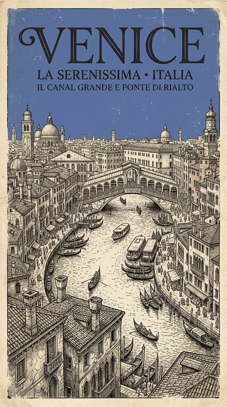
Full Prompt
Create a vertical retro archival city poster for [CITY NAME], [COUNTRY] featuring [LANDMARK]. Style should combine vintage 1950s–1960s travel posters, old geography-book illustrations, and hand-drawn architectural ink sketches. Scene must show a cinematic elevated bird’s-eye city view with dense historic buildings, narrow streets, detailed rooftops, tiny vehicles, people, and realistic urban depth. Use ultra-fine pen linework, cross-hatching, faded print textures, distressed paper grain, subtle ink bleed, worn edges, and authentic retro printing imperfections. The overall artwork should feel like a rare collectible museum-quality travel poster from another era. Color palette must remain limited to: - warm cream / aged paper base - dark charcoal or black ink linework - one single muted accent color: [COLOR] The sky should be entirely filled with a flat textured [COLOR] tone with no gradients. Small accents of [COLOR] may appear on rooftops, signs, windows, streets, water, or architectural highlights. Architecture and environment must match the real cultural identity of [CITY NAME] and [COUNTRY]. The illustration should feel historically rich, cinematic, nostalgic, intellectual, timeless, and highly detailed. Typography: Place large bold vintage serif text “[CITY NAME]” at the top. Below it place the local-language city name in smaller classic typography. Optional small subtitle: “Historic City Series” or “Travel Archive Edition” Style keywords: retro print aesthetic, archival illustration, antique atlas artwork, vintage travel advertisement, old-world atmosphere, hand-drawn architectural etching, screen-print texture, cinematic composition, timeless poster design, ultra detailed.