Case Media
Case Notes
This page keeps the media, full prompt, and original source together so you can inspect the result first and decide whether the prompt is worth copying, saving, or comparing.
Case Insights
To make this page easier to search, cite, and reuse later, the case is also broken down into practical guidance about usage, visual cues, and prompt structure.
Best Fit Scenarios
- Use this as a portrait & photography benchmark when you need a fast style baseline before rewriting your own prompt.
- It is especially helpful if your target overlaps with Portrait, Poster, Typography and you want to judge the image result before tuning wording.
- Keep it as a control sample when you compare nearby prompt variants one variable at a time.
Visual Signals To Notice
- The clearest style signals here are Portrait, Poster, Typography, so those should usually stay in your first rewrite.
- Focus on framing, light direction, pose, and the distance between subject and camera.
- This case keeps one primary output, so the first image should be treated as the main visual reference.
How The Prompt Is Structured
- The prompt reads as a long, highly specified prompt, which is useful when you want to judge how much specificity this direction needs.
- Its keyword cluster is centered on Portrait, Poster, Typography, so you can usually keep that cluster while swapping subject, camera, layout, or copy details.
- A practical rewrite path is: keep the outcome, keep the strongest style cues, then replace only the subject and environment blocks.
Good Follow-up Questions
- What changes first if you keep Portrait, Poster, Typography but switch the subject matter?
- Which part of the result comes from section-level structure (Portrait & Photography) versus tag-level style cues?
- Which related cases in the same section give you a cleaner or more extreme variation of the same direction?
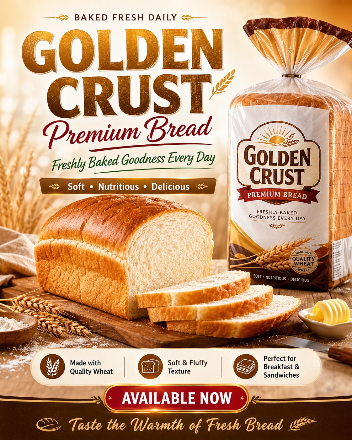
Full Prompt
Create a high-quality branded flyer design for a bread product advertisement. Make it look like a premium commercial bakery flyer with a clean, modern, appetizing layout and strong visual hierarchy. Brand name: GOLDEN CRUST Product name: Golden Crust Premium Bread Tagline: Freshly Baked Goodness Every Day Show the bread as the main hero product: a realistic golden-brown loaf of bread with a few neatly sliced pieces in front, showing soft fluffy white texture, appetizing crust, and fresh bakery quality. Place a professionally designed packaged bread bag beside or slightly behind the loaf. The packaging should look realistic, clean, premium, and fully branded with the name GOLDEN CRUST. Add supporting bakery styling details such as wheat stalks, flour dust, butter, a wooden cutting board, soft linen fabric, bakery props, and warm natural light. Keep the product as the main focus. Use a warm bakery-inspired color palette: golden brown, cream, beige, soft white, deep brown, champagne gold, with subtle red or green accent details. Background style: bright, fresh, premium bakery atmosphere, soft gradients, warm bokeh lighting, clean commercial studio composition, realistic shadows, glossy highlights, and professional food advertising finish. Flyer text layout: Top small text: BAKED FRESH DAILY Main headline: GOLDEN CRUST Subheadline: Premium Bread Tagline: Freshly Baked Goodness Every Day Short selling line: Soft • Nutritious • Delicious Feature highlights: Made with Quality Wheat Soft & Fluffy Texture Perfect for Breakfast & Sandwiches Call-to-action button: AVAILABLE NOW Footer line: Taste the Warmth of Fresh Bread Design style: premium bakery branding, realistic food photography, modern bold typography, elegant script accents, clean spacing, luxury commercial flyer, social media advertisement, print-ready layout, sharp details, appetizing colors, professional product promotion. Aspect ratio: 4:5 vertical flyer. High resolution, ultra-realistic, polished, vibrant, commercial advertising design.