Case Media
Case Notes
This page keeps the media, full prompt, and original source together so you can inspect the result first and decide whether the prompt is worth copying, saving, or comparing.
Case Insights
To make this page easier to search, cite, and reuse later, the case is also broken down into practical guidance about usage, visual cues, and prompt structure.
Best Fit Scenarios
- Use this as a portrait & photography benchmark when you need a fast style baseline before rewriting your own prompt.
- It is especially helpful if your target overlaps with Neon, Portrait, Cinematic and you want to judge the image result before tuning wording.
- Keep it as a control sample when you compare nearby prompt variants one variable at a time.
Visual Signals To Notice
- The clearest style signals here are Neon, Portrait, Cinematic, so those should usually stay in your first rewrite.
- Focus on framing, light direction, pose, and the distance between subject and camera.
- This case keeps one primary output, so the first image should be treated as the main visual reference.
How The Prompt Is Structured
- The prompt reads as a long, highly specified prompt, which is useful when you want to judge how much specificity this direction needs.
- Its keyword cluster is centered on Neon, Portrait, Cinematic, so you can usually keep that cluster while swapping subject, camera, layout, or copy details.
- A practical rewrite path is: keep the outcome, keep the strongest style cues, then replace only the subject and environment blocks.
Good Follow-up Questions
- What changes first if you keep Neon, Portrait, Cinematic but switch the subject matter?
- Which part of the result comes from section-level structure (Portrait & Photography) versus tag-level style cues?
- Which related cases in the same section give you a cleaner or more extreme variation of the same direction?
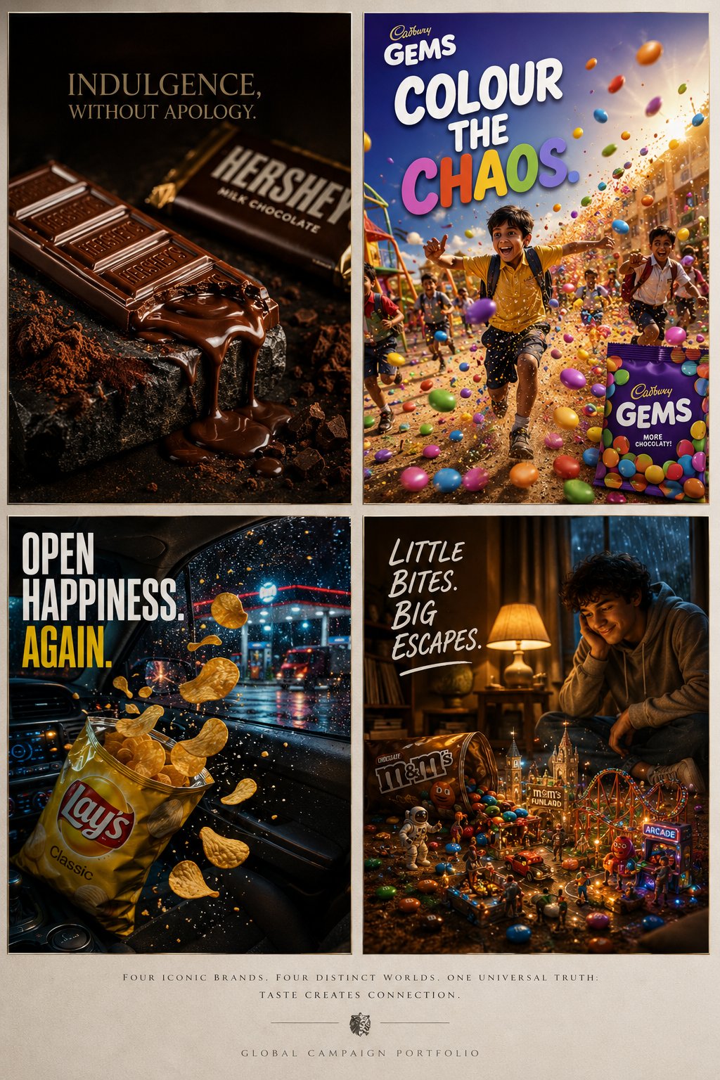
Full Prompt
Create a premium cinematic collage featuring FOUR completely separate FMCG advertising campaigns combined into one clean luxury presentation board. IMPORTANT: The composition should feel like: four independent high-budget advertisements placed together inside one elite creative-agency showcase. DO NOT make the campaigns interact with each other. DO NOT blend environments together. Instead: arrange the four ads like a luxury editorial collage with: clean spacing, magazine-style layout, subtle borders, premium negative space, sophisticated alignment, polished campaign presentation, refined editorial balance. The final result should resemble: a world-class advertising agency presenting four separate global campaigns on one board for an elite Cannes Lions pitch presentation. Each campaign must have: its own distinct lighting, unique emotional atmosphere, independent cinematic composition, separate typography system, completely different visual identity. Ultra-realistic commercial photography. Luxury print-ad realism. Global campaign quality. Internet-breaking visual polish. — TOP LEFT — HERSHEY’S A deeply indulgent luxury chocolate campaign photographed like an elite perfume advertisement. A partially melted Hershey’s chocolate bar rests on dark textured stone beside slow-flowing molten chocolate and drifting cocoa powder illuminated by soft studio spotlighting. The chocolate should feel obsessively tactile: realistic chocolate texture, embossed Hershey’s logo details, glossy melt reflections, soft cocoa dust particles, rich cinematic highlights, premium packaging reflections. Atmosphere: sensual, moody, premium indulgence, late-night luxury. Color palette: deep cocoa brown, matte black, espresso, warm amber highlights. Typography: minimal elegant serif typography: “INDULGENCE, WITHOUT APOLOGY.” — TOP RIGHT — CADBURY GEMS A wildly energetic candy campaign exploding with youthful chaos inside a colorful Indian school playground during golden-hour sunlight. Children running mid-motion while vibrant Cadbury Gems burst through the air like bouncing paint pellets. The environment: colorful playground equipment, energetic movement, flying candy trails, warm sunlight flares, playful dust particles, exaggerated motion blur. The Gems should feel physically real: glossy candy shells, vibrant saturated colors, realistic reflections, candy collisions frozen mid-air. Mood: joyful, playful, nostalgic, chaotic fun. Color palette: bright rainbow candy colors, royal purple, warm yellow sunlight, playground reds and blues. Typography: large playful rounded typography: “COLOUR THE CHAOS.” — BOTTOM LEFT — LAYS A hyper-realistic cinematic snack campaign set during a late-night road trip stop at a glowing roadside fuel station in the rain. A bag of Lay’s chips bursts open in slow motion inside a car illuminated by neon gas-station lighting while crisp golden chips fly through the air. Environment details: rain-covered car windows, cinematic dashboard glow, wet asphalt reflections, neon signage, motion blur from passing trucks, realistic salt particles floating in air. The chips should look: ultra crispy, richly textured, perfectly golden, highly detailed with seasoning dust. Mood: comfort food, late-night freedom, youthful escape, cinematic realism. Color palette: golden yellow, wet asphalt black, neon blue, deep red taillights. Typography: clean bold condensed sans-serif: “OPEN HAPPINESS. AGAIN.” — BOTTOM RIGHT — M&M’S A warm whimsical campaign inside a softly lit apartment living room during a thunderstorm night. A spilled pack of M&M’s transforms the carpet into tiny miniature fantasy worlds: tiny roller coasters, astronauts, miniature city streets, glowing arcades, toy-sized adventures, tiny cinematic landscapes built between candies.