Case Media
Case Notes
This page keeps the media, full prompt, and original source together so you can inspect the result first and decide whether the prompt is worth copying, saving, or comparing.
Case Insights
To make this page easier to search, cite, and reuse later, the case is also broken down into practical guidance about usage, visual cues, and prompt structure.
Best Fit Scenarios
- Use this as a portrait & photography benchmark when you need a fast style baseline before rewriting your own prompt.
- It is especially helpful if your target overlaps with Neon, Portrait, Cinematic and you want to judge the image result before tuning wording.
- Keep it as a control sample when you compare nearby prompt variants one variable at a time.
Visual Signals To Notice
- The clearest style signals here are Neon, Portrait, Cinematic, so those should usually stay in your first rewrite.
- Focus on framing, light direction, pose, and the distance between subject and camera.
- This case keeps one primary output, so the first image should be treated as the main visual reference.
How The Prompt Is Structured
- The prompt reads as a long, highly specified prompt, which is useful when you want to judge how much specificity this direction needs.
- Its keyword cluster is centered on Neon, Portrait, Cinematic, so you can usually keep that cluster while swapping subject, camera, layout, or copy details.
- A practical rewrite path is: keep the outcome, keep the strongest style cues, then replace only the subject and environment blocks.
Good Follow-up Questions
- What changes first if you keep Neon, Portrait, Cinematic but switch the subject matter?
- Which part of the result comes from section-level structure (Portrait & Photography) versus tag-level style cues?
- Which related cases in the same section give you a cleaner or more extreme variation of the same direction?
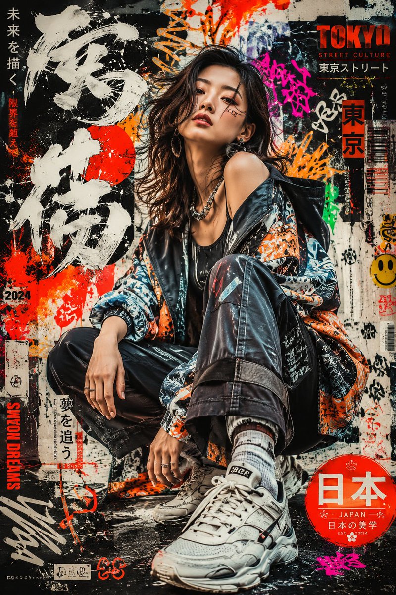
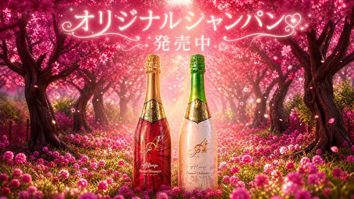
Full Prompt
Create a luxurious romantic website hero banner for a nightlife venue champagne promotion, ultra-wide 16:9 composition, set in an enchanting pink cherry-blossom forest at golden hour with a glowing sun flare at the top center, dense magenta flowers covering the ground, dark curved tree trunks forming a natural arch, drifting petals, glittering bokeh, sparkles, and a dreamy glamorous atmosphere. Center foreground shows exactly 2 champagne bottles standing side by side: the left bottle is deep ruby red with gold foil neck, ornate gold crest label, elegant monogram, and cursive brand text; the right bottle is pale blush white with subtle floral pattern, green foil neck, ornate gold crest label, elegant monogram, and cursive brand text. Add large glowing Japanese headline typography across the upper center reading {argument name="headline text" default="オリジナルシャンパン♡"}, with a second smaller line below reading {argument name="subheadline text" default="発売中"}; style the text as soft white-pink neon calligraphy with decorative swirls on both sides, small hearts, and tiny star sparkles. Use premium advertising photography mixed with fantasy digital art, high contrast, glossy reflections on glass, shallow depth of field, vibrant pink and gold color grading, cinematic lighting, clean commercial layout with the bottles perfectly centered and enough negative space behind the headline.