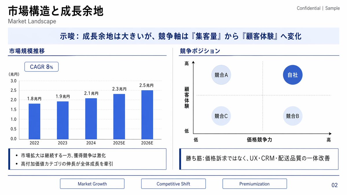
Case Media
Case Notes
This page keeps the media, full prompt, and original source together so you can inspect the result first and decide whether the prompt is worth copying, saving, or comparing.
Case Insights
To make this page easier to search, cite, and reuse later, the case is also broken down into practical guidance about usage, visual cues, and prompt structure.
Best Fit Scenarios
- Use this as a portrait & photography benchmark when you need a fast style baseline before rewriting your own prompt.
- It is especially helpful if your target overlaps with Portrait, Typography, Infographic and you want to judge the image result before tuning wording.
- Keep it as a control sample when you compare nearby prompt variants one variable at a time.
Visual Signals To Notice
- The clearest style signals here are Portrait, Typography, Infographic, so those should usually stay in your first rewrite.
- Focus on framing, light direction, pose, and the distance between subject and camera.
- This case keeps one primary output, so the first image should be treated as the main visual reference.
How The Prompt Is Structured
- The prompt reads as a long, highly specified prompt, which is useful when you want to judge how much specificity this direction needs.
- Its keyword cluster is centered on Portrait, Typography, Infographic, so you can usually keep that cluster while swapping subject, camera, layout, or copy details.
- A practical rewrite path is: keep the outcome, keep the strongest style cues, then replace only the subject and environment blocks.
Good Follow-up Questions
- What changes first if you keep Portrait, Typography, Infographic but switch the subject matter?
- Which part of the result comes from section-level structure (Portrait & Photography) versus tag-level style cues?
- Which related cases in the same section give you a cleaner or more extreme variation of the same direction?
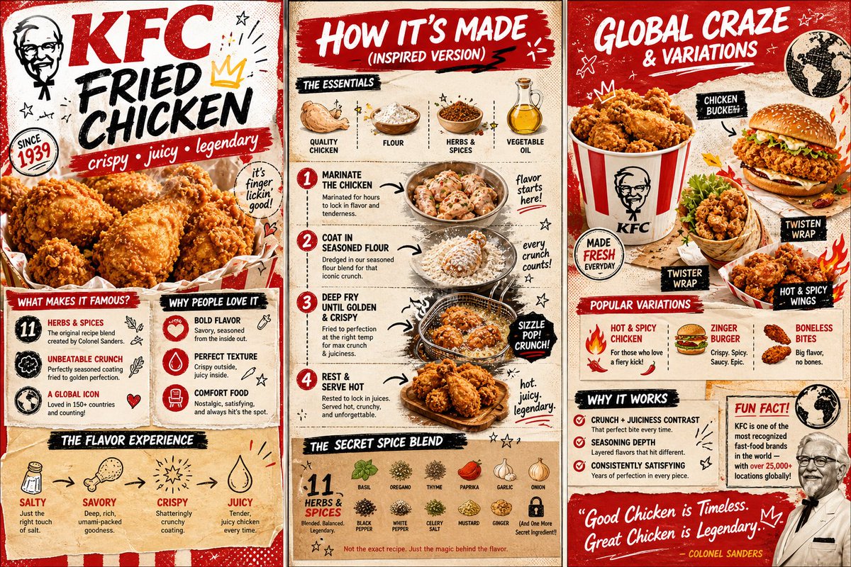
Full Prompt
Create a vibrant, colorful 3-page zine-style infographic about a famous fast-food item: “KFC Original Recipe Fried Chicken”. Style: mixed media collage combining realistic crispy fried chicken photography, bold graphic elements, halftone textures, retro fast-food ads, doodles, stickers, and playful handwritten typography. Color palette inspired by red, white, and warm golden tones. Energetic, slightly retro American fast-food vibe. Layout: Three vertical panels side-by-side (like an open zine spread). PAGE 1 (left panel): - Big bold title: “KFC Fried Chicken” - Subtitle: “crispy • juicy • legendary” - Large hero image of golden fried chicken pieces (drumsticks, wings) - Sections: • “What Makes It Famous?” (11 herbs & spices, crunch, global icon) • “Why People Love It” (flavor, texture, comfort food) • Flavor diagram (salty, savory, crispy, juicy) PAGE 2 (center panel): - Title: “How It’s Made (Inspired Version)” - Ingredients list with icons (chicken, flour, spices, oil) - Step-by-step visuals: 1. Marinate chicken 2. Coat in seasoned flour 3. Deep fry until golden crispy 4. Rest and serve hot - Add arrows, crispy texture highlights, steam effects - Include a “secret spice blend” graphic (symbolic, not exact) PAGE 3 (right panel): - Title: “Global Craze & Variations” - Visuals of fried chicken served in buckets, sandwiches, wraps - Variations (spicy chicken, chicken burger, wings) - “Why It Works” (crunch + juiciness contrast, seasoning depth) - Fun fact about global fast-food culture - Bold handwritten-style closing quote Design details: - Hand-drawn arrows, stars, flames, crunchy texture doodles - Retro stickers, paper textures, bold labels - Slight grunge texture for a street-food feel - High resolution, dynamic and playful composition Aspect ratio: wide horizontal (3-panel layout)