Case Media
Case Notes
This page keeps the media, full prompt, and original source together so you can inspect the result first and decide whether the prompt is worth copying, saving, or comparing.
Case Insights
To make this page easier to search, cite, and reuse later, the case is also broken down into practical guidance about usage, visual cues, and prompt structure.
Best Fit Scenarios
- Use this as a portrait & photography benchmark when you need a fast style baseline before rewriting your own prompt.
- It is especially helpful if your target overlaps with Neon, Portrait, Fashion and you want to judge the image result before tuning wording.
- Keep it as a control sample when you compare nearby prompt variants one variable at a time.
Visual Signals To Notice
- The clearest style signals here are Neon, Portrait, Fashion, so those should usually stay in your first rewrite.
- Focus on framing, light direction, pose, and the distance between subject and camera.
- This case keeps one primary output, so the first image should be treated as the main visual reference.
How The Prompt Is Structured
- The prompt reads as a long, highly specified prompt, which is useful when you want to judge how much specificity this direction needs.
- Its keyword cluster is centered on Neon, Portrait, Fashion, so you can usually keep that cluster while swapping subject, camera, layout, or copy details.
- A practical rewrite path is: keep the outcome, keep the strongest style cues, then replace only the subject and environment blocks.
Good Follow-up Questions
- What changes first if you keep Neon, Portrait, Fashion but switch the subject matter?
- Which part of the result comes from section-level structure (Portrait & Photography) versus tag-level style cues?
- Which related cases in the same section give you a cleaner or more extreme variation of the same direction?
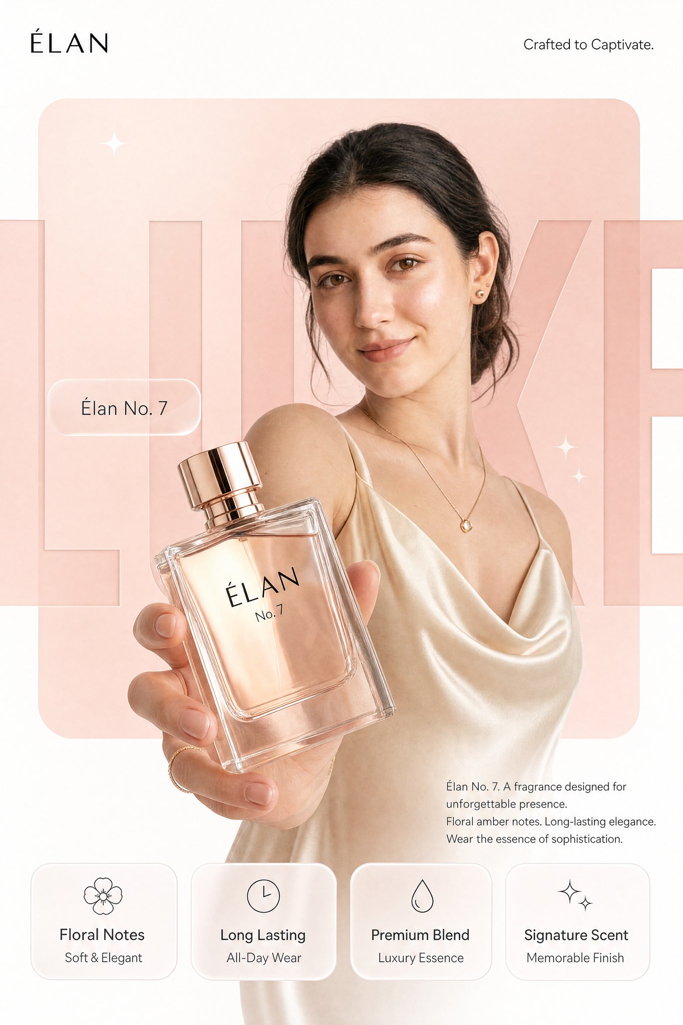
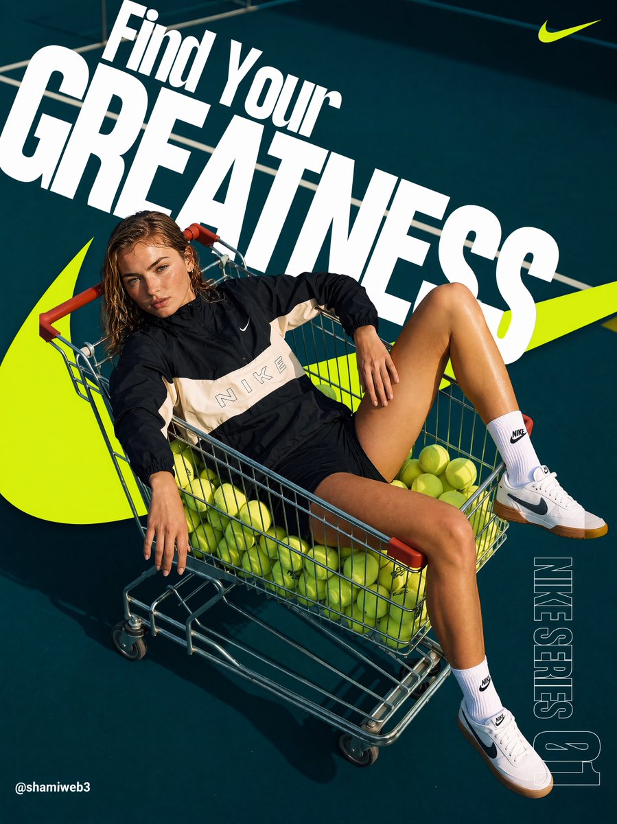
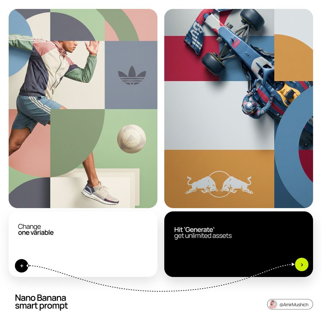
Full Prompt
[BRAND NAME]. You are a world-class editorial designer. STEP 1, DYNAMIC SUBJECT LOGIC: - Subject pick: independently study [BRAND NAME] and choose the right hero subject. - Sandwich layering: weave the subject through the background shapes. Parts of the car or figure must sit hidden behind geometric blocks, while other parts (wheels, limbs, props) overlap in front of those blocks to fake real 3D depth. STEP 2, GRID & GEOMETRY: - Layout: a clean 2x2 grid composition. - Overlays: drop large bold geometric arcs and circles on top of the grid. - Visual balance: place one iconic product prop (a floating key fob for cars, a ball for sports, etc.) in its own quadrant to counterweight the subject. STEP 3, SOPHISTICATED MUTED PALETTE: - No aggressive neon, no oversaturated colors. - Pull [BRAND NAME]'s core colors and shift them into a "sophisticated muted" range. Use desaturated, earthy, dusty versions of the brand colors (dusty rose instead of hot pink, sage green instead of bright mint, slate blue instead of royal blue). - Finish: matte flat color blocks, zero gradients. STEP 4, PHOTOGRAPHY & LIGHTING: - Subject style: high-end commercial studio photography. - Lighting: soft diffused studio light, gentle highlights, no harsh shadows. - Integration: the subject must feel physically embedded into the graphic grid. STEP 5, MINIMALIST BRANDING: - Drop a clean single-color [BRAND NAME] logo dead-center on one background block. No tagline, just the iconic symbol.