Case Media
Case Notes
This page keeps the media, full prompt, and original source together so you can inspect the result first and decide whether the prompt is worth copying, saving, or comparing.
Case Insights
To make this page easier to search, cite, and reuse later, the case is also broken down into practical guidance about usage, visual cues, and prompt structure.
Best Fit Scenarios
- Use this as a model & community benchmark when you need a fast style baseline before rewriting your own prompt.
- It is especially helpful if your target overlaps with Cinematic, Poster, Character and you want to judge the image result before tuning wording.
- Keep it as a control sample when you compare nearby prompt variants one variable at a time.
Visual Signals To Notice
- The clearest style signals here are Cinematic, Poster, Character, so those should usually stay in your first rewrite.
- This kind of case is strongest when you watch deltas: what changed, what broke, and which prompt choice caused that shift.
- This case keeps one primary output, so the first image should be treated as the main visual reference.
How The Prompt Is Structured
- The prompt reads as a long, highly specified prompt, which is useful when you want to judge how much specificity this direction needs.
- Its keyword cluster is centered on Cinematic, Poster, Character, so you can usually keep that cluster while swapping subject, camera, layout, or copy details.
- A practical rewrite path is: keep the outcome, keep the strongest style cues, then replace only the subject and environment blocks.
Good Follow-up Questions
- What changes first if you keep Cinematic, Poster, Character but switch the subject matter?
- Which part of the result comes from section-level structure (Model & Community) versus tag-level style cues?
- Which related cases in the same section give you a cleaner or more extreme variation of the same direction?
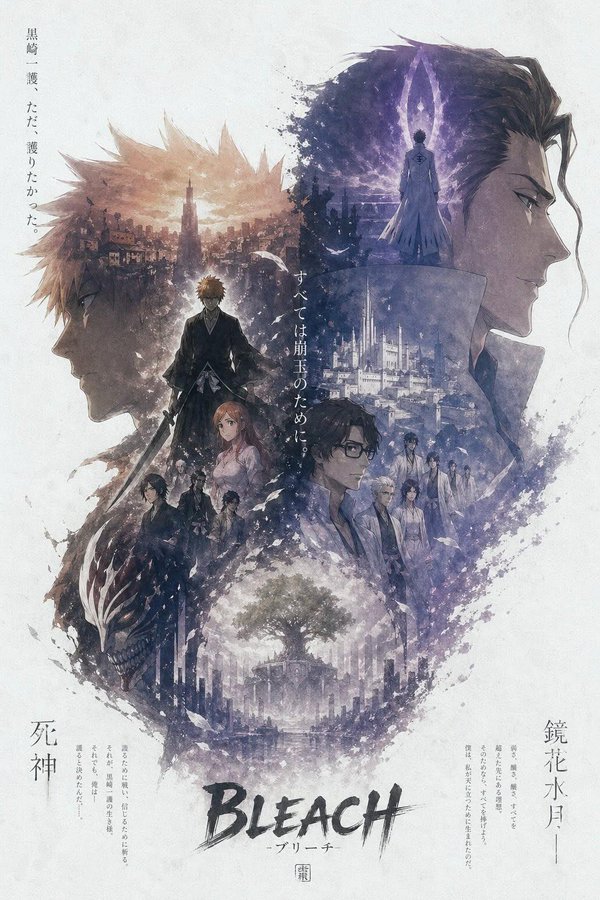
Full Prompt
A premium anime-style cinematic character poster in vertical 9:16 composition, inspired by Japanese key visuals and double-exposure storytelling. Top section: two large opposing side-profile faces of the main characters (left and right), highly detailed, soft expression, forming a dominant silhouette composition. Their hair and outlines dissolve into ink, dust, and particles. Center: a full-body character standing confidently (hero pose), slightly below center, acting as the visual anchor. Outfit detailed, dramatic lighting, subtle glow. Inside the large silhouettes: intricate double-exposure collage showing multiple scenes — cityscapes, battlefields, architecture, symbolic environments, supporting characters, and emotional story moments. Blend everything seamlessly using fog, ink wash, smoke, and layered transparency. Mid-lower section: secondary characters arranged in cinematic grouping, dynamic poses, depth layering, slightly faded into atmosphere. Bottom: a symbolic landscape (tree, ruins, or city) emerging from mist, adding depth and narrative closure. Style: Japanese ink wash + watercolor texture + soft grain + cinematic anime rendering Muted color palette (beige, sepia, gray, soft blue tones) High detail but soft edges Paper texture background with large negative space Edges dissolving into ink splatter and dust Composition: Strong vertical flow guiding eye from top → center → bottom Balanced symmetry left vs right Clean, minimal, high-end poster design Lighting: Soft diffused lighting, subtle glow highlights, atmospheric haze Typography (optional): Minimal Japanese vertical text on sides Small cinematic title at bottom center Quality: Ultra-detailed, 4K, sharp focus, cinematic depth, masterpiece