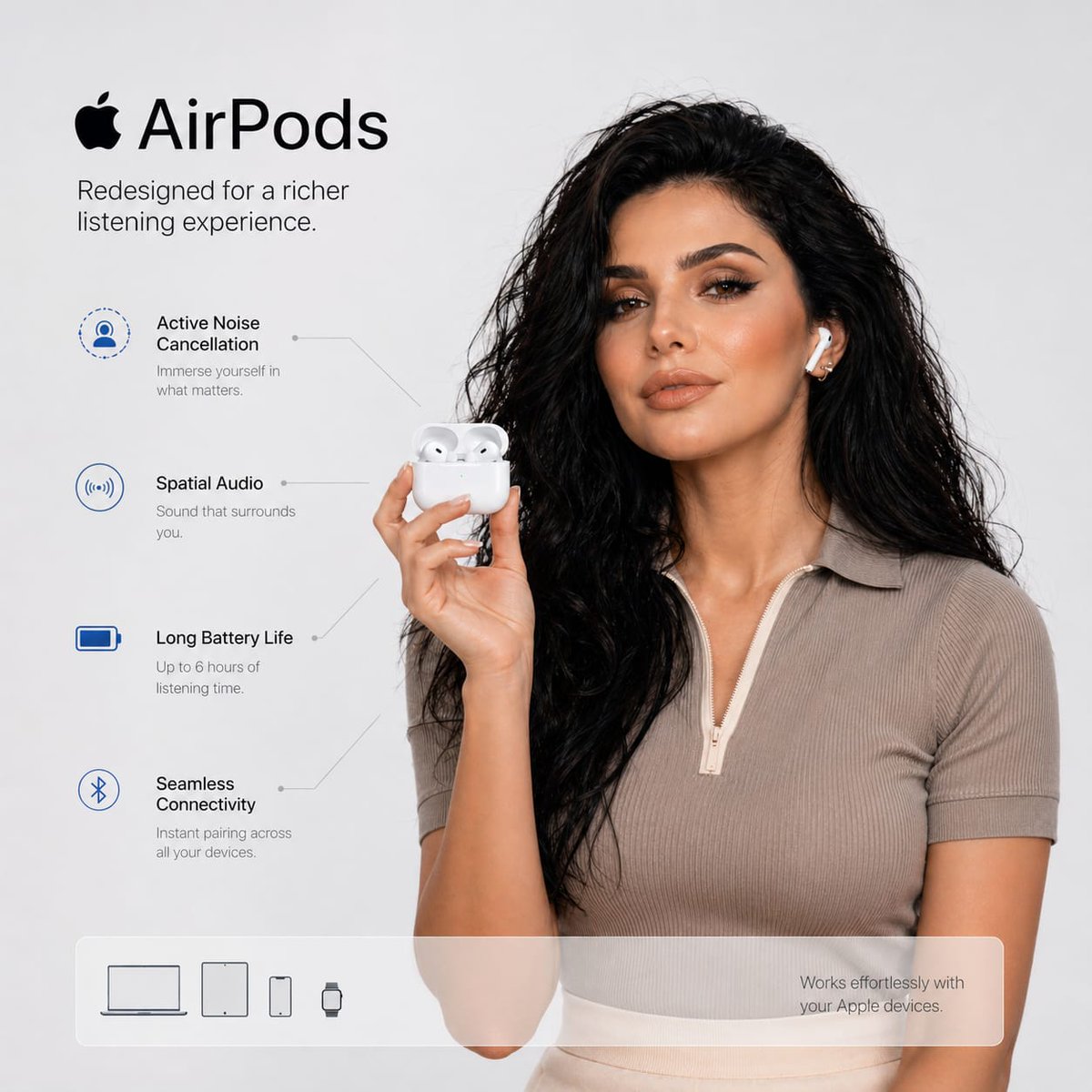
Case Media
Case Notes
This page keeps the media, full prompt, and original source together so you can inspect the result first and decide whether the prompt is worth copying, saving, or comparing.
Case Insights
To make this page easier to search, cite, and reuse later, the case is also broken down into practical guidance about usage, visual cues, and prompt structure.
Best Fit Scenarios
- Use this as a model & community benchmark when you need a fast style baseline before rewriting your own prompt.
- It is especially helpful if your target overlaps with Portrait, Minimal, Typography and you want to judge the image result before tuning wording.
- Keep it as a control sample when you compare nearby prompt variants one variable at a time.
Visual Signals To Notice
- The clearest style signals here are Portrait, Minimal, Typography, so those should usually stay in your first rewrite.
- This kind of case is strongest when you watch deltas: what changed, what broke, and which prompt choice caused that shift.
- This case keeps one primary output, so the first image should be treated as the main visual reference.
How The Prompt Is Structured
- The prompt reads as a long, highly specified prompt, which is useful when you want to judge how much specificity this direction needs.
- Its keyword cluster is centered on Portrait, Minimal, Typography, so you can usually keep that cluster while swapping subject, camera, layout, or copy details.
- A practical rewrite path is: keep the outcome, keep the strongest style cues, then replace only the subject and environment blocks.
Good Follow-up Questions
- What changes first if you keep Portrait, Minimal, Typography but switch the subject matter?
- Which part of the result comes from section-level structure (Model & Community) versus tag-level style cues?
- Which related cases in the same section give you a cleaner or more extreme variation of the same direction?
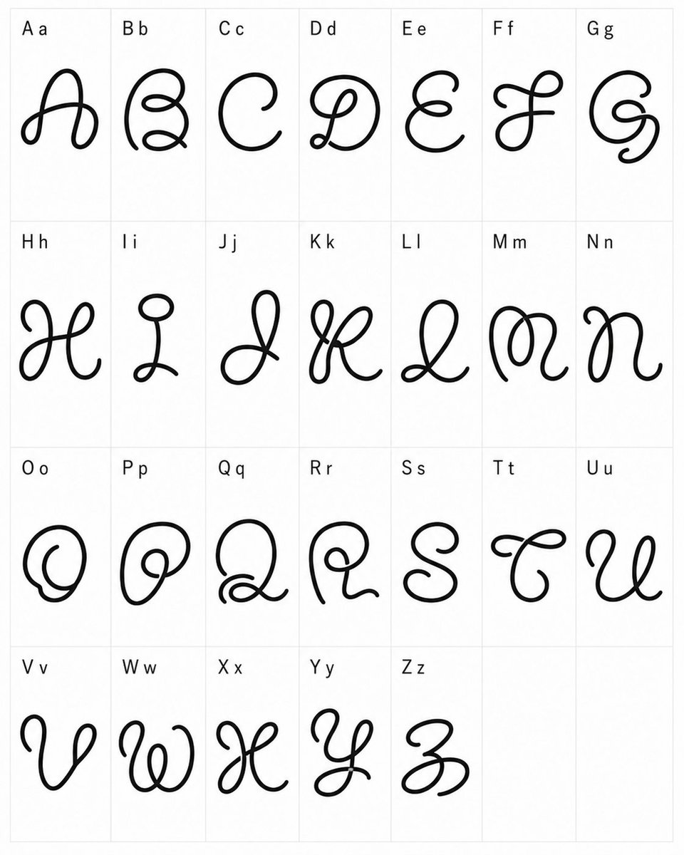
Full Prompt
{"type":"typographic specimen sheet","style":"experimental whimsical cursive font design, black monoline looping glyphs, clean minimal presentation","canvas":{"orientation":"portrait","background":"white","grid":"light gray thin-line table with 4 rows and 7 columns, last two cells empty"},"content":{"title":"custom alphabet font test","alphabet_count":26,"labels":["A a","B b","C c","D d","E e","F f","G g","H h","I i","J j","K k","L l","M m","N n","O o","P p","Q q","R r","S s","T t","U u","V v","W w","X x","Y y","Z z"],"empty_cells_count":2},"layout":{"cell_count":28,"filled_cells":26,"rows":[{"row":1,"count":7,"labels":["A a","B b","C c","D d","E e","F f","G g"]},{"row":2,"count":7,"labels":["H h","I i","J j","K k","L l","M m","N n"]},{"row":3,"count":7,"labels":["O o","P p","Q q","R r","S s","T t","U u"]},{"row":4,"count":5,"labels":["V v","W w","X x","Y y","Z z"],"empty_cells":2}]},"glyph_design":{"line_color":"{argument name=\"line color\" default=\"black\"}","stroke":"thick smooth rounded monoline, hand-drawn vector-like ink","font_mood":"{argument name=\"font mood\" default=\"strange playful cursive\"}","forms":"each capital letter is redesigned as a large decorative looping script symbol with curls, knots, spirals, and exaggerated swashes; lowercase appears only as a small printed reference next to the capital in the label","label_style":"small plain sans-serif black text at the upper-left of each cell"},"composition":"Place one oversized decorative glyph centered in each filled cell, with generous white space and consistent scale. Keep the sheet flat, front-facing, evenly lit, no shadows, no texture, no perspective distortion.","custom_text":"{argument name=\"alphabet labels\" default=\"A a, B b, C c, D d, E e, F f, G g, H h, I i, J j, K k, L l, M m, N n, O o, P p, Q q, R r, S s, T t, U u, V v, W w, X x, Y y, Z z\"}"}