Case Media
Case Notes
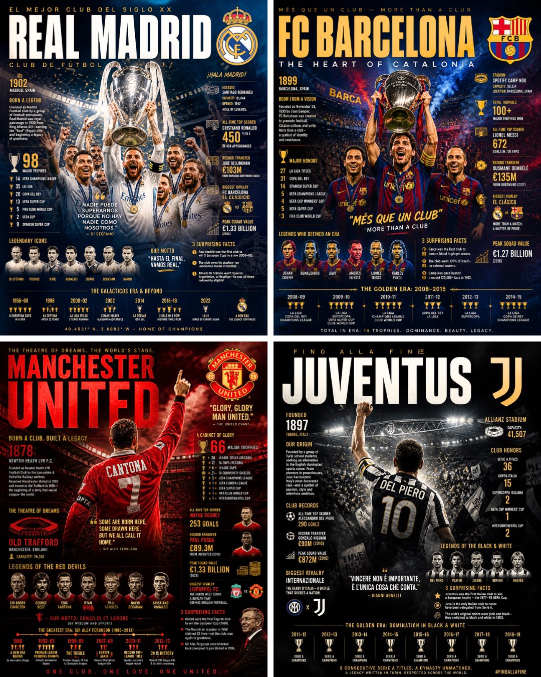
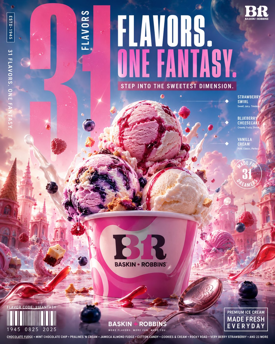
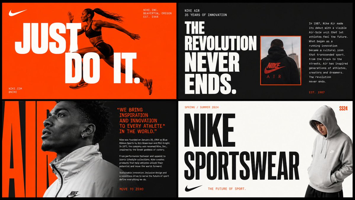
This page keeps the media, full prompt, and original source together so you can inspect the result first and decide whether the prompt is worth copying, saving, or comparing.
Case Insights
To make this page easier to search, cite, and reuse later, the case is also broken down into practical guidance about usage, visual cues, and prompt structure.
Best Fit Scenarios
- Use this as a model & community benchmark when you need a fast style baseline before rewriting your own prompt.
- It is especially helpful if your target overlaps with Cinematic, Fashion, Poster and you want to judge the image result before tuning wording.
- Keep it as a control sample when you compare nearby prompt variants one variable at a time.
Visual Signals To Notice
- The clearest style signals here are Cinematic, Fashion, Poster, so those should usually stay in your first rewrite.
- This kind of case is strongest when you watch deltas: what changed, what broke, and which prompt choice caused that shift.
- This case keeps 2 media outputs, which makes it easier to check whether the style remains stable across multiple results.
How The Prompt Is Structured
- The prompt reads as a long, highly specified prompt, which is useful when you want to judge how much specificity this direction needs.
- Its keyword cluster is centered on Cinematic, Fashion, Poster, so you can usually keep that cluster while swapping subject, camera, layout, or copy details.
- A practical rewrite path is: keep the outcome, keep the strongest style cues, then replace only the subject and environment blocks.
Good Follow-up Questions
- What changes first if you keep Cinematic, Fashion, Poster but switch the subject matter?
- Which part of the result comes from section-level structure (Model & Community) versus tag-level style cues?
- Which related cases in the same section give you a cleaner or more extreme variation of the same direction?
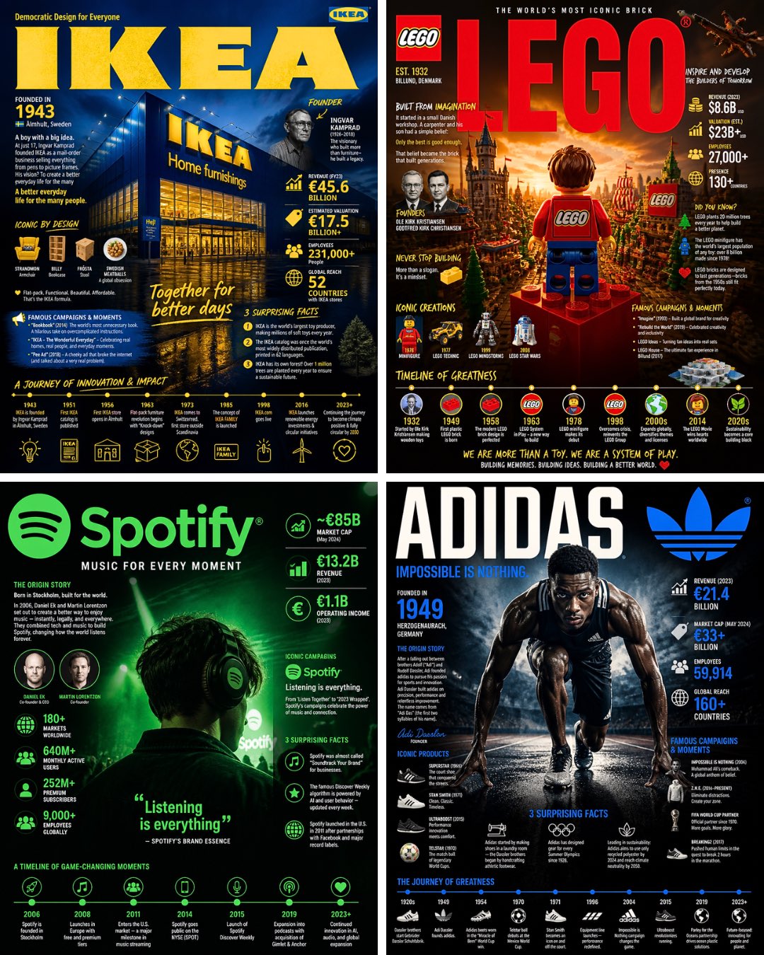
Full Prompt
“Search the web for detailed information about [BRAND] including their founding story, history, key milestones, revenue and valuation, iconic products or achievements, famous campaigns, notable partnerships, controversies, and surprising lesser-known facts. Then create a dramatic editorial infographic poster about [BRAND] in the style of a National Geographic feature — but for iconic brands. The most powerful and recognizable image associated with [BRAND] is the full-bleed atmospheric hero filling the entire poster top to bottom, dramatically lit and color-graded in [BRAND]’s official colors and visual identity. Oversized bold typography with [BRAND]’s name dominates the upper portion in a font matching the brand’s personality and prestige. Text and graphic panels float naturally over the image as editorial overlays — not boxed magazine layouts. Include: founding year and origin story, founder names, current valuation and revenue, iconic products or achievements timeline, most famous campaigns or moments, global reach and employee count, brand motto or slogan, and 3 surprising lesser-known facts. A timeline of the brand’s greatest milestones along the bottom. Color palette and mood drawn entirely from [BRAND]’s official colors and identity — let [BRAND] dictate everything. No white background, no magazine grid, no boxed sections. Everything layered organically over the full-bleed hero image. Aspect ratio 4:5. Dense, tactile, cinematic, unmistakably that brand.”