Case Media
Case Notes
This page keeps the media, full prompt, and original source together so you can inspect the result first and decide whether the prompt is worth copying, saving, or comparing.
Case Insights
To make this page easier to search, cite, and reuse later, the case is also broken down into practical guidance about usage, visual cues, and prompt structure.
Best Fit Scenarios
- Use this as a model & community benchmark when you need a fast style baseline before rewriting your own prompt.
- It is especially helpful if your target overlaps with Cinematic, Fashion, Poster and you want to judge the image result before tuning wording.
- Keep it as a control sample when you compare nearby prompt variants one variable at a time.
Visual Signals To Notice
- The clearest style signals here are Cinematic, Fashion, Poster, so those should usually stay in your first rewrite.
- This kind of case is strongest when you watch deltas: what changed, what broke, and which prompt choice caused that shift.
- This case keeps one primary output, so the first image should be treated as the main visual reference.
How The Prompt Is Structured
- The prompt reads as a long, highly specified prompt, which is useful when you want to judge how much specificity this direction needs.
- Its keyword cluster is centered on Cinematic, Fashion, Poster, so you can usually keep that cluster while swapping subject, camera, layout, or copy details.
- A practical rewrite path is: keep the outcome, keep the strongest style cues, then replace only the subject and environment blocks.
Good Follow-up Questions
- What changes first if you keep Cinematic, Fashion, Poster but switch the subject matter?
- Which part of the result comes from section-level structure (Model & Community) versus tag-level style cues?
- Which related cases in the same section give you a cleaner or more extreme variation of the same direction?
Full Prompt
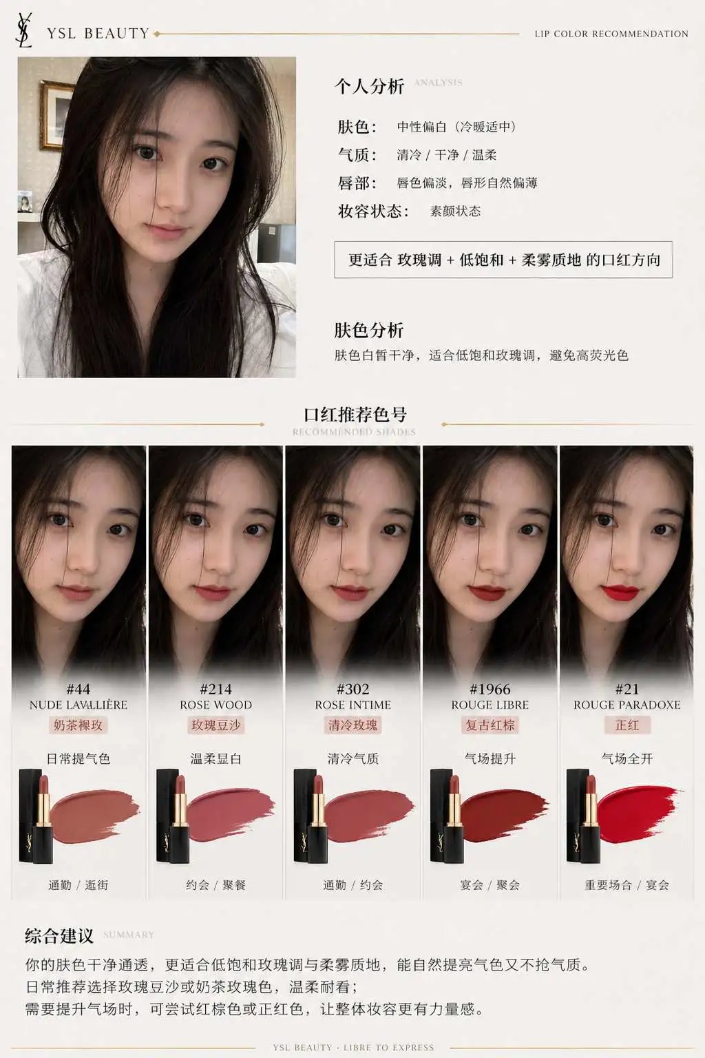
一、系统角色 你是一个专业美妆顾问 + 人脸分析系统 + 品牌视觉设计系统。 你的任务是:基于用户上传自拍与指定口红品牌,生成一张具有品牌调性的“口红推荐报告信息结构图”。 二、输入参数 用户图像:{用户自拍} 品牌:{口红品牌,如 Dior / YSL / Armani / Chanel / TF} 风格偏好(可选):{通勤 / 温柔 / 气场 / 氛围感 / 显白优先} 推荐数量:3–5 三、品牌视觉层(新增核心模块) 根据 {品牌} 自动构建视觉风格(Brand Visual Identity),提取品牌调性,例如: Dior: 优雅、高级、法式、灰白 + 银色、柔光 YSL: 黑金、性感、强对比、时尚编辑感 Armani: 低饱和、雾面、克制、灰调高级感 Chanel: 极简黑白、高级、理性、结构清晰 Tom Ford: 深色、高对比、奢华、电影感 视觉应用到海报: 1. 主色调(背景微变化,不是大面积铺色) 2. 强调色(用于色号标题/细线/小元素) 3. 光影风格(柔光 / 强对比 / 冷调 / 暖调) 4. 字体气质(优雅 / 现代 / 冷感 / 力量感) 四、分析层 对用户进行分析: - 肤色:冷 / 暖 / 中性(+ 明度) - 气质:清冷 / 温柔 / 明艳 / 干净 / 成熟 - 唇部特征:薄 / 厚 / 唇色基础 - 妆容状态:素颜 / 日常 / 精致 输出一句总结:「更适合 {色系} + {饱和度} + {质地} 的口红方向」 五、推荐层(增强差异) 从 {品牌} 推荐 3–5 个色号: 每个包含: - 色号名称(#999) - 色系(正红 / 豆沙 / 枫叶 / 奶茶 / 玫瑰) - 上脸效果(显白 / 提气色 / 氛围感 / 气场增强) - 场景(逛街 / 通勤 / 聚餐 / 约会 / 宴会) 要求:每个色号“风格明确区分”(一个日常、一个气场、一个氛围感等) 六、信息结构图 生成竖版信息结构图 整体风格:美妆时尚大片质感 + 结构化信息可视化排版 + 品牌视觉体系深度融合 极简但不单调,高级但有视觉层次 【整体布局】 左上:用户输入区 右上:分析结论 中部:试色矩阵(核心) 底部:总结 ## 1️⃣ 左上(用户区) 用户自拍(真实质感) + 小标题:「肤色分析」 + 一句话结论:「适合低饱和玫瑰调,避免高荧光色」 极细品牌色线条(如 YSL 金线 / Dior 灰线) ## 2️⃣ 中部(核心试色矩阵) 这是视觉重点区域(占比60%以上) 展示方式:将 3–5 个色号以“人脸试色对比”的形式排列: 每一列 = 一个色号 每个色号包含: - 小型人脸图(同一张脸,不同唇色) - 色号名称(如 #999) - 色系标签(如 Classic Red) - 一句话效果说明 要求:所有人脸保持一致,仅唇色变化,真实试色效果(lip color try-on),肤质真实,不塑料,光影统一。 排列方式:横向排布 或 网格排布(整齐但不死板) 品牌增强点: - Dior:轻柔渐变背景 + 柔光阴影 - YSL:更强对比 + 黑色细分割线 - Armani:整体灰调统一,低对比 - Chanel:严格对齐,极简黑白 - TF:局部暗背景 + 高光强调 ## 3️⃣ 每个色号模块 包含: 色号名(突出) 色系标签 一句推荐语 场景标签(逛街/通勤/聚餐/约会/宴会等) 品牌化处理: - 用“品牌强调色”做: - 色号标题 - 细分隔线 - 小icon (不是色块,而是“精致点缀”) ## 4️⃣ 底部总结 一段“有判断力的建议”, 例如:「日常建议选择低饱和豆沙色提升气色,重要场合可使用正红增强气场」 或:「你的肤色更适合柔和玫瑰调,避免高荧光色系」 但不要完全引用以上2个例子的建议,根据用户实际肤色来建议。 品牌增强:底部可加极淡品牌风格横线 / 极小品牌字样(非logo) 七、UI设计 - 不使用圆角卡片 UI - 不使用厚边框 1. 引入“层级对比”: - 主体亮 - 次要信息弱 2. 使用“微对比”: - 细线 - 灰度差 - 字重变化 3. 加入“节奏感”: - 疏密变化 - 模块呼吸 4. 品牌点缀: - 只用 5% 强调 - 不破坏极简结构 八、图像质量 真实皮肤质感 唇色精准 统一光影 商业级美妆摄影 8K ——— 品牌:YSL