Case Media
Case Notes
This page keeps the media, full prompt, and original source together so you can inspect the result first and decide whether the prompt is worth copying, saving, or comparing.
Case Insights
To make this page easier to search, cite, and reuse later, the case is also broken down into practical guidance about usage, visual cues, and prompt structure.
Best Fit Scenarios
- Use this as a model & community benchmark when you need a fast style baseline before rewriting your own prompt.
- It is especially helpful if your target overlaps with Fashion, Poster, Illustration and you want to judge the image result before tuning wording.
- Keep it as a control sample when you compare nearby prompt variants one variable at a time.
Visual Signals To Notice
- The clearest style signals here are Fashion, Poster, Illustration, so those should usually stay in your first rewrite.
- This kind of case is strongest when you watch deltas: what changed, what broke, and which prompt choice caused that shift.
- This case keeps one primary output, so the first image should be treated as the main visual reference.
How The Prompt Is Structured
- The prompt reads as a long, highly specified prompt, which is useful when you want to judge how much specificity this direction needs.
- Its keyword cluster is centered on Fashion, Poster, Illustration, so you can usually keep that cluster while swapping subject, camera, layout, or copy details.
- A practical rewrite path is: keep the outcome, keep the strongest style cues, then replace only the subject and environment blocks.
Good Follow-up Questions
- What changes first if you keep Fashion, Poster, Illustration but switch the subject matter?
- Which part of the result comes from section-level structure (Model & Community) versus tag-level style cues?
- Which related cases in the same section give you a cleaner or more extreme variation of the same direction?
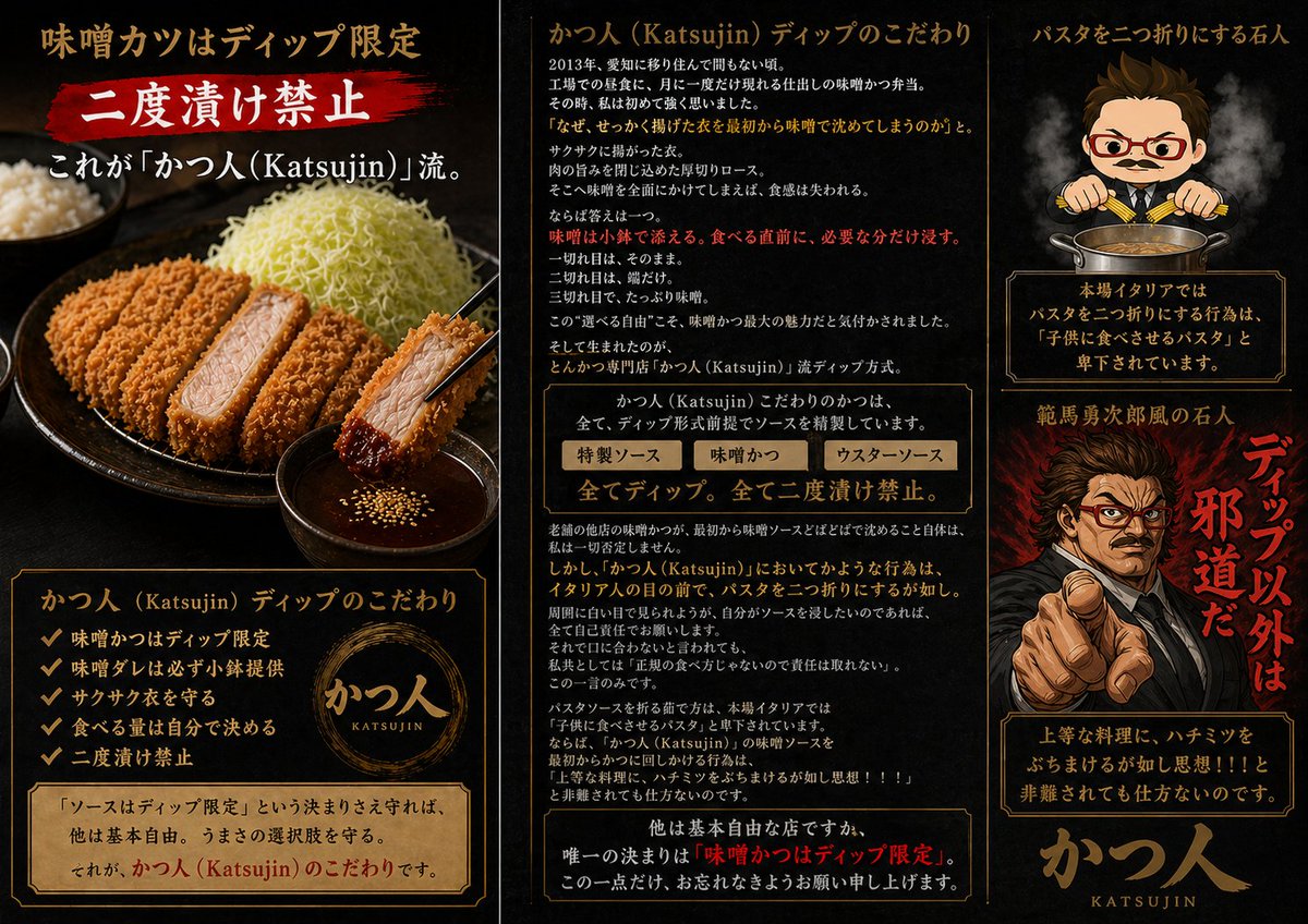
Full Prompt
Goal: Create a dramatic Japanese promotional infographic poster for a highly opinionated tonkatsu specialty restaurant, {argument name="restaurant name" default="かつ人 (Katsujin)"}, focused on the rule that miso katsu sauce is dip-only and double-dipping is forbidden. Canvas: Wide horizontal 16:9 poster divided into three vertical panels by thin antique-gold borders. Use a black charcoal background with smoky texture, dark red brush accents, warm gold typography, and premium izakaya/ramen-shop menu aesthetics. Overall mood: intense, masculine, theatrical, slightly satirical. Left panel: Show a realistic close-up food photo style scene: a black ceramic plate with sliced golden-brown tonkatsu, one piece held by black chopsticks and dipped into a small bowl of dark miso sauce with sesame seeds. Include shredded cabbage piled high and a bowl of rice in the background. At the top, large Japanese headline text: 「味噌カツはディップ限定」. Under it, a red paint-stroke banner with big white text: 「二度漬け禁止」. Add a subtitle: 「これが『かつ人(Katsujin)』流。」. At the bottom, place a framed information box titled 「かつ人(Katsujin)ディップのこだわり」 with exactly 5 checkmark bullet points: 「味噌かつはディップ限定」, 「味噌ダレは必ず小鉢提供」, 「サクサク衣を守る」, 「食べる量は自分で決める」, 「二度漬け禁止」. Include a circular gold brush logo reading 「かつ人 KATSUJIN」 and a parchment note: 「『ソースはディップ限定』という決まりさえ守れば、他は基本自由。うまさの選択肢を守る。それが、かつ人(Katsujin)のこだわりです。」 Center panel: Create a text-heavy editorial explanation column. Header: 「かつ人(Katsujin)ディップのこだわり」. Add multiple short Japanese paragraphs explaining the origin of the dip rule, with key emphasis lines in red. Include a boxed comparison strip with exactly 3 labeled sauce choices: 「特製ソース」, 「味噌かつ」, 「ウスターソース」. Beneath it, add a bold central rule line: 「全てディップ。全て二度漬け禁止。」. Continue with dense explanatory Japanese copy about preserving crisp breading, choosing sauce quantity, and respecting restaurant etiquette. End with a framed bottom warning emphasizing: 「唯一の決まりは『味噌かつはディップ限定』。」 Keep the text visually plausible and neatly typeset, but prioritize legibility of major headings and rules. Right panel: Top section shows a chibi-style stern chef mascot with short brown hair, red glasses, small mustache, suit-like chef outfit, and chopsticks held over a pot of sauce, with steam rising. Header text above: 「パスタを二つ折りにする石人」. Below the mascot, add a framed warning box: 「本場イタリアではパスタを二つ折りにする行為は『子供に食べさせるパスタ』と卑下されています。」. Middle section shows a dramatic manga-style angry man pointing directly at the viewer, black suit, fiery red smoky background, intense expression; place a simple rectangular censor blur over the center of the face. Add large vertical red brush text beside him: 「ディップ以外は邪道だ」 and a smaller title above: 「範馬勇次郎風の石人」. Bottom section contains another framed quote box: 「上等な料理に、ハチミツをぶちまけるが如し思想!!と非難されても仕方ないのです。」. Finish with a large gold calligraphy-style logo at the bottom: 「かつ人」 with small roman letters 「KATSUJIN」. Visual style: Photorealistic food on the left, dense Japanese magazine-ad typography in the center, anime/chibi and manga caricature elements on the right. Use gold borders, parchment panels, red brush callouts, smoky lighting, high contrast, and appetizing tonkatsu texture. Make it look like a premium restaurant introduction image with intentionally strong opinions. Constraints: Use exactly 3 main vertical panels, exactly 5 checkmark bullets in the left-panel list, exactly 3 sauce labels in the center comparison strip, and exactly 2 character illustrations on the right. Do not add watermarks or social media UI.