Case Media

Case Notes
This page keeps the media, full prompt, and original source together so you can inspect the result first and decide whether the prompt is worth copying, saving, or comparing.
Case Insights
To make this page easier to search, cite, and reuse later, the case is also broken down into practical guidance about usage, visual cues, and prompt structure.
Best Fit Scenarios
- Use this as a model & community benchmark when you need a fast style baseline before rewriting your own prompt.
- It is especially helpful if your target overlaps with 35mm, Cinematic, Poster and you want to judge the image result before tuning wording.
- Keep it as a control sample when you compare nearby prompt variants one variable at a time.
Visual Signals To Notice
- The clearest style signals here are 35mm, Cinematic, Poster, so those should usually stay in your first rewrite.
- This kind of case is strongest when you watch deltas: what changed, what broke, and which prompt choice caused that shift.
- This case keeps one primary output, so the first image should be treated as the main visual reference.
How The Prompt Is Structured
- The prompt reads as a long, highly specified prompt, which is useful when you want to judge how much specificity this direction needs.
- Its keyword cluster is centered on 35mm, Cinematic, Poster, so you can usually keep that cluster while swapping subject, camera, layout, or copy details.
- A practical rewrite path is: keep the outcome, keep the strongest style cues, then replace only the subject and environment blocks.
Good Follow-up Questions
- What changes first if you keep 35mm, Cinematic, Poster but switch the subject matter?
- Which part of the result comes from section-level structure (Model & Community) versus tag-level style cues?
- Which related cases in the same section give you a cleaner or more extreme variation of the same direction?
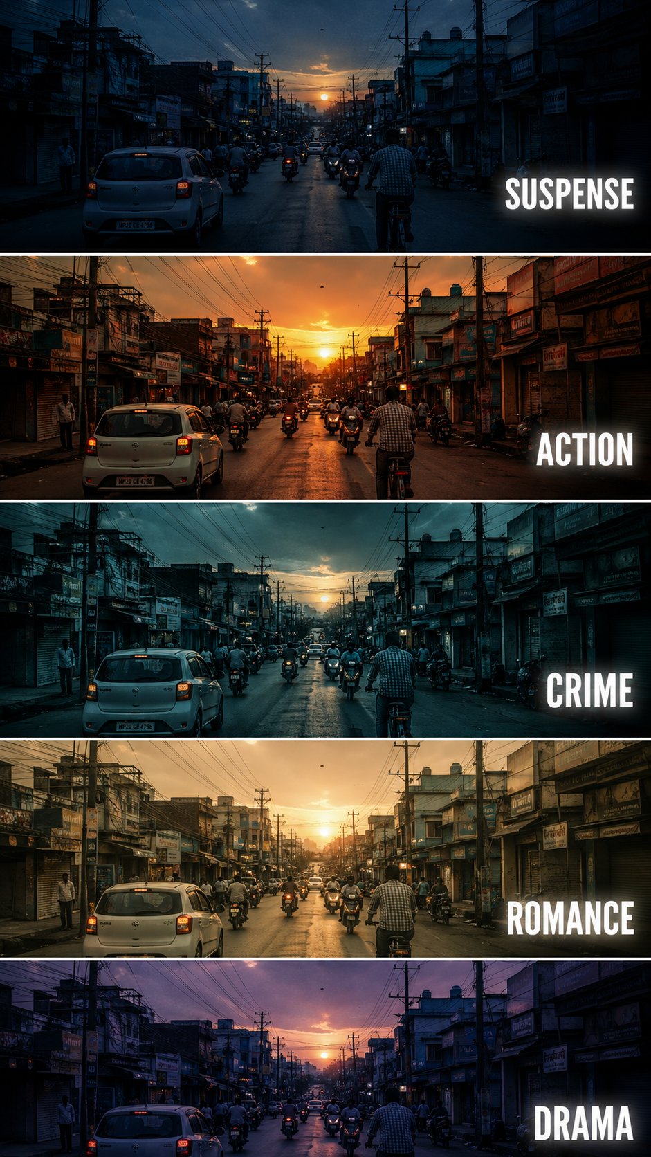
Full Prompt
Create a {argument name="aspect" default="vertical"} cinematic tutorial comparison poster showing the same {argument name="subject" default="urban street scene"} repeated in five horizontal panels, each panel demonstrating a different film genre color grading style. The scene is a busy small city street at sunset, with cars, motorcycles, cyclists, shop buildings, electric poles, tangled overhead wires, and warm evening sky. Keep the camera angle exactly the same in every panel, like a fixed street photography shot. Each horizontal strip should have a different cinematic mood and color tone: Panel 1: SUSPENSE - cool blue shadows, dark contrast, slightly mysterious atmosphere, tense and moody lighting. Panel 2: ACTION - warm orange sunset tone, high contrast, energetic cinematic look, dramatic highlights. Panel 3: CRIME - cold teal blue grading, darker exposure, gritty urban feeling, realistic shadows. Panel 4: ROMANCE - soft golden warm tone, gentle contrast, nostalgic sunset mood, dreamy atmosphere. Panel 5: DRAMA - muted purple blue evening tone, emotional cinematic lighting, soft shadows and serious mood. Add bold white uppercase text on the right side of each panel: SUSPENSE, ACTION, CRIME, ROMANCE, DRAMA. Use clean modern sans serif typography with slight glow or subtle shadow. Separate each panel with thin white horizontal borders. Make it look like a professional filmmaking color grading tutorial thumbnail, cinematic, realistic, high detail, urban street photography, 9:16 vertical composition. Negative Prompt: cartoon, anime, painting, low quality, blurry, distorted buildings, extra text, wrong spelling, messy typography, overexposed, unrealistic colors, duplicated cars, warped street, bad perspective, random objects, low resolution, watermark