Case Media
Case Notes
This page keeps the media, full prompt, and original source together so you can inspect the result first and decide whether the prompt is worth copying, saving, or comparing.
Case Insights
To make this page easier to search, cite, and reuse later, the case is also broken down into practical guidance about usage, visual cues, and prompt structure.
Best Fit Scenarios
- Use this as a model & community benchmark when you need a fast style baseline before rewriting your own prompt.
- It is especially helpful if your target overlaps with Poster, Illustration, Screenshot and you want to judge the image result before tuning wording.
- Keep it as a control sample when you compare nearby prompt variants one variable at a time.
Visual Signals To Notice
- The clearest style signals here are Poster, Illustration, Screenshot, so those should usually stay in your first rewrite.
- This kind of case is strongest when you watch deltas: what changed, what broke, and which prompt choice caused that shift.
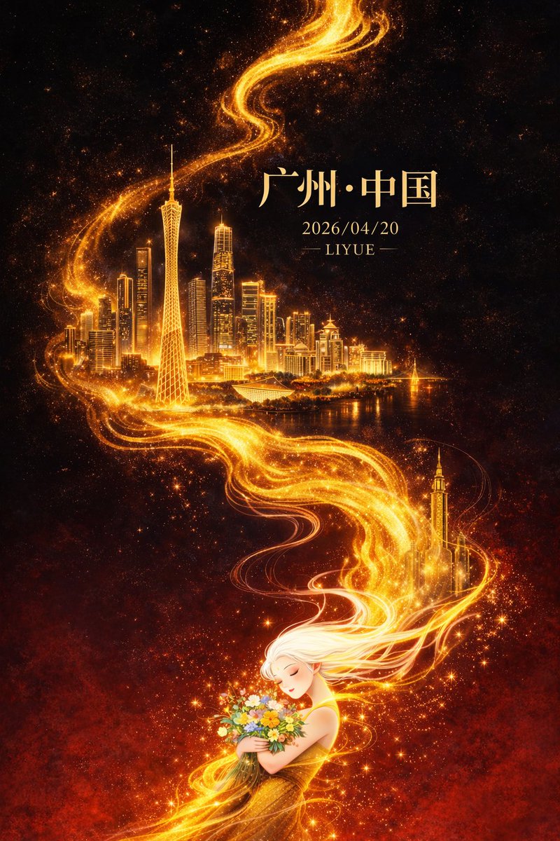
- This case keeps one primary output, so the first image should be treated as the main visual reference.
How The Prompt Is Structured
- The prompt reads as a long, highly specified prompt, which is useful when you want to judge how much specificity this direction needs.
- Its keyword cluster is centered on Poster, Illustration, Screenshot, so you can usually keep that cluster while swapping subject, camera, layout, or copy details.
- A practical rewrite path is: keep the outcome, keep the strongest style cues, then replace only the subject and environment blocks.
Good Follow-up Questions
- What changes first if you keep Poster, Illustration, Screenshot but switch the subject matter?
- Which part of the result comes from section-level structure (Model & Community) versus tag-level style cues?
- Which related cases in the same section give you a cleaner or more extreme variation of the same direction?
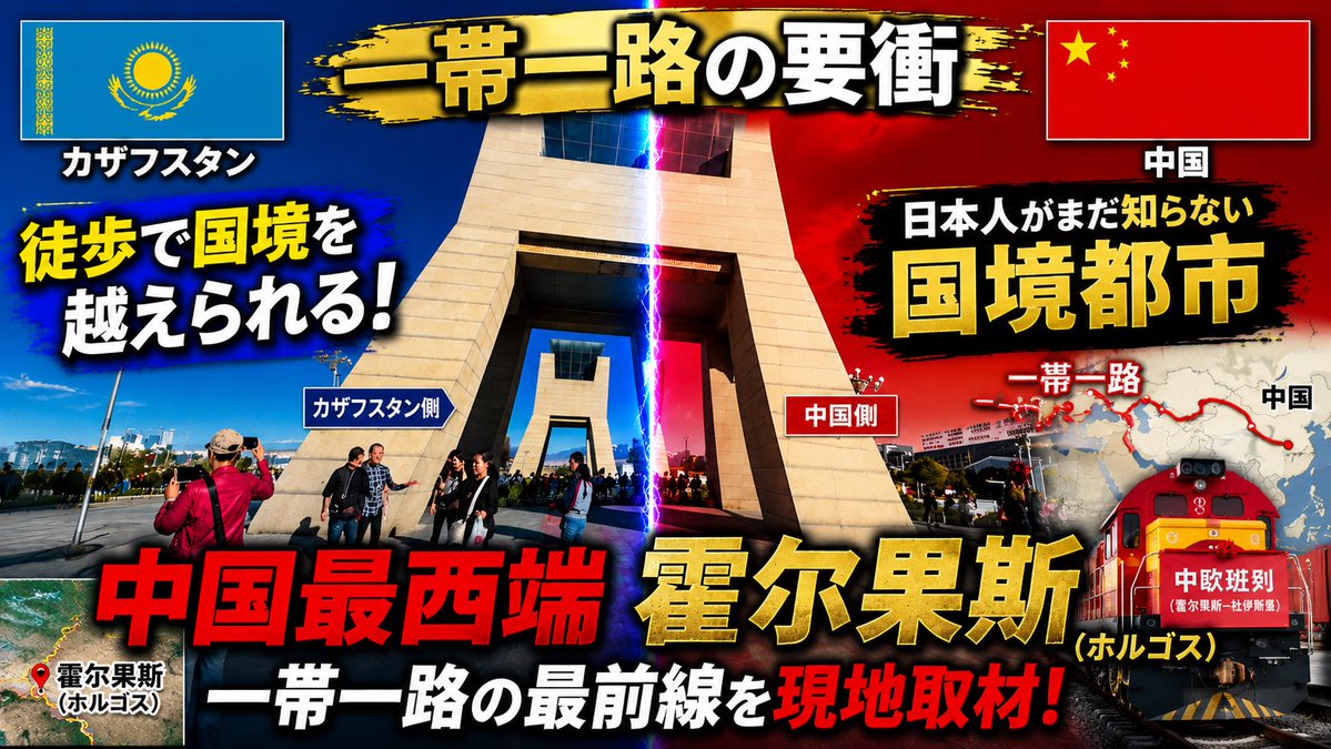
Full Prompt
Using the provided reference image as the base photo, redesign it into a high-impact Japanese YouTube travel/news thumbnail. Keep the border-gate location recognizable, but crop tighter around the central monument, boost contrast and saturation, add dramatic blue-vs-red lighting split down the middle with a vertical lightning beam marking the border, and make the layout feel like an urgent documentary thumbnail. Reposition the Kazakhstan flag to the top left and the China flag to the top right inside bordered boxes with drop shadows. Add a black-and-gold brush-stroke banner across the top with the main title {argument name="main title" default="一帯一路の要衝"}. Add large bold outlined Japanese typography with heavy shadows and color contrast; include exactly 16 visible text elements: 1) "カザフスタン", 2) "中国", 3) {argument name="left hook" default="徒歩で国境を越えられる!"}, 4) "カザフスタン側", 5) "中国側", 6) "日本人がまだ知らない", 7) {argument name="right headline" default="国境都市"}, 8) "一帯一路", 9) "中国", 10) {argument name="bottom red headline" default="中国最西端"}, 11) {argument name="city name" default="霍尔果斯"}, 12) "(ホルゴス)", 13) "一帯一路の最前線を", 14) "現地取材!", 15) "霍尔果斯 (ホルゴス)", 16) "中欧班列". Add a small satellite-map inset at bottom left with a red location pin and label for Horgos. Add a right-side map graphic showing a red Belt and Road route line and dots, partially behind the headline. Add a red freight train illustration/photo composite at the lower right with the "中欧班列" label on its front. Use explosive thumbnail styling: thick black outlines, yellow/red/white text hierarchy, lens flare, vignette, grunge brush backgrounds behind text, and strong drop shadows. Output as a 16:9 thumbnail composition.