Case Media
Case Notes
This page keeps the media, full prompt, and original source together so you can inspect the result first and decide whether the prompt is worth copying, saving, or comparing.
Case Insights
To make this page easier to search, cite, and reuse later, the case is also broken down into practical guidance about usage, visual cues, and prompt structure.
Best Fit Scenarios
- Use this as a model & community benchmark when you need a fast style baseline before rewriting your own prompt.
- It is especially helpful if your target overlaps with Fashion, Poster, Illustration and you want to judge the image result before tuning wording.
- Keep it as a control sample when you compare nearby prompt variants one variable at a time.
Visual Signals To Notice
- The clearest style signals here are Fashion, Poster, Illustration, so those should usually stay in your first rewrite.
- This kind of case is strongest when you watch deltas: what changed, what broke, and which prompt choice caused that shift.
- This case keeps 2 media outputs, which makes it easier to check whether the style remains stable across multiple results.
How The Prompt Is Structured
- The prompt reads as a long, highly specified prompt, which is useful when you want to judge how much specificity this direction needs.
- Its keyword cluster is centered on Fashion, Poster, Illustration, so you can usually keep that cluster while swapping subject, camera, layout, or copy details.
- A practical rewrite path is: keep the outcome, keep the strongest style cues, then replace only the subject and environment blocks.
Good Follow-up Questions
- What changes first if you keep Fashion, Poster, Illustration but switch the subject matter?
- Which part of the result comes from section-level structure (Model & Community) versus tag-level style cues?
- Which related cases in the same section give you a cleaner or more extreme variation of the same direction?
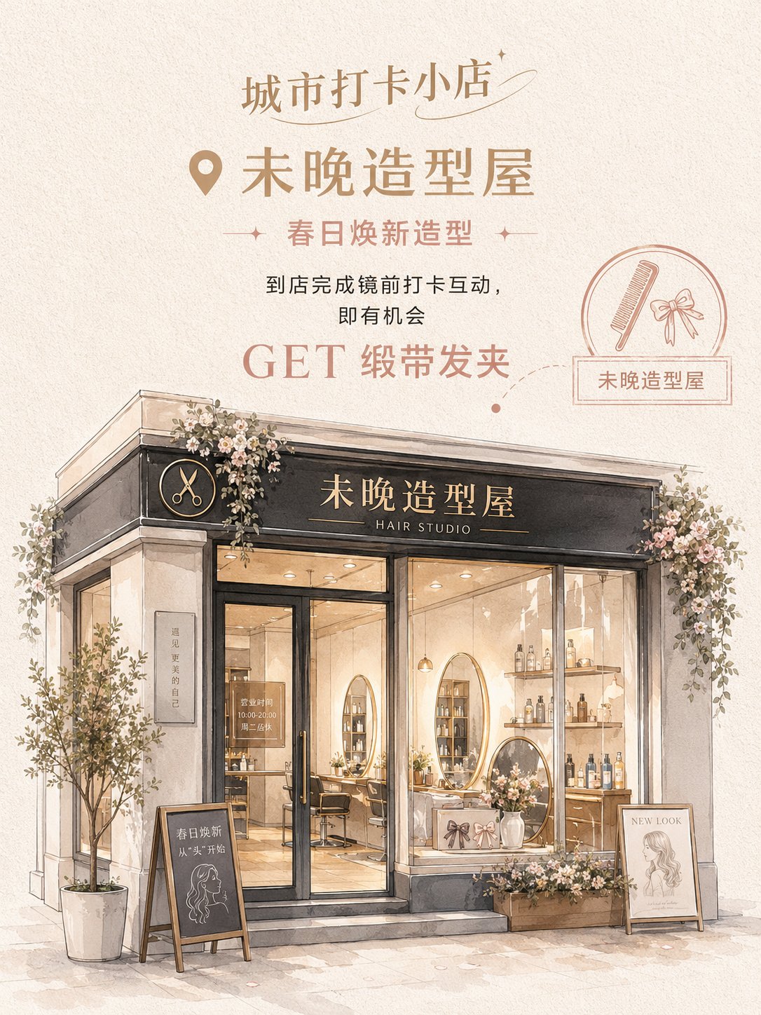
Full Prompt
Based on the store photo I uploaded, generate a vertical 3:4 "Semi-realistic Hand-drawn Store Check-in Poster." Brand / Series Title: [__________] Store Name: [__________] Store Type: [__________] Poster Mode: [Event Traffic Version / Atmosphere Display Version] Store Theme: [__________] Main Copy: [__________] Benefits / Gifts / Experience Content: [__________] Main Color: [__________] Secondary Color: [__________] Accent Color: [__________] Store Style Direction: [__________] Industry Decorative Elements: [__________] Please use the real store photo I uploaded as the core reference; do not reinvent a store. The main identifying features of the original store must be retained, including the store facade, signage position, door and window structure, entrance relationship, shop window position, and overall architectural proportions. You can moderately beautify the storefront, optimize the color scheme, add decorations, improve window displays and the atmosphere at the entrance, but do not change the store into a completely different building. The overall style is semi-realistic hand-drawn + exquisite watercolor architectural illustration + store event poster. The image is not a common photo filter, nor a messy sketch, but a transformation of a real store into a gentle, exquisite hand-drawn poster suitable for check-in and social sharing. The layout adopts a vertical structure of "top information area + bottom store main visual." The top contains the Brand / Series Title, and the upper-middle part contains the Store Name, theme copy, and event information. If it is an Event Traffic Version, highlight "GET + Gift / Benefit"; if it is an Atmosphere Display Version, weaken marketing information and highlight the store's temperament. A circular seal, small icons, map location dotted lines, label boxes, or handwritten notes can be added to the right side or locally to enhance the check-in poster feel. The lower half is the main visual of the store based on the transformed uploaded photo. The store must retain its real structure while becoming more exquisite, gentler, and more "instagrammable." The storefront, signage, windows, glass doors, interior displays, and doorway decorations must be clear. The color scheme should not be fixed to a single pink but should be selected based on the store type: light-colored, fashionable, and soft. The overall saturation is low to medium-low, and the brightness is high, with a feminine, petit bourgeois, youthful, and lifestyle feel. The background uses off-white, milky white, warm gray, or light khaki paper texture. Decorative elements must match the store type: Flower shops can use bouquets, vines, flower baskets, ribbons; Styling houses can use hair clips, combs, mirrors, hair care products; Coffee and dessert shops can use coffee cups, cakes, bread, menu blackboards; Fragrance shops can use perfume bottles, candles, gift boxes, scent testing stations; Nail and eyelash salons can use nail polish bottles, eyelash brushes, color cards, small mirrors; Light jewelry shops can use jewelry trays, earring racks, ring boxes, pearls; Women's fashion boutiques can use hangers, bags, fitting mirrors, window displays. The final effect should be like a gentle, exquisite, semi-realistic store check-in poster suitable for social media sharing. The store is the protagonist, the text is concise and clear, and the overall feel should not be a hard advertisement but have the attraction of "wanting to check-in, wanting to enter the store, and wanting to take photos."