Case Media
Case Notes
This page keeps the media, full prompt, and original source together so you can inspect the result first and decide whether the prompt is worth copying, saving, or comparing.
Case Insights
To make this page easier to search, cite, and reuse later, the case is also broken down into practical guidance about usage, visual cues, and prompt structure.
Best Fit Scenarios
- Use this as a model & community benchmark when you need a fast style baseline before rewriting your own prompt.
- It is especially helpful if your target overlaps with Poster, Minimal, Typography and you want to judge the image result before tuning wording.
- Keep it as a control sample when you compare nearby prompt variants one variable at a time.
Visual Signals To Notice
- The clearest style signals here are Poster, Minimal, Typography, so those should usually stay in your first rewrite.
- This kind of case is strongest when you watch deltas: what changed, what broke, and which prompt choice caused that shift.
- This case keeps 2 media outputs, which makes it easier to check whether the style remains stable across multiple results.
How The Prompt Is Structured
- The prompt reads as a long, highly specified prompt, which is useful when you want to judge how much specificity this direction needs.
- Its keyword cluster is centered on Poster, Minimal, Typography, so you can usually keep that cluster while swapping subject, camera, layout, or copy details.
- A practical rewrite path is: keep the outcome, keep the strongest style cues, then replace only the subject and environment blocks.
Good Follow-up Questions
- What changes first if you keep Poster, Minimal, Typography but switch the subject matter?
- Which part of the result comes from section-level structure (Model & Community) versus tag-level style cues?
- Which related cases in the same section give you a cleaner or more extreme variation of the same direction?
Full Prompt
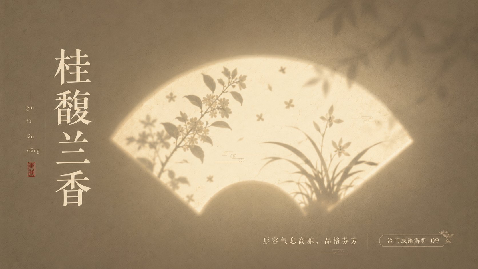
With '{Theme}' as the core, create a minimalist, high-end, poetic, and quiet light and shadow poster. The image should not directly depict the theme, but instead transform the theme into 'silhouette imagery illuminated by light.' In the center of the frame, set a recognizable glowing shape container: {Fan-shaped window / Moon gate / Rectangular window light / Arched niche / Circular light window / Screen projection / Rounded glowing panel}. This shape is like a beam of light cast on a textured wall or paper surface, with soft glowing edges and slight atomized diffusion. Inside the glowing container, use silhouettes and soft-focus projections to represent theme-related elements: {Main element}, {Symbolic element}, {Environmental element}. The main silhouette is slightly clear, while auxiliary elements are more blurred, like shadows of trees, flowers, smoke, branches, lines, or object outlines projected through a paper window. All elements remain restrained, without realistic details, keeping only the most recognizable outlines. The image should have a large amount of white space, a centered composition, and clear visual hierarchy: the background is the quietest, the light area is the most eye-catching, and the silhouette has the most sense of story. The background uses low-saturation {Background color}, with fine paper texture, wall particles, weak noise, slight gradients, and soft vignettes. The light area uses {Light color}, such as cream white, ivory white, pale gold, moonlight yellow, or cool white glimmer. The silhouette uses {Silhouette color}, such as ink gray, blue-gray, dark brown, charcoal black, or dark colors within the same series. The overall color is controlled within three to four types, forming a quiet, restrained, and high-end color relationship. Overall style: Eastern aesthetics, modern minimalism, poetic poster, art exhibition visuals, magazine cover level composition, soft light, negative space, silhouette, white space, airiness, fine grain, low-saturation color matching, quiet emotional tension. Avoid complex backgrounds, avoid strongly saturated colors, avoid hard-edged light effects, avoid over-realism, avoid cluttered elements, avoid cheap decorations. The final image should be like 'a poem left by light on a wall.' —————— This time's obscure idiom analysis: Obscure and breathtakingly beautiful Chinese idioms Use: PPT slides Color scheme: Each picture is different, dynamic layout changes, each has clever design, no fewer than 10 pictures. Ratio 16:9