Case Media
Case Notes
This page keeps the media, full prompt, and original source together so you can inspect the result first and decide whether the prompt is worth copying, saving, or comparing.
Case Insights
To make this page easier to search, cite, and reuse later, the case is also broken down into practical guidance about usage, visual cues, and prompt structure.
Best Fit Scenarios
- Use this as a model & community benchmark when you need a fast style baseline before rewriting your own prompt.
- It is especially helpful if your target overlaps with Cinematic, Poster, Typography and you want to judge the image result before tuning wording.
- Keep it as a control sample when you compare nearby prompt variants one variable at a time.
Visual Signals To Notice
- The clearest style signals here are Cinematic, Poster, Typography, so those should usually stay in your first rewrite.
- This kind of case is strongest when you watch deltas: what changed, what broke, and which prompt choice caused that shift.
- This case keeps one primary output, so the first image should be treated as the main visual reference.
How The Prompt Is Structured
- The prompt reads as a long, highly specified prompt, which is useful when you want to judge how much specificity this direction needs.
- Its keyword cluster is centered on Cinematic, Poster, Typography, so you can usually keep that cluster while swapping subject, camera, layout, or copy details.
- A practical rewrite path is: keep the outcome, keep the strongest style cues, then replace only the subject and environment blocks.
Good Follow-up Questions
- What changes first if you keep Cinematic, Poster, Typography but switch the subject matter?
- Which part of the result comes from section-level structure (Model & Community) versus tag-level style cues?
- Which related cases in the same section give you a cleaner or more extreme variation of the same direction?
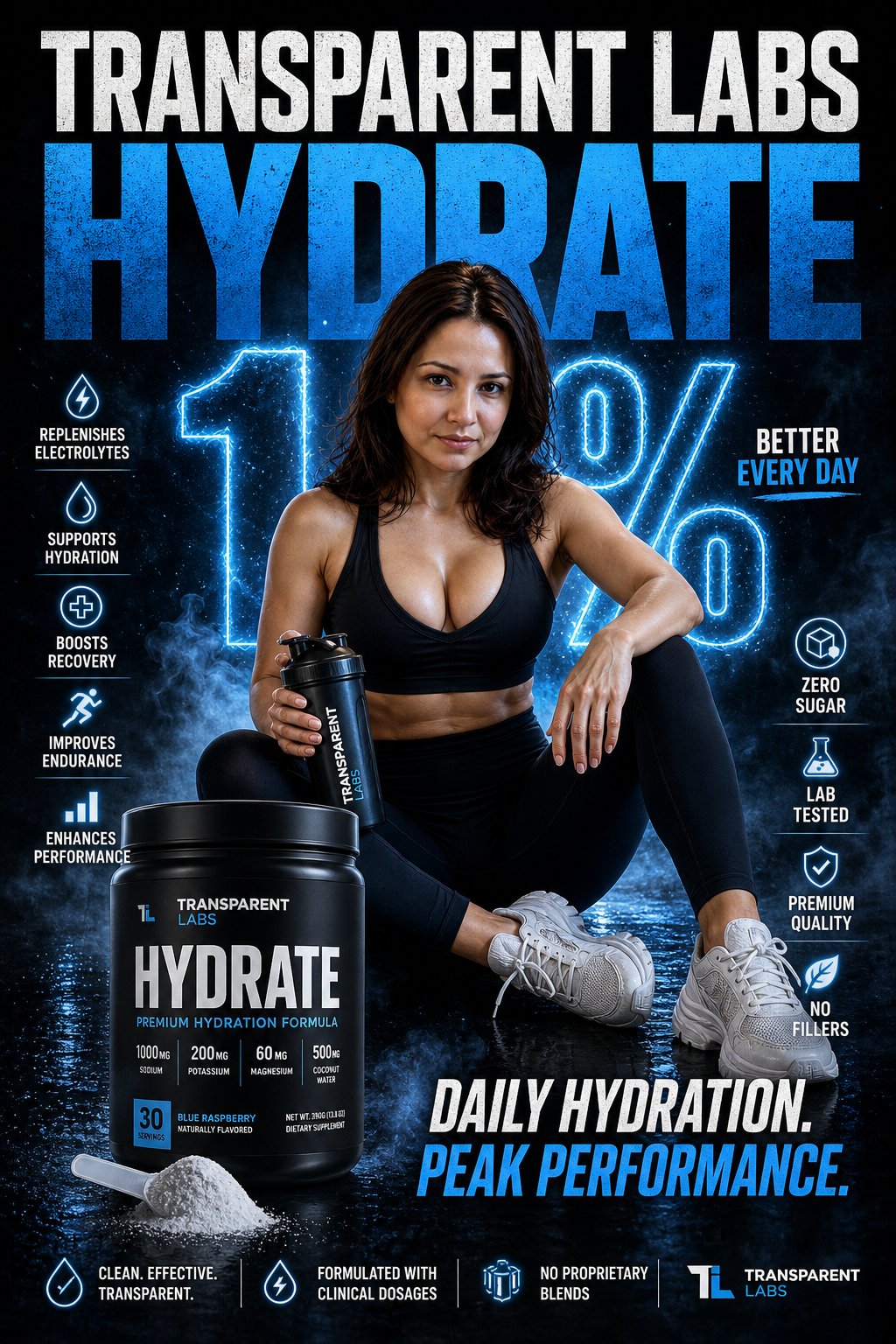
Full Prompt
Create a striking campaign poster that stops people mid-scroll for Transparent Labs Hydrate. Bold high-impact supplement advertisement with dramatic black and deep electric blue color palette, gritty premium fitness aesthetic, sharp cinematic lighting, glossy reflections, light smoke atmosphere, intense contrast. Giant headline typography at top reading “TRANSPARENT LABS HYDRATE” in oversized distressed white and electric blue text. Center composition features the exact woman from the attached reference image as a fit athletic female model seated confidently on a studio floor, holding a shaker bottle, with a focused and powerful expression. Change her clothes into sleek black fitness gym outfit: a black sports bra / tank top and high-waisted black leggings with chunky white sneakers. Large glowing “1%” graphic behind the subject symbolizing daily progress. Front left foreground shows a matte black Transparent Labs Hydrate tub with modern luxury label reading “HYDRATE”, scoop of electrolyte powder spilled beside the container. Surround the poster with clean icon-based benefit callouts: replenishes electrolytes, supports hydration, boosts recovery, improves endurance, enhances performance, zero sugar, lab tested, premium quality, no fillers. Strong motivational copy such as “Daily Hydration. Peak Performance.” Hyper realistic textures, polished commercial retouching, premium sports nutrition branding, modern typography layout, social media ad format, ultra detailed, high resolution.