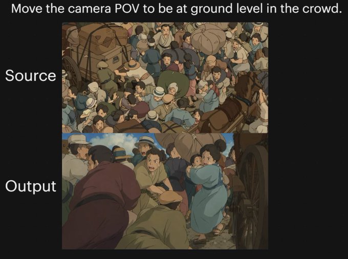
Case Media
Case Notes
This page keeps the media, full prompt, and original source together so you can inspect the result first and decide whether the prompt is worth copying, saving, or comparing.
Case Insights
To make this page easier to search, cite, and reuse later, the case is also broken down into practical guidance about usage, visual cues, and prompt structure.
Best Fit Scenarios
- Use this as a model & community benchmark when you need a fast style baseline before rewriting your own prompt.
- It is especially helpful if your target overlaps with 35mm, Neon, Portrait and you want to judge the image result before tuning wording.
- Keep it as a control sample when you compare nearby prompt variants one variable at a time.
Visual Signals To Notice
- The clearest style signals here are 35mm, Neon, Portrait, so those should usually stay in your first rewrite.
- This kind of case is strongest when you watch deltas: what changed, what broke, and which prompt choice caused that shift.
- This case keeps one primary output, so the first image should be treated as the main visual reference.
How The Prompt Is Structured
- The prompt reads as a long, highly specified prompt, which is useful when you want to judge how much specificity this direction needs.
- Its keyword cluster is centered on 35mm, Neon, Portrait, so you can usually keep that cluster while swapping subject, camera, layout, or copy details.
- A practical rewrite path is: keep the outcome, keep the strongest style cues, then replace only the subject and environment blocks.
Good Follow-up Questions
- What changes first if you keep 35mm, Neon, Portrait but switch the subject matter?
- Which part of the result comes from section-level structure (Model & Community) versus tag-level style cues?
- Which related cases in the same section give you a cleaner or more extreme variation of the same direction?
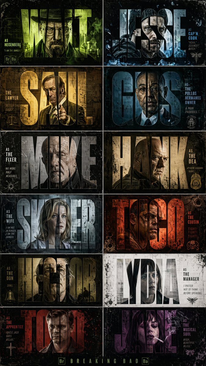
Full Prompt
Create a high-contrast, cinematic graphic design poster inspired by the TV series Breaking Bad, featuring a 2x6 vertical grid of twelve distinct title-card panels showcasing iconic characters from the show. The aesthetic should blend Urban Grunge with crime-thriller intensity, using distressed textures, film grain, and bold typography masking effects. Each panel should prominently feature a massive extra-bold sans-serif name such as WALT, JESSE, SAUL, GUS, MIKE, HANK, SKYLER, TUCO, HECTOR, LYDIA, TODD, and JANE, with the character portrait visible only inside the filled letterforms using a clipping/masking silhouette-window effect. Add smaller cinematic credit text beside or below the names in clean typography, such as “AS HEISENBERG”, “THE LAWYER”, or “THE FIXER.” Characters should have gritty, realistic portraits with intense or emotionless expressions, featuring iconic looks: Walter White in hat/glasses, Jesse Pinkman in hoodie/beanie, Saul Goodman in flashy suit, Gus Fring in formal attire, Mike Ehrmantraut bald with stern face, and Hank in DEA style. Use high-contrast dramatic studio lighting with rim lights and shadows; selectively add green chemical-lab glow, neon cyan, magenta, and amber highlights to certain cards. Backgrounds in each panel should feel unique but cohesive: weathered concrete, rusted metal, cracked walls, wrinkled paper, and smoky meth-lab atmospheres. Overlay heavy ink splatters, paint drips, brush strokes, scratches, scan lines, dust, film burns, and grain for a distressed cinematic look. The overall palette should use dark green, toxic neon lime, monochrome greys, deep charcoals, dirty yellows, and off-whites, with accent pops like a glowing green haze behind Walter, red-orange behind Tuco, blue meth-crystal highlights around Jesse, and sterile white tones around Lydia. The final result should look like a premium Netflix-style crime drama cast poster with a raw, edgy, highly stylized graphic design aesthetic.