Case Media
Case Notes
This page keeps the media, full prompt, and original source together so you can inspect the result first and decide whether the prompt is worth copying, saving, or comparing.
Case Insights
To make this page easier to search, cite, and reuse later, the case is also broken down into practical guidance about usage, visual cues, and prompt structure.
Best Fit Scenarios
- Use this as a model & community benchmark when you need a fast style baseline before rewriting your own prompt.
- It is especially helpful if your target overlaps with Neon, Cinematic, Fashion and you want to judge the image result before tuning wording.
- Keep it as a control sample when you compare nearby prompt variants one variable at a time.
Visual Signals To Notice
- The clearest style signals here are Neon, Cinematic, Fashion, so those should usually stay in your first rewrite.
- This kind of case is strongest when you watch deltas: what changed, what broke, and which prompt choice caused that shift.
- This case keeps one primary output, so the first image should be treated as the main visual reference.
How The Prompt Is Structured
- The prompt reads as a long, highly specified prompt, which is useful when you want to judge how much specificity this direction needs.
- Its keyword cluster is centered on Neon, Cinematic, Fashion, so you can usually keep that cluster while swapping subject, camera, layout, or copy details.
- A practical rewrite path is: keep the outcome, keep the strongest style cues, then replace only the subject and environment blocks.
Good Follow-up Questions
- What changes first if you keep Neon, Cinematic, Fashion but switch the subject matter?
- Which part of the result comes from section-level structure (Model & Community) versus tag-level style cues?
- Which related cases in the same section give you a cleaner or more extreme variation of the same direction?
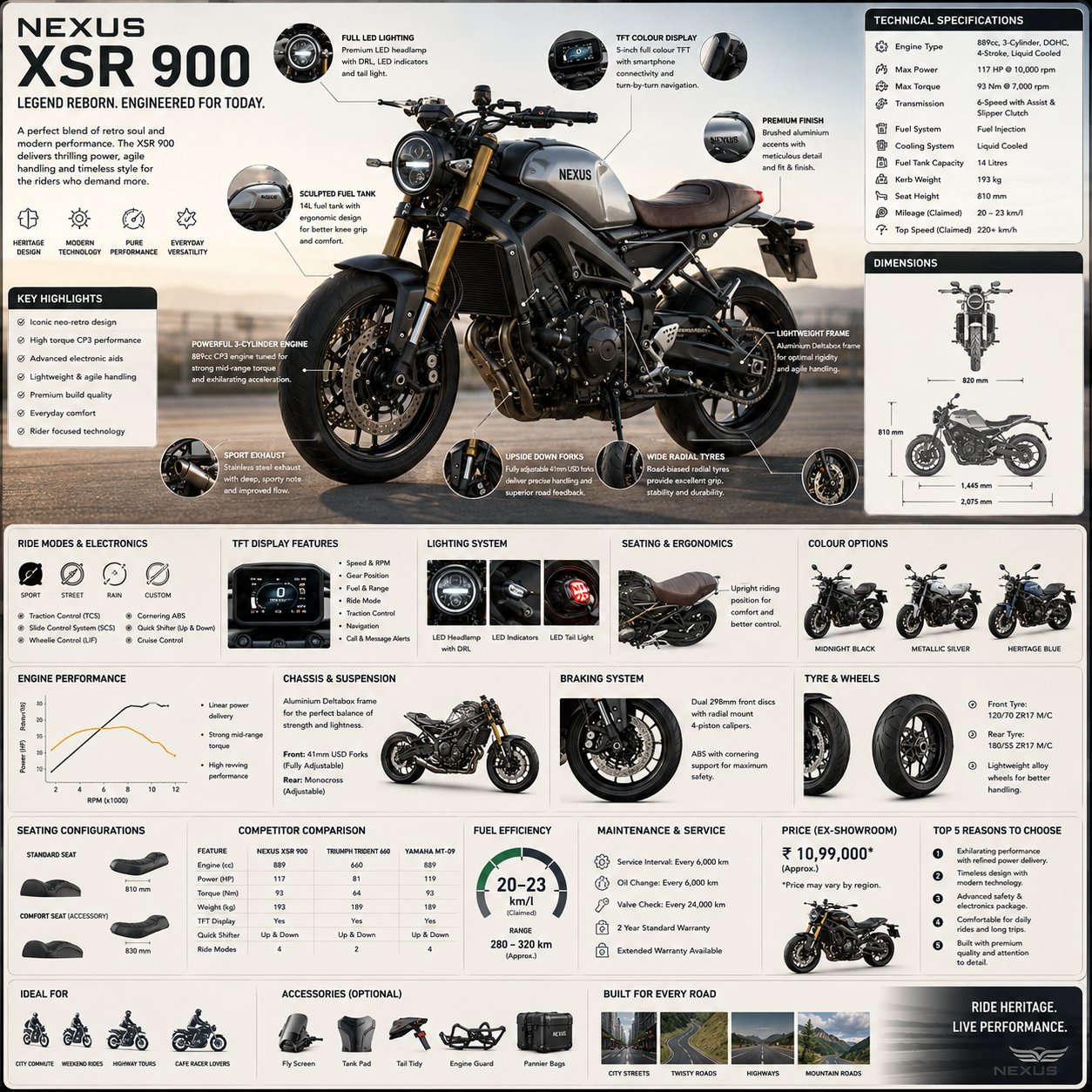
Full Prompt
Create a premium square “reference-style motorcycle infographic” centered around a stylish modern motorbike called the {MOTORBIKE_NAME}, designed as a beautifully curated motorcycle engineering handbook page rather than a commercial advertisement. The composition should feel like a modern visual encyclopedia mixed with an elite rider’s field guide and high-end editorial infographic system. Visual Direction: • 1:1 square composition • Soft industrial-toned background with subtle blueprint textures, mechanical schematics, and premium technical overlays • Elegant muted palette using matte black, titanium gray, brushed steel, deep charcoal, warm metallic accents, and soft neutral highlights • Refined editorial typography hierarchy • Rounded modular information cards with clean spacing • Gentle realistic shadows and premium UI-style dividers • Minimal motorcycle engineering iconography • Extremely detailed central motorcycle render viewed in dramatic three-quarter perspective during cinematic golden-hour lighting • Thin precision annotation lines pointing toward performance systems and mechanical features • Clean, organized “knowledge-first” layout with high information density but breathable spacing Main Subject Presentation: A stunning ultra-detailed realistic render of the {MOTORBIKE_NAME} placed at the center, featuring realistic metallic reflections, premium paint finish, exposed engine detailing, aerodynamic bodywork, suspension systems, sporty tyres, LED lighting, and high-end motorcycle photography realism. Surround the motorbike with scientific and engineering callouts explaining: • engine and exhaust system • fuel tank ergonomics • lightweight chassis design • braking system • suspension setup • tyre and wheel technology • TFT display and electronics • riding modes & traction control • aerodynamic styling • seating and rider ergonomics Include modular infographic sections such as: • Motorcycle Overview • Technical Specifications • Dimensions & Geometry • Engine Performance • Chassis & Suspension • Brake & Safety Systems • Electronics & Ride Modes • Lighting Technology • Tyre & Wheel Setup • Fuel Efficiency & Range • Maintenance & Service Information • Seating Configurations • Color & Variant Options • Accessories & Touring Add-ons • Advantages vs Competitor Bikes • “Top 5 Reasons to Choose” section • Ideal Riding Environments Add small premium visualization modules like: • engine performance graphs • top/side blueprint diagrams • suspension cutaway illustrations • braking system graphics • riding ergonomics charts • wheel & tyre close-up visuals • TFT dashboard UI previews • fuel economy gauges • component material breakdowns • motorcycle comparison tables Style Keywords: “premium motorcycle encyclopedia” “editorial superbike handbook” “high-end motorcycle infographic” “scientific motorcycle poster” “museum-quality bike reference page” “modular automotive knowledge system” “clean rider-focused editorial design” “ultra-detailed motorcycle visualization” Avoid: • racing crash scenes • cluttered commercial advertisement aesthetics • cartoon or futuristic sci-fi bikes • dark grunge-heavy poster styling • unrealistic motorcycle anatomy • excessive neon cyberpunk effects The final result should resemble a professionally published motorcycle engineering reference-book page created for riders, collectors, automotive designers, mechanics, and enthusiast educational archives.