Case Media
Case Notes
This page keeps the media, full prompt, and original source together so you can inspect the result first and decide whether the prompt is worth copying, saving, or comparing.
Case Insights
To make this page easier to search, cite, and reuse later, the case is also broken down into practical guidance about usage, visual cues, and prompt structure.
Best Fit Scenarios
- Use this as a character design benchmark when you need a fast style baseline before rewriting your own prompt.
- It is especially helpful if your target overlaps with Portrait, Cinematic, Fashion and you want to judge the image result before tuning wording.
- Keep it as a control sample when you compare nearby prompt variants one variable at a time.
Visual Signals To Notice
- The clearest style signals here are Portrait, Cinematic, Fashion, so those should usually stay in your first rewrite.
- Look at silhouette, costume language, mood styling, and whether the character reads clearly at a glance.
- This case keeps one primary output, so the first image should be treated as the main visual reference.
How The Prompt Is Structured
- The prompt reads as a long, highly specified prompt, which is useful when you want to judge how much specificity this direction needs.
- Its keyword cluster is centered on Portrait, Cinematic, Fashion, so you can usually keep that cluster while swapping subject, camera, layout, or copy details.
- A practical rewrite path is: keep the outcome, keep the strongest style cues, then replace only the subject and environment blocks.
Good Follow-up Questions
- What changes first if you keep Portrait, Cinematic, Fashion but switch the subject matter?
- Which part of the result comes from section-level structure (Character Design) versus tag-level style cues?
- Which related cases in the same section give you a cleaner or more extreme variation of the same direction?
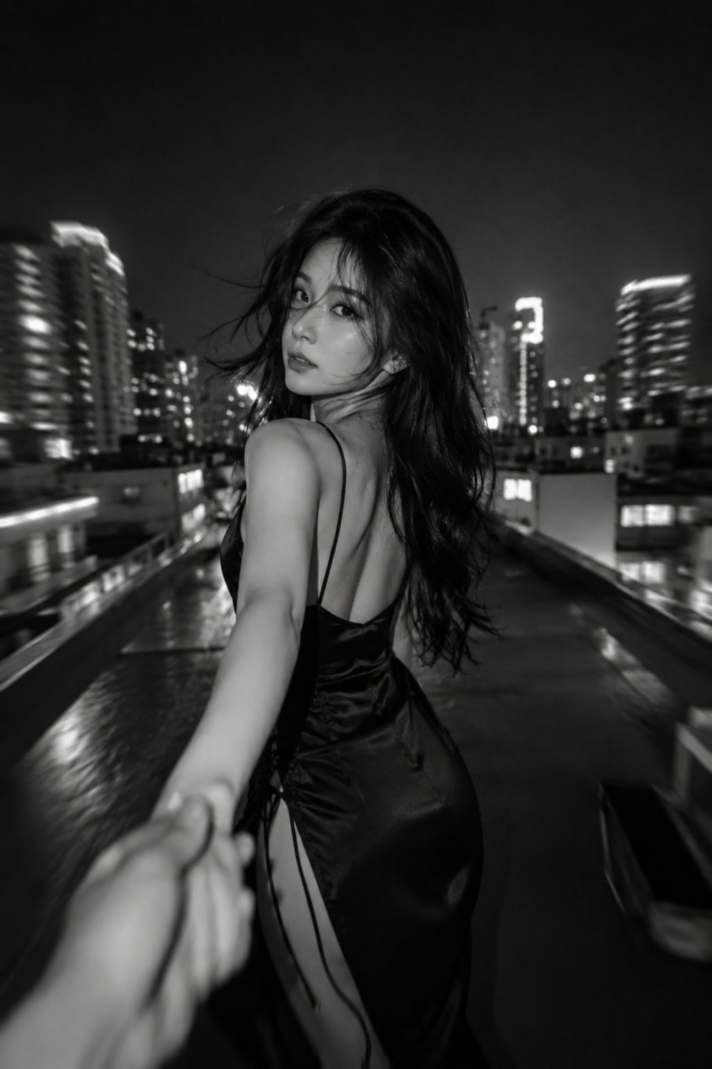
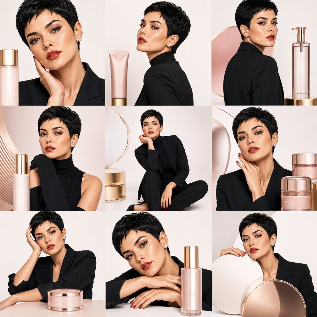
Full Prompt
Create a clean and perfectly aligned 3×3 master grid layout composed of nine equally sized square panels. Each panel occupies its own dedicated space and must never overlap, merge, or extend into neighboring panels. Maintain strict geometric placement and balanced spacing throughout the composition. Inside each of the nine panels, place exactly one single inner panel containing one single stylish female model with consistent identity from the reference image. No additional frames, no duplicated subjects, and no layered collage elements. Each model wears a chic black outfit and appears in a unique pose and camera angle, including close-up beauty portraits, side profiles, over-the-shoulder glances, and elegant high-fashion poses. Maintain premium Korean beauty aesthetics with flawless dewy skin, soft glow lighting, refined facial features, and luxurious editorial styling. Oversized skincare products should appear as sculptural objects positioned completely inside their respective panels, never crossing into adjacent panels. Use a clean white seamless studio background with subtle pink and gold accents, cinematic lighting, and soft gradients. The overall composition should resemble a premium fashion magazine layout with nine clearly separated panels, one inner frame per panel, one character per frame, strict geometric structure, and absolutely no overlapping elements or subjects. Ultra-premium Korean skincare advertisement aesthetic, minimal luxury branding, highly detailed cinematic editorial style.