Case Media
Case Notes
This page keeps the media, full prompt, and original source together so you can inspect the result first and decide whether the prompt is worth copying, saving, or comparing.
Case Insights
To make this page easier to search, cite, and reuse later, the case is also broken down into practical guidance about usage, visual cues, and prompt structure.
Best Fit Scenarios
- Use this as a character design benchmark when you need a fast style baseline before rewriting your own prompt.
- It is especially helpful if your target overlaps with Cinematic, Illustration, Character and you want to judge the image result before tuning wording.
- Keep it as a control sample when you compare nearby prompt variants one variable at a time.
Visual Signals To Notice
- The clearest style signals here are Cinematic, Illustration, Character, so those should usually stay in your first rewrite.
- Look at silhouette, costume language, mood styling, and whether the character reads clearly at a glance.
- This case keeps one primary output, so the first image should be treated as the main visual reference.
How The Prompt Is Structured
- The prompt reads as a long, highly specified prompt, which is useful when you want to judge how much specificity this direction needs.
- Its keyword cluster is centered on Cinematic, Illustration, Character, so you can usually keep that cluster while swapping subject, camera, layout, or copy details.
- A practical rewrite path is: keep the outcome, keep the strongest style cues, then replace only the subject and environment blocks.
Good Follow-up Questions
- What changes first if you keep Cinematic, Illustration, Character but switch the subject matter?
- Which part of the result comes from section-level structure (Character Design) versus tag-level style cues?
- Which related cases in the same section give you a cleaner or more extreme variation of the same direction?
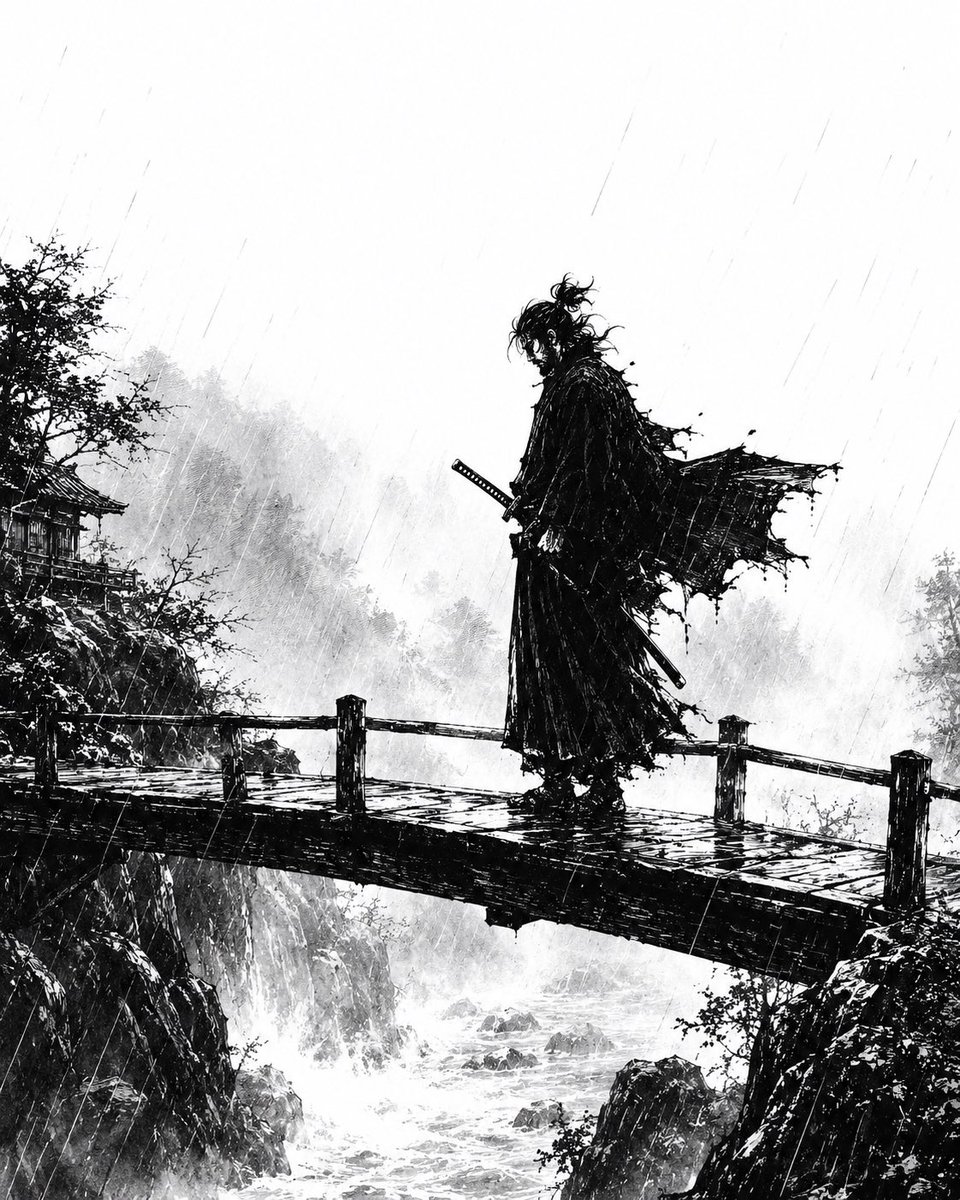
Full Prompt
Create a dramatic monochrome ink illustration in the style of a gritty Japanese samurai manga: a lone {argument name="character type" default="ronin samurai"} stands in profile on a narrow wooden bridge spanning a rocky mountain gorge during heavy rain. The figure is a tall black silhouette with messy tied-up hair, a long tattered cloak whipping violently to the right, layered ragged robes, and two swords at the waist, one hand near the katana hilt. Use extreme black-and-white contrast, scratchy brushwork, splattered ink, and fine diagonal rain streaks across the entire scene. The bridge has wet planks, rough rail posts, and dark reflective puddles; below it, whitewater rapids churn between jagged cliffs. In the background, misty forested mountains fade into pale gray wash, with a small traditional Japanese temple or pavilion partly hidden among trees on the left cliff. Composition is vertical and cinematic, with the samurai slightly right of center, lots of pale empty rainy sky above, atmospheric fog, stormy motion, and no color except black, white, and gray. Mood: {argument name="mood" default="melancholic, lethal, and solitary"}.