Case Media
Case Notes
This page keeps the media, full prompt, and original source together so you can inspect the result first and decide whether the prompt is worth copying, saving, or comparing.
Case Insights
To make this page easier to search, cite, and reuse later, the case is also broken down into practical guidance about usage, visual cues, and prompt structure.
Best Fit Scenarios
- Use this as a character design benchmark when you need a fast style baseline before rewriting your own prompt.
- It is especially helpful if your target overlaps with Illustration, Character, Anime and you want to judge the image result before tuning wording.
- Keep it as a control sample when you compare nearby prompt variants one variable at a time.
Visual Signals To Notice
- The clearest style signals here are Illustration, Character, Anime, so those should usually stay in your first rewrite.
- Look at silhouette, costume language, mood styling, and whether the character reads clearly at a glance.
- This case keeps one primary output, so the first image should be treated as the main visual reference.
How The Prompt Is Structured
- The prompt reads as a long, highly specified prompt, which is useful when you want to judge how much specificity this direction needs.
- Its keyword cluster is centered on Illustration, Character, Anime, so you can usually keep that cluster while swapping subject, camera, layout, or copy details.
- A practical rewrite path is: keep the outcome, keep the strongest style cues, then replace only the subject and environment blocks.
Good Follow-up Questions
- What changes first if you keep Illustration, Character, Anime but switch the subject matter?
- Which part of the result comes from section-level structure (Character Design) versus tag-level style cues?
- Which related cases in the same section give you a cleaner or more extreme variation of the same direction?
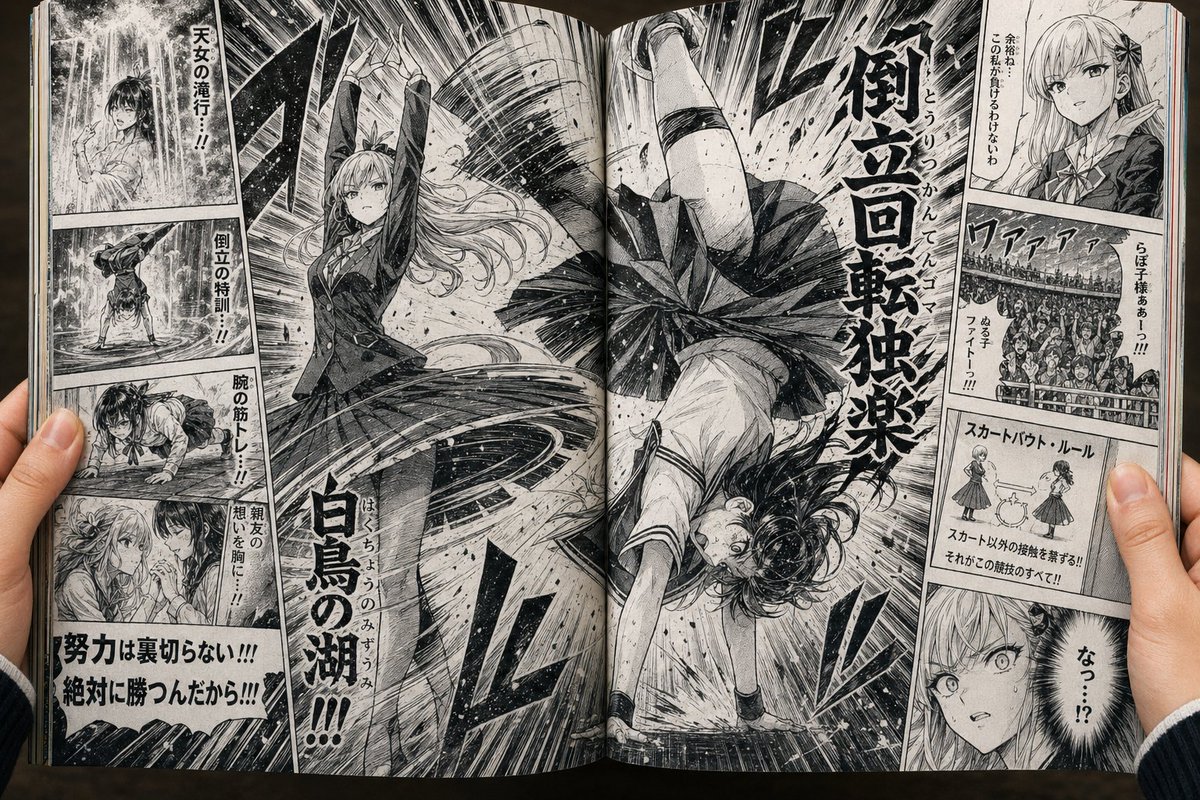
Full Prompt
A realistic close-up photo of two human hands holding open a Japanese manga magazine at the center spread, viewed from slightly above, with the full two-page black-and-white manga visible including the book’s curved spine, paper texture, and slight page warping. The spread depicts an over-the-top fictional battle-sports manga about girls fighting using only skirt-based techniques in a dramatic shonen style with dense screentone, speed lines, ink splatter, exaggerated motion, and explosive typography. The central action spans both pages: 2 school-uniform girls are in combat, one on the left upright and powerful with long flowing hair, blazer, pleated skirt, and both arms raised overhead as if executing a special move, while the other on the right is upside down in a handstand-like spin with her pleated skirt flaring outward in a tornado shape, legs extended upward, as if being thrown or rotating through the air. The composition should feel chaotic and kinetic, with huge Japanese sound effects and attack text dominating the center, especially a large vertical title-like impact phrase reading 倒立回転衝撃 and another large vertical move name reading 白鳥の湖, integrated into the action art. Surrounding the main splash are 8 smaller side panels total: 4 stacked on the left page and 4 stacked on the right page. On the left page, panel 1 shows a girl standing under a waterfall in harsh training; panel 2 shows an inverted handstand training scene in water; panel 3 shows strength training or push-up-like exercise; panel 4 shows an emotional close-up of 2 girls facing each other. Add bold Japanese motivational captions near these left panels, including 天女の滝行!!, 倒立の特訓!!, 腕の筋トレ!!, 親友の想いを胸に…!!, and at the bottom a large emotional statement 努力は裏切らない!!! 絶対に勝つんだから!!!. On the right page, panel 1 is a close-up of a refined rival girl speaking calmly, with vertical Japanese dialogue; panel 2 is a roaring stadium crowd cheering, packed with spectators and chant text; panel 3 is a tiny explanatory rules diagram labeled スカートバウト・ルール showing 2 simplified girl figures and a skirt icon, with small Japanese rule text explaining that touching anything other than the skirt is forbidden; panel 4 is a shocked close-up face with the reaction なっ!? in a black burst balloon. Keep a few rectangular censorship mosaics over 2 small face areas to mimic a posted-online magazine scan. The manga should look like a printed weekly comic anthology page photographed in real life, not a clean digital layout: visible halftone dots, gutter shadow, page edges, slight yellowed paper, subtle ambient warm lighting, and believable fingers gripping both lower outer corners.