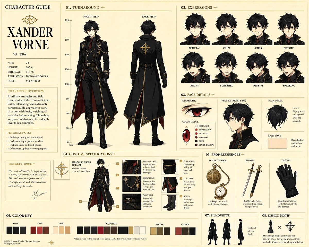
Case Media
Case Notes
This page keeps the media, full prompt, and original source together so you can inspect the result first and decide whether the prompt is worth copying, saving, or comparing.
Case Insights
To make this page easier to search, cite, and reuse later, the case is also broken down into practical guidance about usage, visual cues, and prompt structure.
Best Fit Scenarios
- Use this as a character design benchmark when you need a fast style baseline before rewriting your own prompt.
- It is especially helpful if your target overlaps with Illustration, Character, Anime and you want to judge the image result before tuning wording.
- Keep it as a control sample when you compare nearby prompt variants one variable at a time.
Visual Signals To Notice
- The clearest style signals here are Illustration, Character, Anime, so those should usually stay in your first rewrite.
- Look at silhouette, costume language, mood styling, and whether the character reads clearly at a glance.
- This case keeps 4 media outputs, which makes it easier to check whether the style remains stable across multiple results.
How The Prompt Is Structured
- The prompt reads as a long, highly specified prompt, which is useful when you want to judge how much specificity this direction needs.
- Its keyword cluster is centered on Illustration, Character, Anime, so you can usually keep that cluster while swapping subject, camera, layout, or copy details.
- A practical rewrite path is: keep the outcome, keep the strongest style cues, then replace only the subject and environment blocks.
Good Follow-up Questions
- What changes first if you keep Illustration, Character, Anime but switch the subject matter?
- Which part of the result comes from section-level structure (Character Design) versus tag-level style cues?
- Which related cases in the same section give you a cleaner or more extreme variation of the same direction?
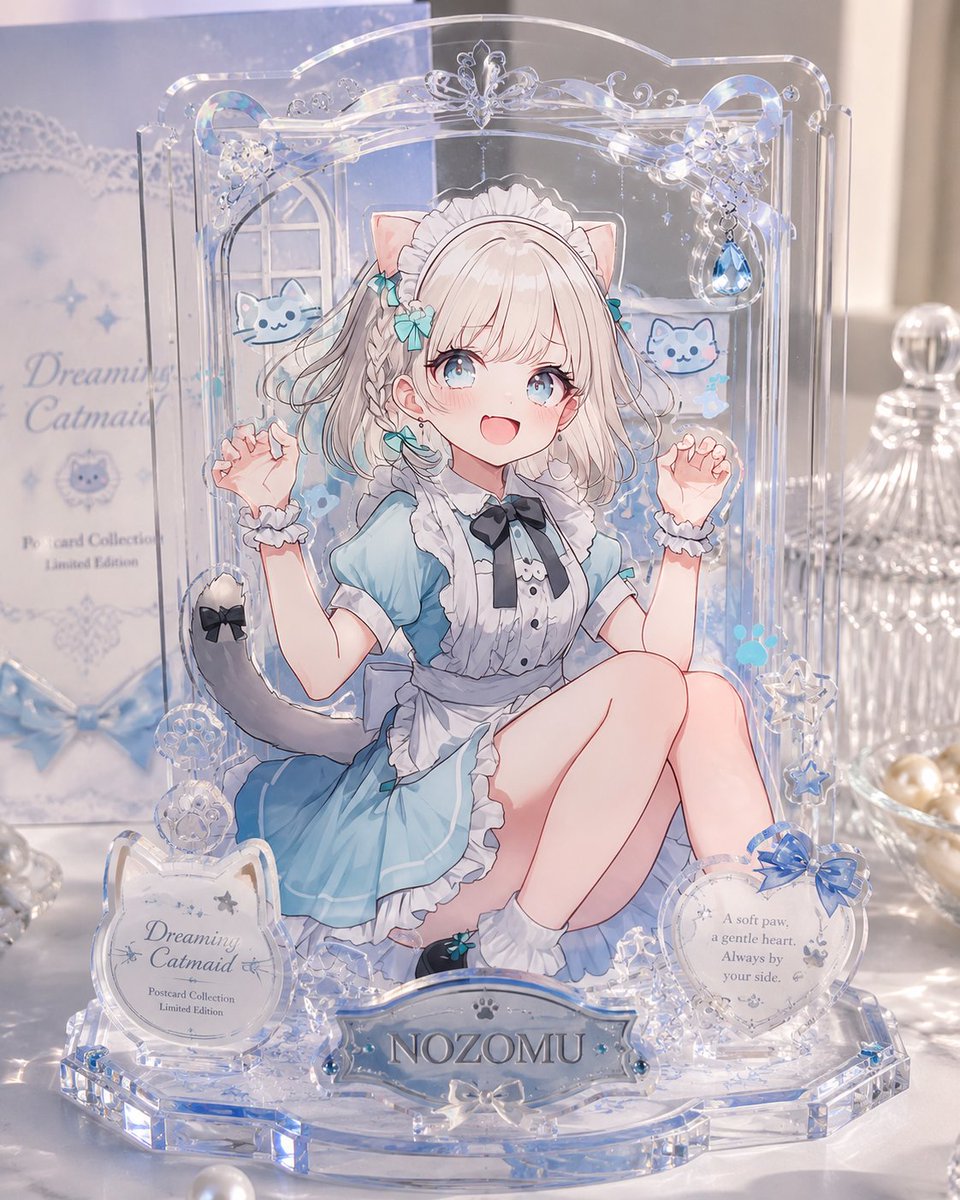
Full Prompt
Goal: Create a polished product-style photograph of a layered transparent acrylic display postcard, like a miniature exhibition case, featuring an anime catmaid character in a dreamy blue theme. Canvas: Vertical 4:5 product photo, close-up view on a glossy white tabletop, soft natural window light, shallow depth of field, pastel blue and pearl highlights. Main subject: A freestanding clear acrylic postcard stand made of multiple stacked transparent layers. The back plate is tall with rounded decorative edges and an ornate arch top. The acrylic edges catch light with blue iridescent refractions, giving a premium collectible-goods look. Character layer: Center the anime character {argument name="character name" default="NOZOMU"}, a cute catmaid girl seated with knees bent, wearing a light blue maid dress with white frills, black ribbon tie, white apron, wrist cuffs, white socks, teal ribbon accents, cat ears, and a gray cat tail with a black bow. She has pale blonde bobbed hair with braids and soft line art. Place a plain opaque pale beige square censor block over the center of her face, covering the facial features while leaving hair, ears, outfit, arms, and pose visible. Layered acrylic construction: Make the image visibly built from separate flat acrylic parts: exactly 4 main layers — 1 background illustration layer, 1 character cutout layer, 1 foreground decorative ornament layer, and 1 front nameplate layer. Use transparent offsets and visible acrylic thickness to show depth. Decorations and counted elements: Include exactly 2 small blue cat mascot illustrations floating behind the character, one left and one right. Include exactly 3 front plaques: 1 left circular plaque with ornate cat-ear shape reading {argument name="collection title" default="Dreaming Catmaid"} plus small text "Postcard Collection" and "Limited Edition"; 1 center nameplate reading {argument name="nameplate text" default="NOZOMU"}; and 1 right circular plaque with a blue bow and the quote {argument name="quote text" default="A soft paw, a gentle heart. Always by your side."}. Include exactly 5 prominent dangling or raised clear ornaments around the frame: 1 butterfly ornament at the top center, 1 blue teardrop jewel at upper right, 1 snowflake-like crystal ornament at lower right, and 2 round clear floral rosettes at lower left. Add tiny stars, paw prints, bubbles, and lace-like swirls as subtle printed embellishments. Background setting: Behind the acrylic stand, place a pastel blue product box on the left with soft blurred readable text matching the collection title, plus a clear cut-glass jar on the right and scattered pearls or glass beads near the base. Keep the background elegant, bright, and softly out of focus. Visual style: High-end Japanese anime merchandise photography, transparent acrylic, glossy highlights, delicate blue-and-white color palette, dreamy catmaid theme, crystalline reflections, realistic product lighting mixed with crisp 2D anime illustration. Constraints: No extra characters, no extra plaques, no watermark, no hands holding the item, keep the face covered by the square censor block, preserve the layered postcard-display construction clearly.