Case Media
Case Notes
This page keeps the media, full prompt, and original source together so you can inspect the result first and decide whether the prompt is worth copying, saving, or comparing.
Case Insights
To make this page easier to search, cite, and reuse later, the case is also broken down into practical guidance about usage, visual cues, and prompt structure.
Best Fit Scenarios
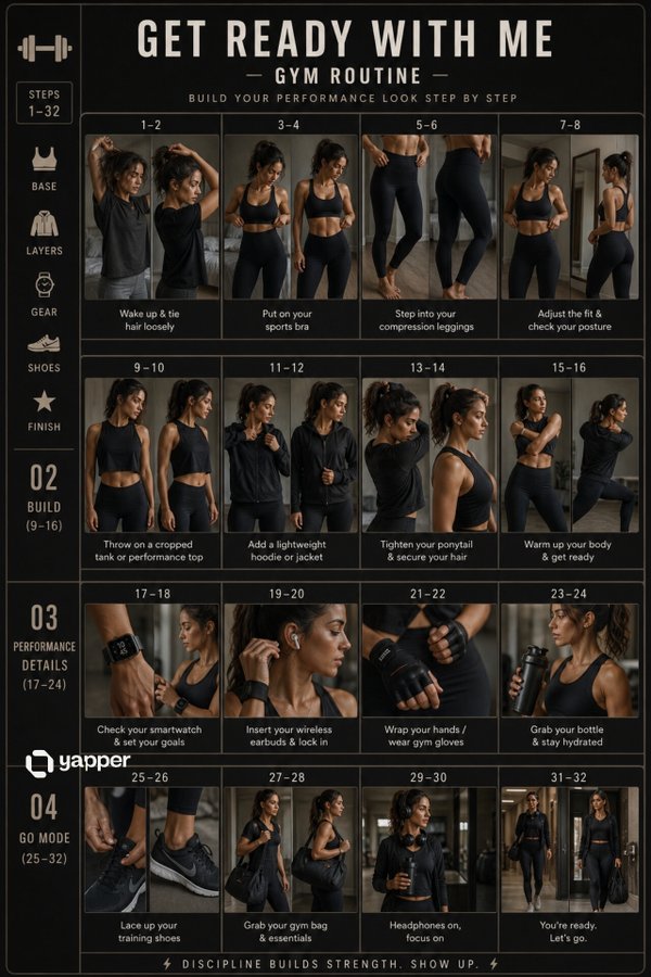
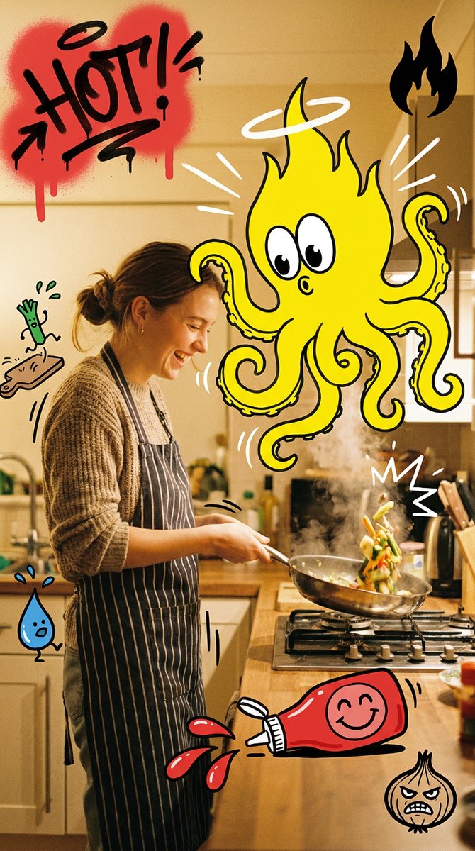
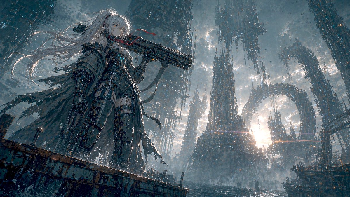
- Use this as a character design benchmark when you need a fast style baseline before rewriting your own prompt.
- It is especially helpful if your target overlaps with 35mm, Fashion, Poster and you want to judge the image result before tuning wording.
- Keep it as a control sample when you compare nearby prompt variants one variable at a time.
Visual Signals To Notice
- The clearest style signals here are 35mm, Fashion, Poster, so those should usually stay in your first rewrite.
- Look at silhouette, costume language, mood styling, and whether the character reads clearly at a glance.
- This case keeps one primary output, so the first image should be treated as the main visual reference.
How The Prompt Is Structured
- The prompt reads as a long, highly specified prompt, which is useful when you want to judge how much specificity this direction needs.
- Its keyword cluster is centered on 35mm, Fashion, Poster, so you can usually keep that cluster while swapping subject, camera, layout, or copy details.
- A practical rewrite path is: keep the outcome, keep the strongest style cues, then replace only the subject and environment blocks.
Good Follow-up Questions
- What changes first if you keep 35mm, Fashion, Poster but switch the subject matter?
- Which part of the result comes from section-level structure (Character Design) versus tag-level style cues?
- Which related cases in the same section give you a cleaner or more extreme variation of the same direction?
Full Prompt
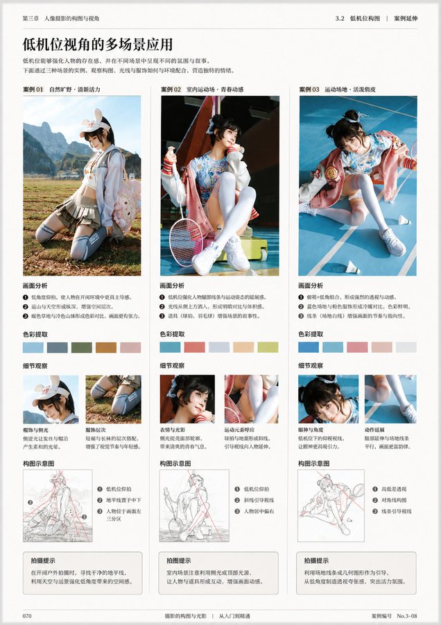
You are a professional book designer, visual editor, image analyst, and teaching content planner. The user will upload an image. You need to first carefully analyze the content, style, theme, purpose, knowledge attributes, and possible book type of this image, then generate a complete book interior page layout design based on this image. The final image must look like a certain page from a real publication, not an ordinary poster, promotional image, PPT, or social media layout. Your task is to determine "what this book is likely about" based on the image, and design a book interior page around this image that has learning value, reading hierarchy, a sense of publication, and can be directly printed and used. After analysis, please directly generate the final book interior page image, do not generate any copy for the user. 1. First analyze the image content and book attributes Before generating the page, please first understand the image uploaded by the user, including but not limited to: What is the main subject of this image. What category of content it belongs to: photography, painting, design, architecture, fashion, film, art history, nature observation, product design, figure study, travel, humanities documentary, craftsmanship, illustration, visual training, professional tutorials, etc. What type of book this image is most likely to appear in: photography learning books, painting technique books, art appreciation books, design textbooks, portfolios, architectural space analysis books, visual composition textbooks, color research books, humanities documentary books, nature illustrated guides, film shot analysis books, other more suitable book types Determine what is most worth explaining about this image: composition, light and shadow, color, space, perspective, brushstrokes, texture, emotion, narrative, technique, style, symbolic meaning, visual rhythm, character relationships, picture structure, creative method Based on the image content, automatically infer what function this book interior page is most suitable to serve: case analysis page, technique breakdown page, work appreciation page, teaching demonstration page, image research page, visual composition analysis page, creative step explanation page, key knowledge summary page, comparative observation page, exercise guidance page 2. Page content planning Please plan which sections this page should contain based on the image content. Do not use fixed templates; decide intelligently based on the image itself. It may include but is not limited to the following sections: Page main title Use a concise, publication-style title to summarize the theme of this page. The title should be like a real book chapter title, not advertising copy. Subtitle or introduction Use a short paragraph of text to explain why this image is worth analyzing, or what is mainly learned on this page. Main image display area The uploaded image should become the core visual content of the page. According to layout needs, it can be displayed completely, or partially enlarged, cropped, or displayed with white space, but the recognizability and aesthetics of the image must be maintained. Image analysis area Extract several key observation points based on the image content, for example: composition method, light direction, color relationship, spatial layers, visual focus, technique characteristics, emotional expression, creative logic Annotation description area You can add thin lines, numbers, arrows, partial frame selections, annotation labels, etc. around the image to point out important details in the image. Annotations must be restrained, accurate, and design-oriented, not cluttered. Partial enlargement area If there are details worth learning in the image, you can set one or more partial enlargement frames to display brushstrokes, textures, light and shadow, composition details, character movements, materials, spatial relationships, etc. Method summary area Use short items to summarize the methods, patterns, or learnable aspects behind this image. Exercise prompt area If suitable, you can add a small exercise task, for example: try recropping this image and observe the visual focus changes. Copy the light-dark relationship in it. Analyze the main color, secondary color, and accent color. Use three lines to summarize the composition structure of the picture. Try to shoot or draw another work with the same composition. Page number, chapter number, column name You can add a small number of publication details, such as chapter numbers, page numbers, column titles, caption numbers, etc., to make the page more like a real book interior page. 3. Content generation principles The text content on the page must be generated based on image analysis, it cannot be vague, and professional terms cannot be randomly piled up. If the image is a photography work, you should focus on analyzing: Composition method 2. Lens perspective 3. Light direction 4. Light-dark relationship 5. Color tendency 6. Depth of field and focus 7. Moment capture 8. Narrative sense and viewing path If the image is a painting work, you should focus on analyzing: Composition structure 2. Color relationship 3. Brushstrokes and texture 4. Light-dark shaping 5. Space handling 6. Modeling language 7. Style characteristics 8. Emotional expression 9. Copying or learning methods If the image is a design work, you should focus on analyzing: Layout structure 2. Font relationship 3. Color system 4. Information hierarchy 5. Visual rhythm 6. Brand temperament 7. Image-text relationship 8. Borrowable design methods If the image is architecture or space, you should focus on analyzing: Spatial structure 2. Perspective relationship 3. Light entry method 4. Material contrast 5. Block relationship 6. Scale of people and space 7. Sense of order and circulation If the image is nature, travel, or documentary content, you should focus on analyzing: Location atmosphere 2. Humanities background 3. Picture narrative 4. Natural form 5. Color and seasonal sense 6. Observation method 7. Visual recording value 4. Layout design requirements The generated image must be a high-quality book interior page, not a poster. Overall requirements: Suitable for printing. 2. The layout is clean, restrained, and professional. 3. There is a clear reading order. 4. The image-text ratio is reasonable. 5. The text cannot be too much, nor empty. 6. The page must have the texture of a real publication. 7. It cannot look like a PPT. 8. It cannot look like an e-commerce detail page. 9. It cannot look like a social media long image. 10. It cannot look like a cluttered infographic. 11. Do not over-decorate. 12. All elements must serve the purpose of image analysis and learning. Preferably adopt the following layout directions: Book interior page grid layout. Left image right text, or top image bottom text, or large image with sidebar annotations. Clear hierarchy of titles, subtitles, body text, captions, annotations, and page numbers. Large areas of white space. Exquisite thin lines, numbers, columns, marginal notes. Low saturation, readable, print-suitable color scheme. Font style should have a sense of publication, academic feel, or art book temperament. The image area should be prominent, and the text area should assist understanding. 5. Visual style requirements The overall visual style should be automatically selected based on the image content, but must maintain a high-end, restrained, real publication texture. You can refer to the following styles: Art textbook interior page 2. Photography book interior page 3. Painting technique book interior page 4. Visual design textbook 5. Art museum publication 6. Architecture magazine interior page 7. Portfolio analysis page 8. High-end art catalog 9. Modern editorial design 10. Minimalist academic publication The image should have: Clear grid system. 2. Stable type area. 3. Reasonable page margins. 4. Delicate image-text relationship. 5. Restrained decorative elements. 6. Precise visual annotations. 7. Readable body text layout. 8. Print-suitable clarity. 6. Text layout requirements The main title should be clear and summarizing. 2. The subtitle should be short, explaining the learning focus of this page. 3. The body text should not be too long; it should be like analytical text in a real book. 4. Annotation text should be short and accurate. 5. Each section title should be clear. 6. Do not use exaggerated marketing language. 7. Do not use empty adjectives. 8. Do not appear meaningless placeholder text. 9. The text should be like content written by a professional editor, not randomly generated explanations by AI. 10. All text must be related to the image content. 7. Relationship between image and content The uploaded image must be the core of this page. You need to build a complete page around this image, not treat the image as decorative material. The image can be used for: Main image display 2. Partial enlargement 3. Structure analysis 4. Color extraction 5. Composition wireframe 6. Detail annotation 7. Technique breakdown 8. Learning case But do not excessively destroy the original image. Analysis lines, annotations, cropping, and enlargement should all serve to understand the image. 8. Printability requirements The final generated result must be suitable for direct printing as a book interior page. Please follow these requirements: The page ratio is suitable for a book interior page. 2. Prioritize vertical page format. 3. A4, A5, 16mo, or ratios close to publication interior pages can be adopted. 4. The resolution should be clear. 5. The text should be clearly readable. 6. Image edges, titles, and body text should not be too close to the page edges. 7. Safe margins should be kept around the page. 8. The layout should not be too full, to avoid appearing crowded after printing. 9. The overall look should be like a formal book page that has already completed editorial design. 10. The final page should have the completeness to be directly placed in a book, textbook, portfolio, or art catalog. 9. Final generation goal Please generate a professional book interior page layout based on the image uploaded by the user. This page should achieve the following effects: At a glance, it can be seen that it belongs to a certain type of professional book. 2. It can be seen why this image is placed on this page. 3. The page is not only good-looking but also has analysis, learning, or appreciation value. 4. There is a clear relationship between the image, title, body text, annotations, and partial details. 5. The layout is like a real publication, not a temporary design draft. 6. The user can directly print it out and use it as a certain page in a book. 7. The page has a professional, restrained, clear, readable, and collectible publication temperament. 10. User optional custom area Please have the user upload an image Page number: Page size: Text language: Whether partial enlargement is needed: Whether image annotation is needed: Other supplementary information: